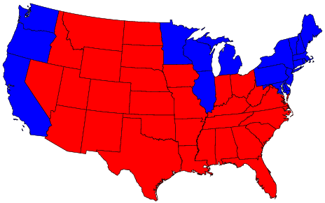
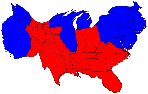
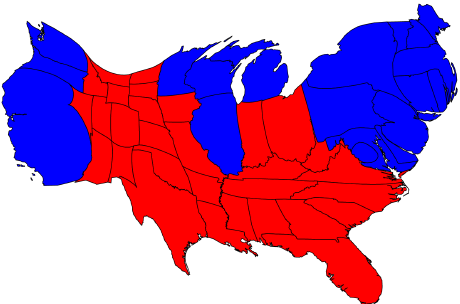
Whoever said a picture is worth a thousand words wasn't kidding. In 2004 Kossacks and the world waited anxiously for the U.S. Presidential results. And no matter where you viewed them, it's almost certain you saw a map like this one.
As you probably know, maps like this (and the even more distorted county maps) paint an unfair picture of the political demographics of the United States. Republicans and the mainstream media(MSM) exploited these maps to spread lies and deceptions about the size of their "victory" and the "mandate" they didn't earn.
For a fun look at the best ways to fight back against these untruths about "Red State America," look below the fold.
Update: Added some GREAT Kosack Links at end of diary
Electoral Maps and Propaganda
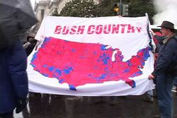
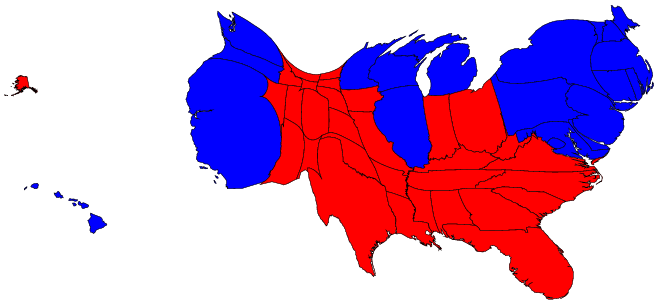
Bushites across the country loved to point to maps like this one (courtesy of Matt Kohn's
Call It Democracy) as evidence of overwhelming acceptance of Republican and NeoCon dogma. In a wholly unscientific survey, (a google search of "map maps"), this map or similar ones are the most frequently posted maps on FreeRepublic.com.
So why are these pics wrong and how do they distort reality? The answer is that they give a geographical representation of statistics that are actually about people.
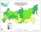 Consider this map of Russia which shows the percentage of people of people who voted for President Putin. The darker the color, the higher the region voted for Putin, with light green being 50%. A quick glance (falsely) shows him seemingly with overwhelming approval all over the country.
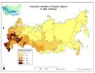 The problem is, the big green swaths in the heart of Russia that went 50% or higher for Putin represent a very small part of the population of the country, as you can see from the population map. on the right.
The same things holds true for the Red State-Blue State Map we all saw on election night. Note the big red swath of alleged "Bush support" in the heart of the west and midwest just below:
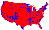
But a look at a simple population map of the U.S. (1 dot = 7500 people) shows that the same area is in reality the least populated portion of the country.
So much for all that Republican strength! 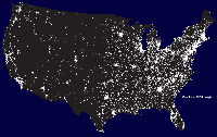
So all that Red is representing a proportionally very small population of voters.
So how do we counteract these unfair maps? (for people who won't wade through this diary!) Lets face it, we're a picture society. Forget those "thousand words," what we need is a better picture.
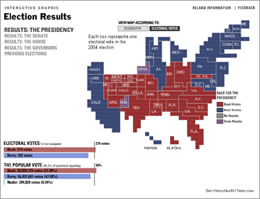 The New York Times deserves some credit for posting this interactive map, (image at right) which attempted to show a more proportional representation of the actual vote.
But an even better way to paint the picture is with cartograms. Cartograms are diagrams that maintain the form of a map to present numeric information while keeping a degree of geographic accuracy. (huh?)
Don't worry if you can't understand that, just check out the picutures below.
Cartograms
The best cartograms I found (and the most thorough analysis) were from the Department of Physics and Center for the Study of Complex Systems at the University of Michigan*:
Election results by state
...[W]e have seen many maps that look like this...
The map gives the superficial impression that the "red states" dominate the country, since they cover far more area than the blue ones. However, as pointed out by many others, this is misleading because it fails to take into account the fact that most of the red states have small populations, whereas most of the blue states have large ones. The blue may be small in area, but they are large in terms of numbers of people, which is what matters in an election.
We can correct for this by making use of a cartogram, a map in which the sizes of states have been rescaled according to their population. That is, states are drawn with a size proportional not to their sheer topographic acreage -- which has little to do with politics -- but to the number of their inhabitants, states with more people appearing larger than states with fewer, regardless of their actual area on the ground. Thus, on such a map, the state of Rhode Island, with its 1.1 million inhabitants, would appear about twice the size of Wyoming, which has half a million, even though Wyoming has 60 times the acreage of Rhode Island.
Here are the 2004 presidential election results on a population cartogram of this type:
The cartogram reveals what we know already from the news: that the country was actually very evenly divided by the vote, rather than being dominated by one side or the other.
Here's a version with Alaska and Hawaii. Note the proportional sizes of the two states indicating population.
Next they account for the Electoral College:
We can represent the effects of the electoral college by scaling the sizes of states to be proportional to their number of electoral votes, which gives a map that looks like this:
This cartogram looks very similar to the one above it, but it is not identical. Wyoming, for instance, has approximately doubled in size, precisely because of the bias in favor of small states.
The areas of red and blue on the cartogram are now proportional to the actual numbers of electoral votes won by each candidate. Thus this map shows at a glance both which states went to which candidate and which candidate won more votes -- something that you cannot tell easily from the normal election-night red and blue map.
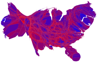
Finally, they do the same thing for the county maps:
Election results by county...
Similar maps have appeared in the press, for example in USA Today, and have been cited as evidence that the Republican party has wide support. Again, however, a cartogram gives a more accurate picture...:

Again, the blue areas are much magnified, and areas of blue and red are now nearly equal. However, there is in fact still more red than blue on this map, even after allowing for population sizes. Of course, we know that nationwide the percentages of voters voting for either candidate were almost identical, so what is going on here?
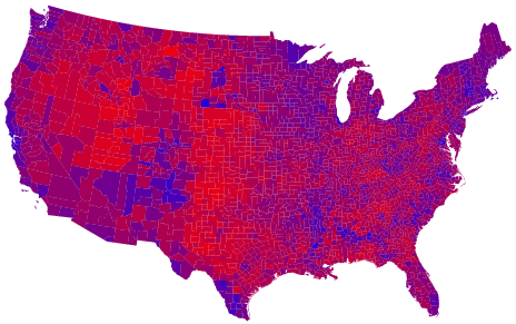 The answer seems to be that the amount of red on the map is skewed because there are a lot of counties in which only a slim majority voted Republican. One possible way to allow for this, suggested by Robert Vanderbei at Princeton University, is to use not just two colors on the map, red and blue, but instead to use red, blue, and shades of purple to indicate percentages of voters. Here is what the normal map looks like if you do this.
And here's what the cartogram looks like.
In this map, it appears that only a rather small area is taken up by true red counties, the rest being mostly shades of purple with patches of blue in the urban areas.
This USA Today article from 2000 makes a rather outlandish conclusion based entirely on their faulty map:
"A USA TODAY analysis suggests that Democrats have a more urgent survival question. Gore won only a quarter as many counties as Bush."
That would be fine, if elections were decided on winning large geographic areas with small populations. But as we have clearly seen, they are not.
Finally, Chris Bowers wrote an excellent diary over at MyDD that takes a different approach: using GOP tactics to beat them at their own game. I highly recommend his diary.
Update:
Some very good Kosack links
I would like to add these dailykos links to other diarists and posters who touched on similar issues:
DreaminOnEmptys diaries on the changing color of the map since the election
MarketTrustees diary about Energy which also utilizes cartograms
- And some very good related threads
here,
here and
here
sent to me by
Yellow Canary
I did search before I posted my diary, but obviously not well enough! Thanks for letting me know about them.
Leftover Links:
- Other efforts for mapping election results courtesy of U of M: here, here, here, and here.
- Wikipedia: cartogram
- Two maps showing a comparison of Free/Slave States and Blue/Red States form '04. (Surprisingly similar!)
- The second most popular electoral map on FreeRepblic.com (again according to my unscientific count) with an anonymous Freeper's idea for a new national border with Canada added in (in yellow)
*NOTE: All images on this page are as small as possible, and are not hotlinked to the original source. Links to the sources are provided in the text. If an image has no link then the image is from The University of Michigan and cited under a Creative Commons License. Many thanks to U of M's Michael Gastner, Cosma Shalizi, and Mark Newman.
