The
first part of my analysis of the Wisconsin Democratic AG primary race showed just how effective Kathleen Falk's TV ads were. I claimed that they determined the outcome of the race, but I didn't really back that up with real data. The map I presented showed how strongly each county went for one candidate or the other, but what it didn't show was how many actual votes came from each county. And some counties obviously have a heck of a lot more voters than others.
So I made a new map to show where the votes actually came from. Follow me down to see it.
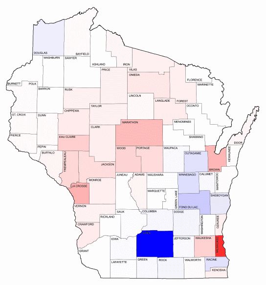
Once again, Red is Falk, blue is Lautenschlager. But since this map reflects the margins in actual votes, rather than percentages, it looks quite a bit different. Dane and Milwaukee Counties really stand out. Almost one-third of the total votes in the primary came from these two counties alone. Lautenschlager won Dane County by about 10,100 votes, and Falk won Milwaukee County by almost 8,400 votes.
But Madison and Milwaukee pretty much canceled each other out. So just where did Falk's 20,000 vote margin of victory come from?
Turns out it came from the Wausau/Rhinelander and the La Crosse/Eau Claire media markets, as I claimed before. Despite the fact that there aren't a huge number of votes in any of these counties individually, which is why they're light pink in this map, Falk won all of them by healthy margins, totaling about 23,000 votes, more than enough to offset the fact that Lautenschlager actually won in the rest of the state.
For a little more detail, and a side-by-side comparison of the two maps, please check my blog, reform-dem.blogspot.com.
