A picture is worth a thousand words. In the case of the current economic environment, a picture
is worth a thousand words. Below are some charts and graphs of the current housing market and the households who purchase housing. These graphs indicate there are problems ahead.
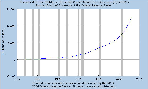
Consumers can't take on much more debt. Notice how the steepness of this line has continually increased, indicating the rate of debt accumulation has increased.
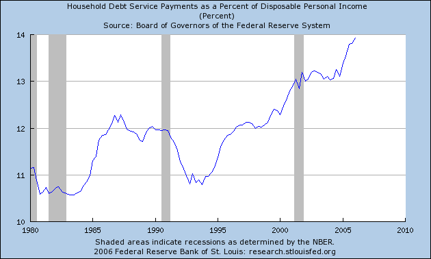
A larger percentage of income is going to paying off debt.
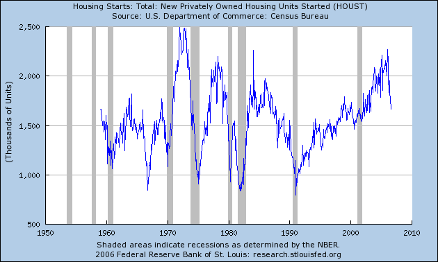
Homebuilders are bearish ....
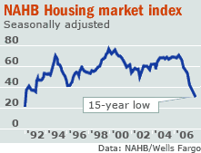
... so they're not building as many new houses. Pay particular attention to the rapid drop in housing starts and recessions.
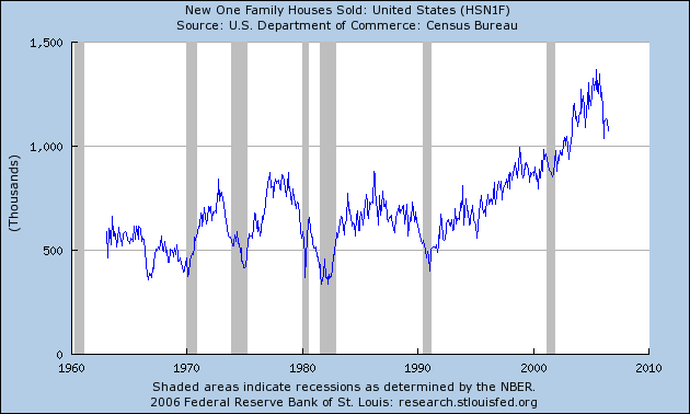
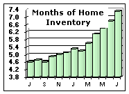
Home sales have dropped ...
... so inventories of available homes for sale have ballooned:
As inventories increase and home sales drop, prices drop. This trend looks like it will continue for awhile.
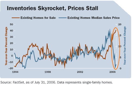
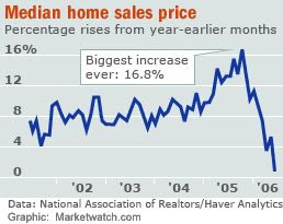
Here's a graph of median home prices without inventory.
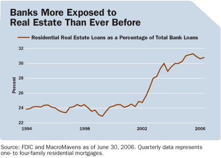
Banks are more exposed to real estate.
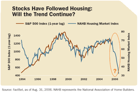
Finally, home prices lead the S&P stock index:
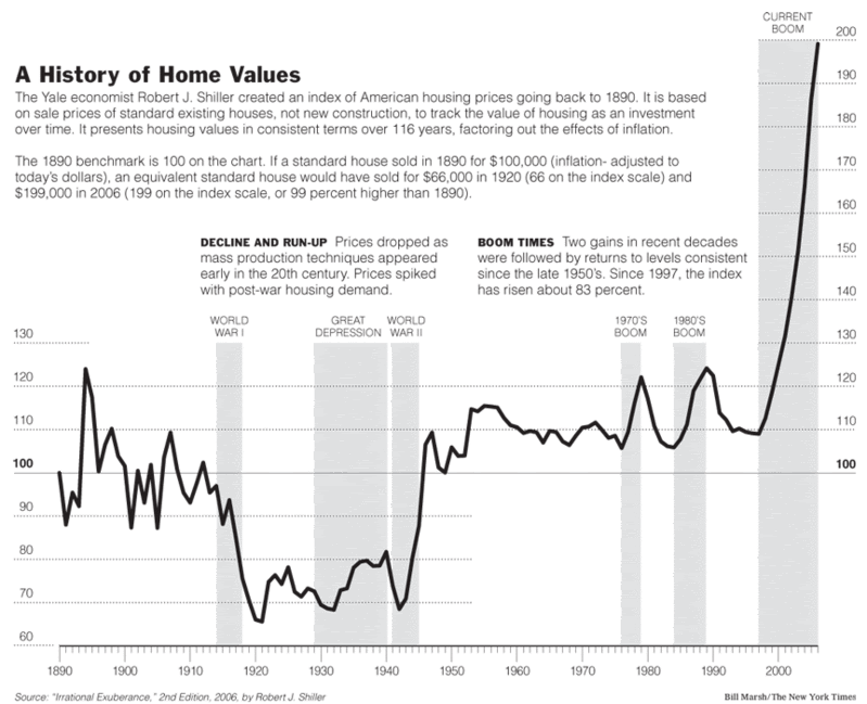
Update [2006-9-22 11:29:50 by bonddad]:: Thanks to Fines from the comments for this graph from the NY Times. It shows how out-of-whack house prices are with the historical norm.