So I'm off today, not having to work, and it's great. Hanging out at home, trying to get caught up on everything happening in the world ....
And I stumbled across a chart. About the economy. About our current financial situation.
And I had to stare at it for a while to even figure it out. Because it didn't look like most charts. I couldn't see the usual ups-and-downs, the fluctuations that you normally see in charts.
What is the chart? And why will it make your hair stand on end?
It's a chart that shows the level of borrowing, by banks, from the Federal Reserve. Econ 101 tells us that money is created in our society by the loaning of money from the Fed. In other words, money is created through the creation of debt.
So debt is good, right? Debt makes money. Literally.
But look at this chart:
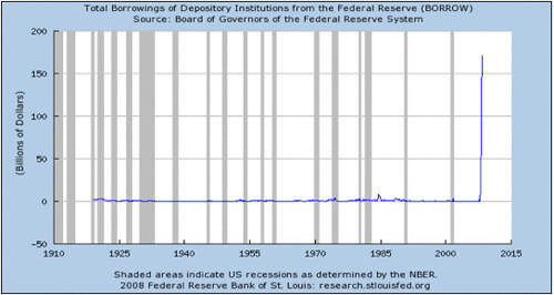
It's sort of like one of those illusions, where at first you can't see if it's a rabbit or a duck ...
But it's something that's virtually a straight line ..... then it suddenly shoots straight up. A virtual right angle.
This means that the Fed has suddenly been printing money like there's no tomorrow.
Why? Because it loaned out a ton of funny money in the past eight years. If money is created through loaning it out, and the loans are bad, then the money itself is bad.
So how is the Fed covering its butt for creating all that bad money? By creating MORE bad money.
None of this money that it's been creating lately is backed by anything. It's more debt to cover previous bad debts.
It's like if you or I took out a huge loan in order to pay off our credit cards because we couldn't pay them off any other way.
That's what our glorious leaders have brought this country to. Virtual bankruptcy.
Looking at this chart, it seems the worst is yet to come. And it's gonna be a doozy.
The chart is from here, a site for the Federal Reserve Bank of St. Louis.
Here's something of an article about it:
One of the basic functions of a central bank is to act as the 'lender of last resort'. This facility is used to keep banks liquid during a period of distress.
For example, if a bank is experiencing a run on deposits, it will borrow from the central bank instead of trying to liquidate some of its assets to raise the cash it needs to meet its obligations. In other words, the central bank offers a 'helping hand' by providing liquidity to the bank in need.
The chart proves there is truth to the adage that a picture is worth a thousand words. It's one thing to say that the present financial crisis is unprecedented, but it is something all together different to provide a picture putting real meaning to the word 'unprecedented'.
It is an understatement to say that the U.S. banking system is in uncharted territory. The Federal Reserve is providing more than just a 'helping hand'.
This chart should alert everyone to the perils of putting your wealth on deposit in a bank. The magnitude of the borrowing by banks shown on this chart is signaling that the banking system is suffering from more than a lack of liquidity. The real question we need to be asking ourselves is whether the banking system is solvent...
If you have money in a bank, I'd say get it out. The sooner the better.
