Bush and McCain bear an uncanny resemblance. Could they have been separated at birth?
Follow me below the fold for the unveiling of the amazing new production they are co-starring in this fall.
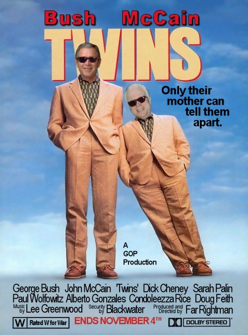
Warning: Due to the intense and graphic nature of this production, no Republicans will be admitted to the Oval Office after January 20th.
Permission to use for any purpose as long as you're for Obama.
I considered a few variations on this, and have them just about ready to go. "Not even their mother can tell them apart" instead of "Only their mother", and "Doobie Stereo" instead of Dolby, and with and without sunglasses. Let me know if you want one of those. If you ask nicely, I'll even send you an xcf (or psd, if you need that).
Update: Since some people didn't feel this was much of a diary, I've added some background on how to create an image like this, in case people find that useful.
Tools: The only tool you'll need is The GIMP.
Resources: I started by finding a version of the Twins movie poster online. Since I'm creating a parody, I believe the use of it is covered under fair use. I also had a few images of Bush and McCain that I've downloaded to use in parodies. Before I was finished, I also needed to find a copy of the Dolby Stereo logo.
Cleaning up the images: I had to remove Arnold Schwarzenegger's head (let's pause and reflect on that for a moment) and Danny DeVito's head, most of the existing copy in the poster (except for the big TWINS title at the top), and since the image I started with was a rather low-quality jpeg, it had a lot of noise I had to clean up.
Removing existing features from an image is best accomplished with the Clone tool in the GIMP. This tool lets you copy one area of an image to another. You often need to think carefully about which areas to copy from, and it can involve a lot of close up work with a small brush size at a high zoom level. This is the most painstaking part of the task. In particular, Arnie's head was much harder than Danny's (surprise, surprise), since part of the TWINS banner is behind it, whereas Danny just had blue sky behind him.
Once I had removed their heads and the copy (text), I had to smooth out the noise of the low-quality jpeg. This wasn't too bad since the background of the poster is smoothly changing colors. Just select the background using the Fuzzy select tool, which selects similar colors, and then keep Shift+Clicking different colored areas until you've selected all of the background but none of the foreground (e.g., the bodies). This is easier than it sounds.
Then, with the background selected, use Filters > Blur > Selective Gaussian Blur and voilà! The background is now nice and smooth without a lot of low-level noise.
When there's nothing left to take away, it's time to start adding things
At this point, I had a nice background on which to layer the rest of the graphics. And 'layer' is the right word here. Layers are indispensable for a task like this. They let you separate different parts of the graphics and work on them independently, without interfering with each other. And then you can composite them like a stack of transparencies.
The next step was to add the text. This was pretty straightforward. There were only two details worth mentioning: I kept different bits of text on different layers, to let me move them around independently, and for the "Bush" and "McCain" text at the very top, there were three layers each.
One layer for a black version of the text and one slightly smaller layer with a red version. That resulted in red text with a thin black border to make it stand out. And finally, one more layer for a drop shadow, slightly blurred and shifted slightly down and to the right.
Logos: I found a Dolby Stereo logo, black on white, and changed it to have a transparent background by: setting the image mode to RGB (it was grayscale), adding an Alpha layer, and then using Select by Color to select all the white. I had to turn the threshold up a bit to really clean all the background away and make it nicely transparent. Then just resize and position it.
For the "W | Rated W for War" logo there was nothing fancy: just create the text and then draw some boxes around it with the rectangle select tool and the Edit > Stroke Selection command.
The big kahuna: The heads
I ran through my Bush and McCain pics to find the ones I wanted to use (basically, ones where they were looking in the right direction). I used variations on the above methods, plus some up-close editing with the erase tool, to get their heads and part of their torsos (essentially, a bust) against a transparent background.
But it's very hard to cut things just right so that the join lines up nicely, and I have a trick for doing that.
Rather than simply put Bush's and McCain's heads on Arnie's and Danny's bodies, I copied the original background layer a few times, and then cut out parts of it against transparent backgrounds onto some new layers. I realize this is getting confusing, so let me just give you a partial list of some of the layers in the stack after I got done with this step:
- Danny's sunglasses
- Danny's collar and torso
- McCain's head
- Arnie's sunglasses
- Arnie's collar and torso
- Bush's head
- The background
Note: all but the bottom layer are mostly transparent.
Because of the way I created the "collar" layers (just duplicate the background, and then erase everything except what I want), the collar can't help but perfectly line up with the same pixels in the background.
Because of this arrangement, I could put Bush's head over the background, and then Arnie's collar and torso over Bush's head. What that meant was, it didn't matter if I had a little "too much" of Bush — that is, if he wasn't cropped perfectly to fit into Arnie's collar. In fact, it is better if there is a little overlap. It will be hidden when you superimpose the collar layer over Bush.
(I know what you're thinking. "It doesn't matter if you have a little too much of Bush? Hey, I've had WAY too much of Bush!")
The same argument goes for the McCain layers above, natch.
Oh, I also had to rotate and scale the heads to get them just right. There's no way to know just how many degrees to rotate or what size to scale to. The only thing for it is trial and error. Undo is your friend (Ctrl-Z). Fortunately, the GIMP has good multi-level undo.
The "sunglasses" layers also lined up pixel-perfectly with the original background image, for the same reason the "collars" did, but that wasn't useful. Because the heads were not exactly the same size, or at the same angle, as in the original, to get the sunglasses to fit I had to rotate and position them.
The Beauty of Layers
One nice thing about layers is, you can turn them on and off at will. So, since the sunglasses are on separate layers, I can remove one or both pairs of glasses and create a new jpeg as easy as pie.
I also created alternate versions of one of the text layers, and one of the logo layers. I have a "Not even their mother can tell them apart" layer that I can replace the "Only their mother can tell them apart" layer with in a flash. And I created a parody of the "Dolby Stereo" layer that reads "Doobie Stereo". Again, switching this is as easy as falling off a log. I decided against the "Doobie Stereo" logo since I wanted the poster to have the broadest possible application, and I knew some people might not be comfortable using it if it said that.
In Conclusion
There are 22 layers in the final xcf file (the native GIMP format), 20 of which are visible in the jpeg above. That's how I spent my evening. What'd you do? Watch a speech at the Republican National Funeral?

