Elections have consequences. The election of a laissez-faire, klepto-plutocrat free market fundamentalist Administration in 2000 and 2004 had real consequences. State actions to clamp down on predatory loans were pre-empted. A do-nothing SEC allowed Wall Street banks to lever up at levels of 30 or 40 to 1. Just for example. Changes in these policies can also have consequences, and those consequences can be for the better. Even a belief that things are going to get better can have real economic consequences.
So a new Administration in Washington populated by Economic Adults may unfreeze the logjam of money supply sitting in banks and not being lent out. Certainly there is a pressing need for massive infrastructure investments that can lead to renewed bank lending and economic expansion on Main Street.
Yes, there is Hope for an Obama Economic Recovery in 2009. Below I will describe the State of the Economy in December 2008, and why there is a significant possibility that conditions which appear to be worsening now, can still recover next year.
The below is a compendium of posts I have recently published at The Economic Populist
I. We are in the first full-fledged deflationary bust since 1938
Beginning in September, a host of economic indicators, some coincident, some leading, have shown the worst economy in decades: we have the worst housing starts since 1991, the worst consumer sentiment since 1979, the biggest stock market crash since 1987, the worst builder sentiment since the survey began, the biggest drop in industrial production since the survey began, a sudden 10%+ drop in retail shopping, a collapse in car sales, and on and on.
This week the NAPM reported a record low reading on their services index. This is the vast majority of the economy. We also learned that auto sales also declined by a record amount in November. What both auto sales and services have in common is a continuing worsening of monthly measures compared with 2007. For example, in August car sales were down about 19% YoY. In September the loss was 21%. In October it was 23%. November's number, released yesterday,was more than 30% off from 2007.
Then, in the mother of all bad readings, we found out that the economy had lost 533,000 jobs in November and 1,250,000 in three months. This is an economy in free-fall.
Bureau of Labor Statistics data going back 95 years show that with one trivial exception (one month in 1928), every single time there has been a deflation of greater than 1.5% over a 12 month or less period, it has been associated with a recession. Furthermore, the deeper the deflation, the worse the recession, as shown in the table below. Recession dates are per the NBER. Inflation figures are taken from the BLS website:
| Recession Time Period | -1.5% Deflation | Largest Change |
|---|
| | |
| 1/13 - 12/14 | 2 - 4/14 | (-3.0%) |
| 8/18 - 3/19 | n/a (inflationary) | +23.7% |
| 1/20 - 7/21 | 8/20 - 9/22 | (-15.8%) |
| 5/23 - 7/24 | 4/24 | (-1.8%) |
| 10/26 - 11/27 | 1 - 5, 8/27 | (-3.4%) |
| n/a | 6/28 | (-2.8%) |
| 8/29 - 3/33 | 4/29, 3/30 - 8/33 | (-10.7%) |
| 5/37 - 6/38 | 1 - 12/38 | (-3.4%) |
|
| 2/45 - 10/45 | n/a (inflationary) | +2.8% |
| 11/49 - 10/49 | 1/49 - 1/50 | (-3.2%) |
| 7/53 - 5/54 | n/a | (-.8%) |
12/07? - ???? | 10/08 - ???? | (-1.5%) |
The deflationary data continues to wash ashore like a tsunami. The commodity bubble that brought us "Peak Everything" in Oil, gold, copper, and a whole host of agricultural prices just a few short months ago, has suddenly and breathtakingly collapsed:
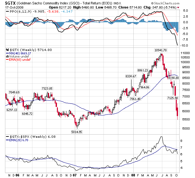
This collapse has brought about the long-awaited decline in gas prices from over $4/gallon nationally, to well under $2/gallon in many places, and it has manifested itself in a decline in the inflation rate for imports, producer prices, and consumer prices as well.
Tim Iacono of "The Mess that Greenspan Made" has published the latest version of his very revealing graph series of the Case Schiller-CPI, which replaces "owners equivalent rent" with actual house prices:
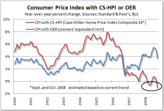
showing an even more dramatic decline in inflation.
Most recently, the November ISM services report revealed that in November, prices continued to decline dramatically, also to a new all-time low -- from an all-time high only four months ago. Viewed in this light, it is probably not a surprise that the stock market has crashed since this deflation started in July, and indeed appears to anticipate a much more crippling deflationary spiral. Since November and December have a seasonal bias towards slightly negative (-.1 and -.2 respectively) monthly CPI readings, and since November CPI in 2007 was +.6%, it is very likely that this November it will be replaced with another large deflationary number instead, confirming that a Deflationary Bust -- the first since 1938 -- is in full force.
II. Housing continues to collapse
Some time ago, I summarized Prof. Edward Leamer's research on typical business cycle contractions that was presented to the Federal Reserve at its Jackson Hole conference in 2007. The paper itself is an excellent, in-depth analysis and I highly commend to you reading it in full if you have an hour or so on your hands due to inclement weather, indolence, intellectual curiosity, or if you just generally otherwise have a pathetic life.
Leamer's exposition of the data led to the following conclusion:
The first item to soften and the first to turn back up is residential investment:
The temporal ordering of the spending weakness is: residential investment, consumer durables, consumer nondurables and consumer services before the recession, and then, once the recession officially commences, business spending on the short-lived assets, equipment and software, and, lasst, business spending on the long-lived assets, offices and factories. The ordering of the recovery is exactly the same.
In other words: first housing, then durables (mainly cars and furniture), then non-durables, and finally services. When services go, you are in the full force of the recession. That's where we are now.
Unfortunately, many people are dismissing Leamer because even though the data in his paper led to a spot-on conclusion, namely:
The historical record strongly suggests that in 2003 and 2004 we poured the foundation for a recession in 2007 or 2008 led by a collapse in housing we are currently experiencing....
no doubt influenced by the sanguine outlook preferred by his audience, he disregarded that, and instead included the following paragraph:
But don't worry.... This time troubles in housing will stay in housing. It's because manufacturing has done an "L" of a job.... Though this is uncharted territory, it doesn't look like manufacturing is positioned to shed enough jobs to generate a recession.
as to which from the viewpoint of December 2008 he is undoubtedly beating his fist on his forehead and repeating NO NO NO NO NO NO NO NO NO !
As it turns out, this time it wasn't different.
Leamer used a sophisticated mathematical "kernal" to calculate the relative contribution of housing to GDP during expansions and recessons, in order to arrive at his conclusions, but we can approximate this by looking at Real Residential Investment (i.e., normalizing for inflation) which was calculated annually until the post WW2 era, and quarterly since:
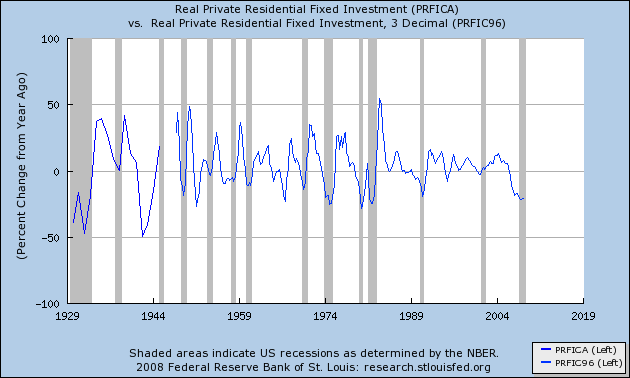
(note: I have omitted 1945-46 because investment soared at a 300% YoY rate, which would reduce the rest of the graph to squiggles!)
What is most noteworthy is that the %age increase in real residential investment has always peaked before the onset of the ensuing recession. Since the onset of the Great Depression in 1929, it has troughed at the end of the recession 4x, in advance of the end 7x, and before the onset of recession 2x -- i.e., either at or before recession's end. To put it simply, Real Residential Investment's status as a major leading indicator is confirmed.
Our current economy is such that statistics which only date from the post-WW2 inflationary era can be gravely misleading. In that regard, Leamer's aside to pre-WW2 housing data is most noteworthy, to wit:
The housing starts data available from the Census Bureau begin in 1959 [but] ... the image [ ] of the earlier data in Ketchum (1954)... [shows that] ... housing starts declined beginning in 1925! .... Problems in housing led the great depression by a full three years. ...[I]t seems possible that the increase in the discount rate in 1928 was very hard on an already weakened housing sector, and set in motion the events that led to the Great Depression, dropping housing starts from around 850 thousand in 1925 to a meager 40 thousand in 1933.
Here is the image referred to in the above paragraph:

If this were a regular, "minor" recession like 1991 or 2001, by the time the service sector rolled over a couple of months ago, housing starts may already have bottomed and a nascent recovery may have started. Unfortunately, for reasons that need to be more fully explored in another diary, there was a singular decline in consumer spending that began in September and may be having the effect of an avalanche now. The most recent housing starts data is from October:
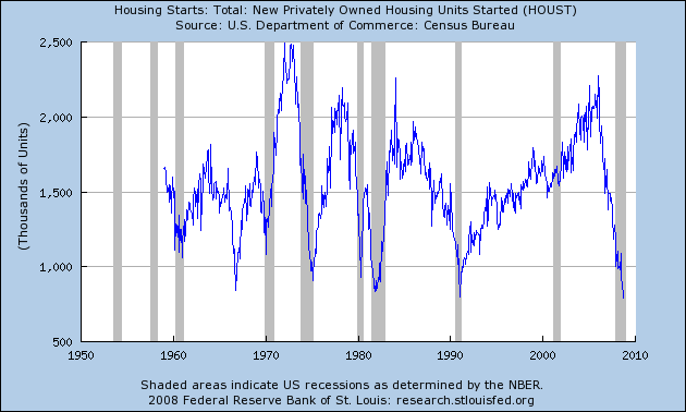
At an annual rate of 791,000 starts, this is the lowest reading since the end of WW2.
In short, Prof. Leamer's model shows that we are still firmly in recession. Leamer himself should have stuck with what his model concluded (which was absolutely correct) and not ventured into the "uncharted territory" of "this time it's different." This time it isn't different.
III. The Federal Reserve and Treasury's attempts to pump-prime the economy haven't worked (so far)
Left to its own devices, I suspect the economy would succumb to a deflationary spiral. But Ben Bernanke and the Federal Reserve know this as well: Bernanke is a scholar of Federal Reserve mistakes during the 1929-32 Great Depression. He is resolved not to make the same mistakes that were made then (cycnics may say: so he's making entirely new and different ones!). Chief among those mistakes was raising interest rates and throttling back on the money supply. So the Fed has dutifully lowered interest rates virtually to zero, and has begun a series of programs and steps, including "quantitative easing" such as buying long-term bonds in an effort to bring long term rates, such as mortgage rates, down as well. He is aiming a veritable monetary firehose at the deflationary vortex, hoping to flood it with money and so overcome the incipient deflation.
The economic issue going forward is, therefore, will the Fed and the Treasury's combined attempt to flood the financial system with money overcome the deflationary impact of a collapse of consumer spending? Despite the fact that the Federal Reserve is now increasing the money supply at a 10% annual rate, the signs are that it may be insufficient to overcome the tsunami of deflation which is just starting to crash ashore.
The recent example of 2006 is instructive. In late 2006, Oil prices declined about 36% from ~$80 a barrel to $51 a barrel. The decline this year of over 70% in Oil prices is even more dramatic. This screen shot of BLS monthly inflation data for 2006-2008 shows the relative impact of deflation.
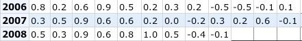
In 2006, the decline in Oil prices coincided with a (- 1.1%) decline in consumer prices. So far in 2008, there has already been a ( - 1.5%) decline in inflation, and now, unlike 2006, the consumer has collapsed.
There is at least some hope, despite the recent awful numbers that confirm that we are in a Major Deflationary Recession, that the pump-priming + deflating consumer prices may work to pull us into a tepid recovery in 2009.
A. In the first place, there is a regular pattern of cpi vs. ppi inflation unfolds over economic cycles. Consumer inflation is relatively tame, but producer inflation starts out very low, and considerably less than consumer inflation (the red line is under the blue line). Simply put, producer costs aren't rising as fast as consumer prices can be increased, and increased production and sales leads to increased profits. Over time, both consumer and producer inflation increases. Ultimately, producer prices increase faster than consumer prices.(the red line is over the blue line). Producers aren't able to pass on their increased costs to consumers, and their profits decline. When their profits decline, they cut back and lay off employees. A recession ensues as consumers pull in their belts. Prices, especially producer prices, decline, thus setting off the next cycle.
For example, here is the graph showing consumer inflation (blue), producer inflation (red) and the inflation rate for oil (green) for the period up to and including the 1974 Oil-shock recession:
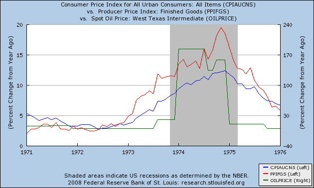
Just as in the 1974 Oil shock, since July of this year consumer inflation, as well as the price in oil, are all in a steep decline, just as in the latter part of the 1974 Oil shock recession:
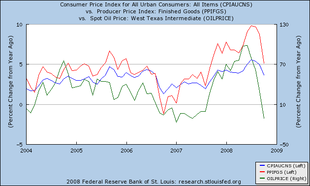
While there is a distinct possibility that we are seeing the beginning of a deflationary spiral of declining prices and large increases in unemployment, nevertheless, if this recession follows the pattern of previous oil shock recessions, we can continue to expect producer prices to decline faster than consumer prices. Possibly as soon as this month, year over year PPI will be less than CPI, meaning the profit margin for producers has increased. This pattern is consistent with a scenario that, perhaps in the first half of 2009, the recession will bottom out, and at least a weak recovery may begin.
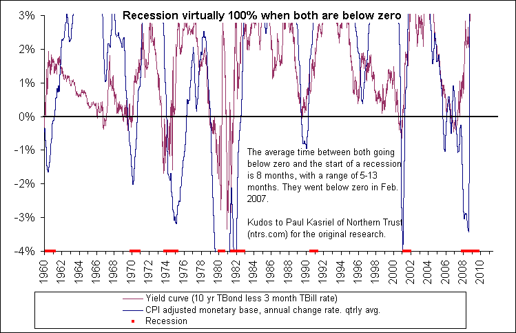
B. Secondly, There are two very reliable indicators of recession, which combined have been nearly infallible for 75 years. This is a variation of the proprietary "foolproof recession indicator" of Paul Kasriel, as modified by Mike Shedlock a/k/a Mish. Here's Mish on the infallibility of the Kasriel indicator as displayed graphically above:
Bingo! A perfect seven of seven with no misses and no false positives. The two blue-grey ovals are conditions where only one of two conditions were met.
The two indicators are, (1) a positively sloping yield curve, where you are paid more interest to hold bonds for a longer time than a shorter time, and (2) a money supply entering the economy that is growing faster than inflation. When both of these are negative, a recession has always ensued. When both are positive, a recession has never been in place. So strong are these two indicators that they also accurately coincide with the periods of recovery during the Great Depression itself. Here is a display, dating from ~1960, of the Kasriel indicator:
And here is the most recent money supply indicators (m1 [red, green] and monetary base[orange]) which continue to indicate so as of the end of November:
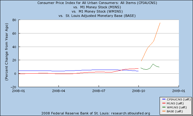
When both lines in the Kasriel indicator have been below 0, it has always correctly forecast recession. Conversetly, when both lines have been above 1, it has (so far) always correctly indicated a recovery. It is now virtually certain that the Kasriel indicator will predict a recovery in the first half of 2009.
Against this, it has been argued, for example, here and by Mark Sunshine of First Capital that money velocity has slowed to a crawl due to banks' hoarding:
However, there was the new September/October surprise of liquidity hoarding and falling velocity of money. Lower velocity has the same effect as falling money supply; GDP is destroyed, commodity prices fall, deflation occurs, and credit is rationed.
But, the Fed’s effort to increase money supply doesn’t do anything to stop hoarding and maybe makes things worse. A better policy would be increased fiscal stimulus and qualitative adjustments to banking regulations. Qualitative regulatory changes that discourage hoarding include incentives for lending and disincentives for holding cash and Treasuries.
Certainly true, but the counter-argument imho is that this "hoarded" money has not disappeared into a black hole: when banks become more confident, all of this money being thrown at them will still be available to be lent out. Once a new Administration of authentic Grown Ups takes office in January, perhaps with a decent and large stimulus package, that confidence may well begin to appear. When the spigot opens, recovery may not be far behind at all.
IV. There is a faint light at the end of the Housing collapse tunnel
As my regular readers know, I like to follow the data and be alert to changes in trend. While I absolutely agree with Bonddad that We're Nowhere near a Bottom in Housing, there are signs that change is afoot.
As I have previously described, Prof. Edward Leamer has studied all of the post WW2 recessions, and has noted that society needs only so many new houses and vehicles in any given year. Expansions typically end at a point where there has been overproduction of both. The recession ends and the next expansion begins only after that excess has been sopped up by a long and/or deep enough period of underproduction. Needless to say, there was wild overbuilding of houses in the first part of this decade. In fact, the graphs which appear below suggest overbuilding began ever so slightly over 10 years ago.
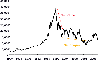
Due to the massive overbuilding, the housing bubble is correcting via a market crash. Russ Winter has aptly described market crashes as typically consisting of two parts -- "guillotine" and "sandpaper" -- by which he means that there is an initial near vertical decline (the guillotine) followed by a long, grinding slow further decline (the sandpaper). Here's an example (Japan's stock market crash) pulled from his blog:
In the case of the housing market crash, how would the change from "guillotine" to "sandpaper" look? In the past, Calculated Risk has reckoned that the inflection point between advancing and declining house prices was at about 7 months' supply. So I submit that first of all, we would see a decline in months' supply of houses for sale towards that mark, as sales started to outstrip new house starts and existing homes being offered for sale. In order to accomplish that, you would first need to see that new home building has declined to a level where sales exceed new starts. You would also want to see existing home sales increasing on a year-over-year basis. In other words, the volume of new home starts would transition from guillotine to sandpaper first, well before prices themselves would begin the transition.
And Guess what? All of those conditions have either started or appear to be on the cusp of starting.
Turning first to new home sales, in the first graph below (courtesy of Mike Larson) I have overlayed in the yellow line the trend of new home sales, showing just how great the excess of the first part of this decade was. To return to Prof. Leamer's point, only when the area OVER the line, representing volume of the previous housing bubble, is followed by an equal area representing subsequent underproduction, will the bust end and the equilibrium point be reached again:
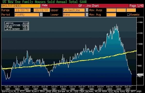
Just by eyeballing the graph, it looks like we are about half the way there. The remaining area can be made up by further declines in volume, or longer time at existing volumes, or some combination of both. The graph suggests that, at least in terms of VOLUME, the decline in new home sales might not have that much further to go.
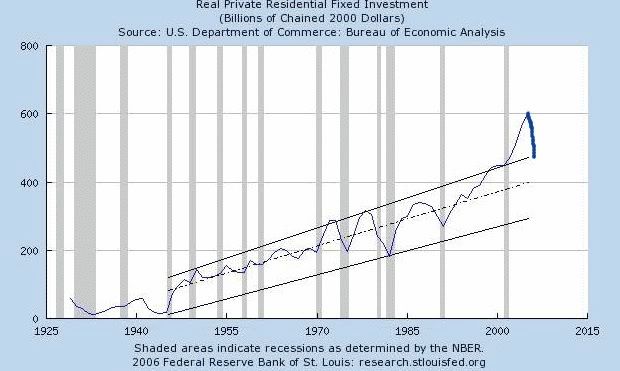
A second graph comes from Mark Thornton. This graph, with data only through the end of 2005, shows the long term trend of real investment in private structures. Each area above the dotted line showing the median trend, is balanced by an area below the line, until about 1995, exactly as shown in the first graph above. The trend line is completely blown by the bubble of earlier this decade. In this graph I have drawn in the most recent data, which only dates from 2007. Undoubtedly now at the end of 2008 the real investment in private structures has plummeted below the dotted median trend line. It does not have too much further to fall to its long term bottom trend line:
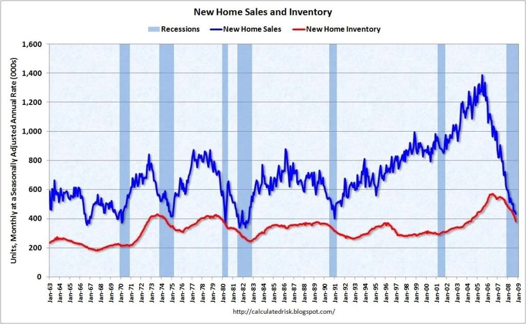
The third graph (courtesy of Calculated Risk), shows new home sales and months of inventory through October of this year. As CR himself notes, builders have cut back so drastically that inventory (the red line) has been in decline for over a year:
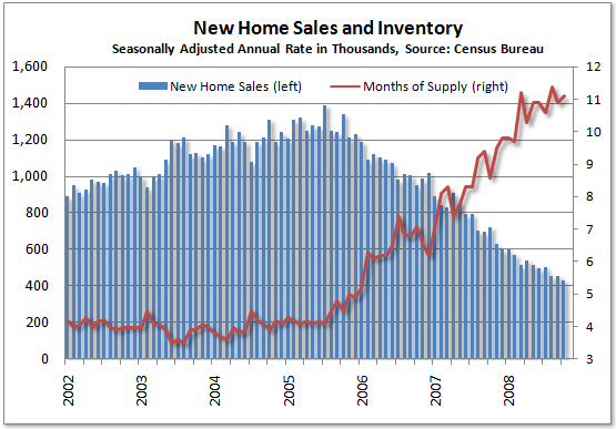
Another look at the same data by Tim Iacono that shows months of new home inventory indicates that months of supply may be on the verge of peaking:
Turning to the much larger market for existing homes, the most recent data (also courtsey of Calculated Risk) shows that for the first time since 2005, in both September and October 2008 sales exceeded 2007 sales:

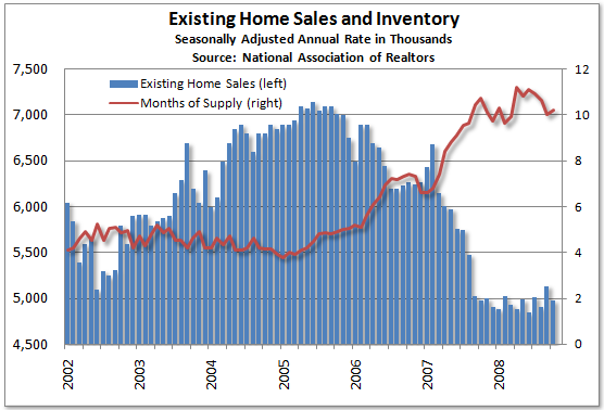
And Tim Iacono's graph of the same data shows that the number of existing homes sold per month is stabilizing, as is the months' supply of inventory:
Conclusion
Right now the economic data is grim. A shallow recession confined to housing and Wall Street earlier this year has metastisized into a Major Recession. The easiest prognostication device, Leading economic indicators, strongly indicate it will get worse.
Nevertheless, at some point, inevitably the housing bust will come to an end. If we are at the beginning of the transition from the guillotine phase to the sandpaper phase, with volume preceding price, which is what the above data suggests, then at least in terms of volume -- but not price -- the bottom may come as early as next year (even though prices themselves would still be "nowhere near bottom").
But,whenever that happens, an increase of the volume of construction from even a very depressed level means that additional jobs would be created, and more business would be transacted than at the bottom, even if prices are still declining. In other words, the basis for beginning of some sort of economic expansion. If this shows up in the next few months in real residential spending, that will suggest the free-falling economy of autumn 2008 is stabilizing. It isn't there yet. Still, while it may be a journey of 1000 miles, but progress towards the end of the housing bust has taken its first step.
Elections have consequences. The election of a laissez-faire, klepto-plutocrat free market fundamentalist Administration in 2000 and 2004 had real consequences. State actions to clamp down on predatory loans were pre-empted. A do-nothing SEC allowed Wall Street banks to lever up at levels of 30 or 40 to 1. Just for example. Changes in these policies can also have consequences, and those consequences can be for the better. Even a belief that things are going to get better can have real economic consequences.
So a new Administration in Washington populated by Economic Adults may unfreeze the logjam of money supply sitting in banks and not being lent out. Certainly there is a pressing need for massive infrastructure investments that can lead to renewed bank lending and economic expansion on Main Street.
Yes there is Hope for an Obama Economic Recovery in 2009.
