The country begs to differ:
Au contraire, mon frere - eet eez wee who surround vous!
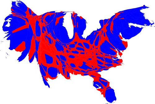
This map is called a cartogram. It attempts to show a reasonably faithful map of the United States where the size of each county represents the size of its population, not its actual geographic size. Or more simply, it's a map weighted by population. The blue, of course, represents counties where the majority voted for Obama in 2008, and the red represents counties where the majority voted for the other guy.
Go to this site for more information.
