I was going to do this as a comment in bonddad's diary, but it would get lost in the flurry. It turned out to be longer than a comment anyway.
What I am going to do is show how bonddad's charts do not support his overarching assertion that the economy is turning around. I'll take this chart-by-chart, point-by-point.
Bonddad says:
... let's look at history to see when we should start to expect a drop in the unemployment rate.
First of all, the frame of reference is wrong. If you want to look at history, the best examples would be the fall of the USSR or the fall of the Roman Empire. In each case, the economy had become FUBAR, the society corrupt to the core. That's where we are now. Bonddad instead compares our current situation with the period from... well, look at the chart:

1948-1960? Are you kidding me? That was the Golden Age of our country! We were on top of the world then. How is that period in any way similar to what we face now, which is a total unraveling of our financial system to the extent that the biggest buyer of our government debt is our government (eeriliy similar to the last throes of the old USSR)?
Second, a huge assumption is being made: That GDP has bottomed. That remains to be seen. To all appearances, it could continue to fall and could fall much further, especially if the dollar completely shits the bed -- and that's looking more and more likely.
Third, even if "the unemployment rate" (which is bullshit -- how many people do you, personally, know who are out of work right now?) falls in a year or so, by then we will have a deficit of eight million jobs. How many months will it take to replace those jobs? If the economy adds Clinton-era levels of jobs each month, it will take years from a year from now before we're even at the level of treading water.
Next chart that matters (bonddad offered a couple more showing how employment growth lags GDP bottoming)...
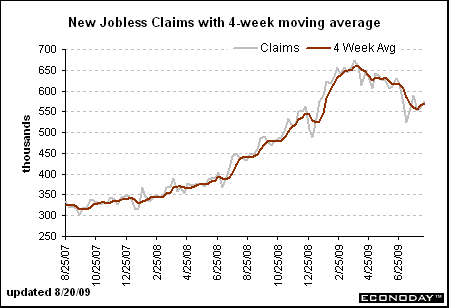
Bonddad's comment on this chart:
notice the overall trend is still down. The 4-week moving average has been dropping since roughly the end of March. In other words, the longer trend for initial unemployment claims is still positive.
Uh, no, bonddad, the overall trend is still very much up. Look at the chart again. We see a little dip in the past few months, but the level of initial claims is still well above where it was in 2007. If the initial claims continue to drop for another year or so, then we can talk about overall trends.
At any rate, this doesn't mean much: If everyone lost their job next week, the initial claims would drop to zero the week after. Good news, right!
Bonddad goes on to show some charts about mass layoff events being down recently. Well, businesses have cut to the bare bones over the last couple of years, so I don't know why you would expect them to keep doing mass layoffs. They need some people to do the work if they're not closing their doors. What I don't see is a chart showing mass hiring.
The next few charts show a slight decline in short-term unemployment. Right, well, I suppose we could expect that in light of this:
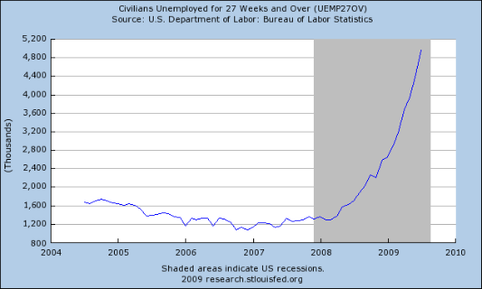
Fewer people are in short-term unemployment because an unprecedented number have been out of work for long periods of time.
Then New Deal Democrat chimes in with this golden nugget of poor reasoning:
Initial jobless claims peak first, then claims 5-14 weeks in length, then 15-27 weeks, and finally claims longer than 27 weeks -- which peak long after the recession is done.

Following that logic, assuming we're at the end of the recession (a very generous assumption), we can expect the unprecedented number of long-term claims to go even higher, since they won't peak until "long after" the recession is done. Great, I'm really looking forward to that. We're already in totally uncharted territory with long-term unemployment, and we can expect it to get worse -- oh, but history is such a good guide. This is just like the recessions of the Golden Age of America.
Bonddad finishes with some points so poorly thought out that I almost don't want to deal with them to avoid embarrassing him. He seems like a nice guy, but this can't stand:
Because the number of initial claimants is decreasing, we can expect a slow improvement in the number of people unemployed for various lengths of time.
The number of initial claimants has NO RELATIONSHIP to whether or not people will be hired, which is the only thing that will lead to "slow improvement in the number of people unemployed for various lengths of time."
The longer term unemployed are still increasing, but given the drops in the other metrics this number should start to show a decrease within the next 4-6 months.
Uh, no. If anything, we can expect the shorter term numbers to keep dropping and the longer term numbers to continue their meteoric rise. Someone who is unemployed for 27 weeks or longer fell out of the ranks of those unemployed 5 weeks for fewer at least 22 weeks ago. A drop in short-term unemployment combined with a rise in long-term unemployment logically means:
- Employers are not firing people at the same rate
- Employers are not hiring people/people are not finding jobs and are unemployed for longer periods of time.
Finally, in his mercifully short prescriptive finish, bonddad says something I can agree with:
1.) Make sure the longer-term unemployed are given benefits and other help to ease their suffering.
OK, no argument with that.
2.) Ask ourselves is there a way we can better implement the stimulus money to increase the rate of GDP growth and thereby see a faster drop in GDP?
I'm just going to give bonddad the benefit of the doubt and assume that was a typo.
