It's time to change the meme to the truth, and the truth is that America's current fiscal issues are from two sources: Lost Jobs and Tax Cuts.
Not only is Spending not the primary source of the deficit, cutting spending now could dangerously endanger the recovery according the Fed Chairman Ben Bernanke and the CBO.
NEW YORK (CNNMoney)—Lawmakers risk derailing the economic recovery if they act too soon to slash spending or raise taxes substantially. But if they wait too long to tackle the country's burgeoning debt, they risk damaging the economy for decades.
That's a key message from the Congressional Budget Office, which released its long-term federal budget outlook on Wednesday....
That is a message that needs to be hammered home as the President heads into negotiations with Congress over the Debt Ceiling.
But of course the Koch Brothers Funded Heritage Foundation disagrees and seems to be getting into a pissing contest with Talking Points Memo over it.
They're arguing of course that the primary problem is spending on entitlements - not revenue losses or defense with charts such as this.
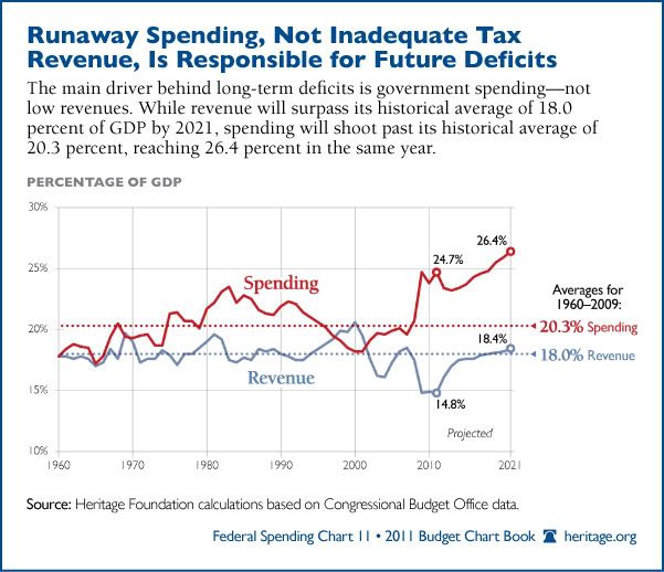
And this is where I will show that this chart is a Lie.
Heritage Posted their chart in response to this one from TPM and the CBO which shows the difference between Revenues and Spending between 2001 when we had a Surplus and Now.
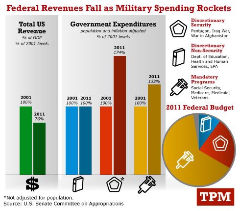
Heritage argues that the TPM chart is wrong (or at least misleading) because it doesn't show the wider trend of Defense and Entitlement Spending.
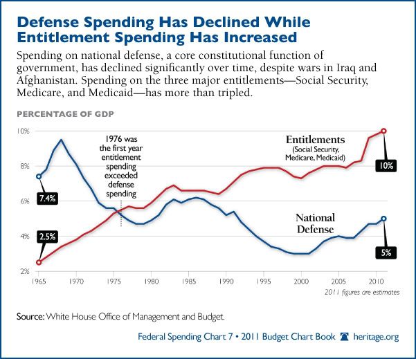
TPM’s chart compares security and non-security discretionary spending to entitlement spending and total revenues in 2001 and 2011, disregarding what happened in between. This shows defense spending rising over the last decade more than any other category. It should come as no surprise that military spending grew as the nation went from a time of peace to fighting the global war on terrorism. But the chart is misleading. Looking at the bigger picture, defense spending is currently below its historical average of 5.2 percent of GDP, despite wars in Iraq and Afghanistan. Meanwhile, entitlement spending has increased rapidly, from just 2.5 percent of GDP in 1965 to about 10 percent today.
So how true is this?
Well, going to a favorite Tea Party friendly budget site of mine - USGovernmentSPending.com which tends to use actual data we get this:
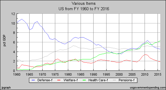
As a percent of GDP Defense spending is down compared to where it was during the 70's and 80's but in order to make Entitlements look worse Heritage had to Combine Them All Together. They're treating Social Security (Pensions), Healthcare (Medicare/Medicaid), and Welfare (Food Stamps, General Assistance, Unemployement) as all one thing. But the only reason most of those have risen recently is become of the economic downturn itself where the demand for those services have increased as more people have been unemployed and had need for government services as a result of the Great Recession of 2008. The chart also shows that as the Recovery Continues spending in all these areas will begin to naturally decrease over time, not because of cuts but because of reduced demand. If more people are working revenues will go up as taxes are collected and spending will go down. The only thing besides defense that always goes up no matter what is the cost of Health Care.
You can see that here as we show the same data in raw $Billions instead of as a percentage of GDP.
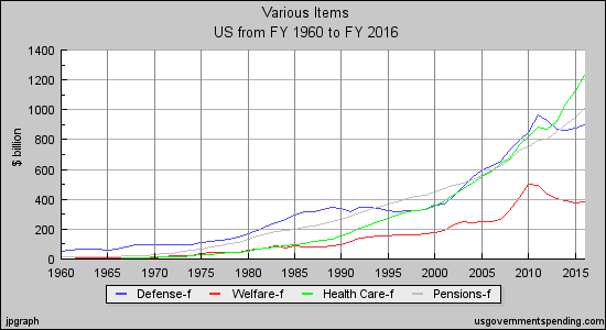
By using the GDP chart Heritage is trying to argue that Defense Spending has gone down since 2001 or in relation to where it was in 70's or 80's, but the fact is that since 2001 Defense Spending Has Doubled from $450 Billion to just under $1 Trillion per year.
Their argument is of course ment to show that we should cut deeply into entitelment spending just when people need those services the most.
But what about that original chart that shows the revenues never catching up to the spending going all the way out to 2021?
Well the simple and direct answer to that is this chart which comes directly from the CBO with no modifications - and shows that if Congress Doesn't Change a Thing the Budget will come into balance by 2016, and also what would happen if the Bush Tax Cuts are extended and the Affordable Care Act is Repealed.
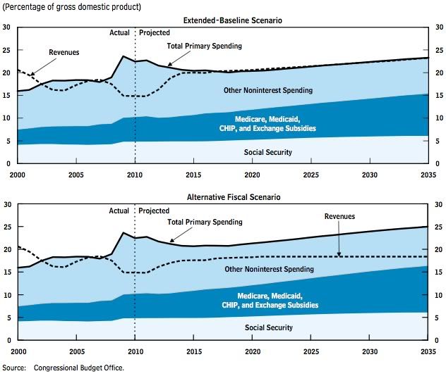
The Top of this Chart shows what will happen as result of current law - not withstanding the results of a debt ceiling deal. The bottom which matches Heritages First Chart almost exactly is under the Alternative Fiscal Scenario where the Bush Tax Cuts are made permanent, and the Savings CBO anticipates in Health Care Costs as a result of the Affordable Care Act are removed.
So basically Heritage is trying to prove TPM wrong - using the Scenario That they Endorse, not the current law. Yes, it's based on CBO data - but it's based on the Wrong CBO Data.
This is how CBO describes the Alternative Fiscal Scenario.
The budget outlook is much bleaker under the alternative fiscal scenario, which incorporates several changes to current law that are widely expected to occur or that would modify some provisions of law that might be difficult to sustain for a long period. Most important are the assumptions about revenues: that the tax cuts enacted since 2001 and extended most recently in 2010 will be extended; that the reach of the alternative minimum tax will be restrained to stay close to its historical extent; and that over the longer run, tax law will evolve further so that revenues remain near their historical average of 18 percent of GDP. This scenario also incorporates assumptions that Medicare's payment rates for physicians will remain at current levels (rather than declining by about a third, as under current law) and that some policies enacted in the March 2010 health care legislation to restrain growth in federal health care spending will not continue in effect after 2021.
As TPM explained when they originally posted that last graph.
In the top graph below, the dotted line represents projected revenue and the straight line projected spending (broken down by entitlement and discretionary spending, in blue) if the Bush tax cuts expire completely. Notice that, after the tax cuts expire, we get back to balance very quickly.
The bottom graph projects an alternative scenario in which most of the tax cuts are extended and a few smaller hypothetical policy changes are made. In that scenario, revenues don't ever match spending, so there would be major deficits far into the future.
In every revenue chart shown here - including Heritage's - you can clearly see the downturn in taxes in 2001 as a direct result of the Bush Tax Cuts, and another in 2008 as a result of lost jobs during the Great Recession. In order to rebalance the budget it's clear that we need to do two simple things.
a) Remove the Bush Tax Cuts and
b) Get People Back to Work.
Cutting spending on Unemployment, Social Security, Medicare and Medicaid will shrink demand and hurt businesses by drying up their potential customer base. That's not the direction we need to go. We do not need to pull money out of the economy just when it's needed the most.
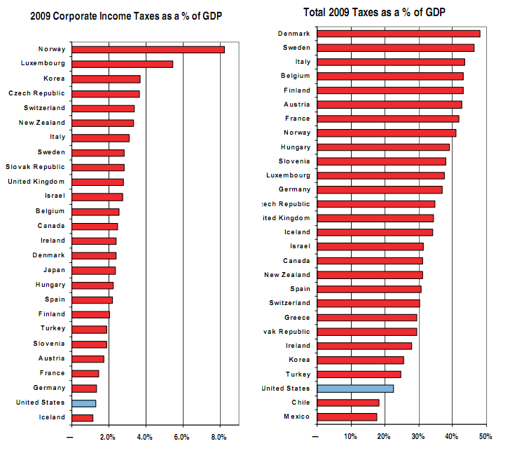
The argument that we can't afford to cut corporate tax loopholes falls flat on it's face when you recognize, as Thinkprogress has pointed out, that U.S. Corporate Taxes are currently the Second Lowest in the Developed World.
All we need to do - is hold the line as much as possible and let the Recovery and Affordable Care Act do their jobs. We may have to have some cuts and revenue increases to help pay for extending the Bush Cuts below $250,000, which is about $400 Billion - but that's it, that's enough.
Vyan

