Every time I hear this, it grates on me. So I thought I'd do a few graphs that show how those of us being called on to sacrifice have already done so ... actually for a long time. Funny how the cumulative sacrifices that have been made by at minimum half of the population are not viewed as such. Sometimes such sacrifices are seen as bad luck, laziness, God's punishment, and other things I'm just not thinking of right now. But I see them as sacrifices, just the same.
My view will hopefully be a little less provincial than the usual U.S. view in some instances. A more global viewpoint places things in what I consider to be a more proper context. Mr. Obama says rightly, "We're all in this together as a country." I say, "We're all in this together as human beings ... as a world." And if we don't hang together, we will, I believe, ultimately hang separately. And in the future, human history, if it indeed still is written or passed down orally, will look upon us less than kindly.
Follow me below the squiggle.
Income
Shared sacrifice by the bottom 90% in terms of giving up their share of national income:
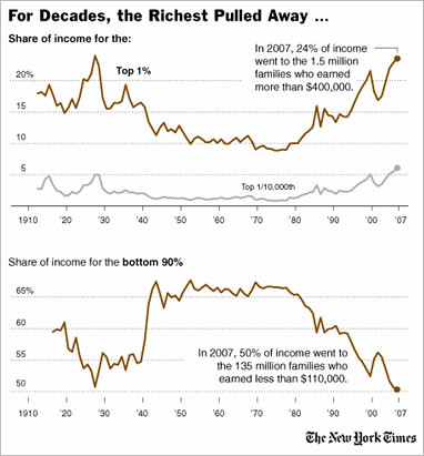
The bottom 90% have sacrificed, Mr. President.
Corporate (Non-)Sacrifice Since the Great Recession
This graphic shows how corporations have improved their bottom line since the recession ended for them in the 2nd quarter of 2009 to the 1st quarter of this year. It also shows no improvement, if not a slight degradation, of wages/salaries and employment.
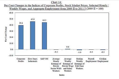
Where are the jobs?
Corporations are not sacrificing, Mr. President, and nor are they employing.
Government Employment
See the difference there between employment as it stands, and what it would be if state and local governments had enough money to employ the same number of people that they have before?
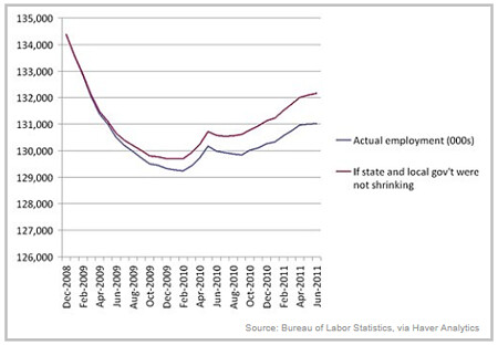
And this doesn't count the furloughs, wage freezes, and pay cuts that we've endured. State and local employees have sacrificed, Mr. President.
Hours Worked
So how has the middle class been able to hold their own since the 70s? By spouses working more hours. Hours worked outside the home have increased by almost a factor of 2 for women since 1950 to 2000. And here's a graph from the Bureau of Labor Statistics on married couples total hours worked in 1969, 1979, 1989, and 2000:
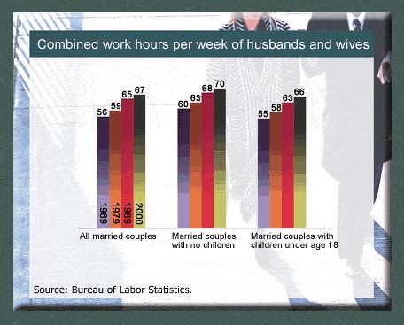
More time working outside the home, less time with the kids? Married people, especially those with children, have sacrificed, Mr. President.
Taxes
Here's a fun graphic showing income for the top 0.01% of households versus the 40-60% or the middle fifth or quintile, versus tax rates.
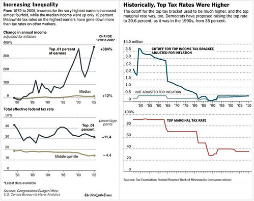
The middle fifth of income has gone up in real terms by 12% from 1979 to 2005. The top 0.01% has gone up 384% over the same period. They've done very well, and I understand they're doing even better now since their recession is over. Effective tax rates for that 0.01% have gone down 11.4%, while tax rates for the middle fifth of income has gone down only 4.4%. And let's not forget Reagan's Social Security tax deal ... which turned out to be the biggest middle class tax increase in U.S. history in real terms. And now you're proposing to take some of that money back to finance tax cuts like these to the top 0.01%. The middle class has sacrificed, Mr. President, what about the top 0.01%?
Funding for Federal Regulators and Corporate Taxes
Love Canal, Times Beach, and other Superfund sites are all waiting to be cleaned up after corporations have decided to cut corners to maximize profits and socialize costs by dumping their toxic waste unsafely. We count on government to regulate corporations to keep that and other "cost saving" measures that would harm the public from happening. Like those lead-paint coated toys made and then imported from China. Predatory lending, and now they want to starve the Consumer Financial Protection Bureau. Cutting regulatory budgets is a big favor to corporate interests.
And not only that, but corporations are paying a smaller portion of total Federal revenues than they have since at least 1950. By decade, it goes like this:
1950s: about 26%, maximum of 32% in 1952
1960s: about 18%
1970s: about 14%
1980s: about 9%
1990s: about 10%
2000s: about 13%, but 6.5% in 2009, the last year available in the data.
And it's not come up since. While this doesn't include their share of the Social Security and Medicare taxes, that has run from 24% of receipts to 35% now, pretty much at the latter value since 1984.
Corporations are amoral, and they can live forever. We've all sacrificed our safety for the corporations, Mr. President! What are they sacrificing?
Military-Industrial-Congressional Complex (M-I-C C)
Another fun graph ... on the Department of Defense budget from 2000 to now. What you'll find MOST striking is that the wars are only a part of the increase from 2000 to now. Note the blue ... that's increases excluding the wars in Afghanistan and Iraq. The increase is approaching the size of the 2000 DoD budget back in 2000. The total DoD budget doubled between 2000 and 2007, with much of that increase the result of those two wars.
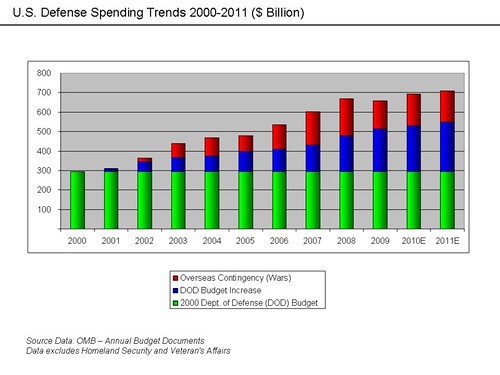
From this graphic, I can eyeball over $1,000,000,000,000 dollars (yeah, that's TRILLION) that has been spent on those wars. I can also eyeball at least as much going to regular DoD activities over and above what went to them in 2000. We've sacrificed close to $2,000,000,000,000, 4-5,000 American lives (and God knows how many others who will never be the same after coming home), and hundreds of thousands of Iraqi and Afghani lives. We've sacrificed plenty on this front, Mr. President. And for what?
I could go on ... there's plenty more to rail about.
But I'm not convinced they're listening. We need to make them hear us!
