A new climate study by a group at Berkeley concludes that there has been about a 1°C average global temperature rise since the 1950s. See, for instance, Climate study, funded in part by conservative group, confirms global warming
This is consistent with previous estimates of global warming. What's remarkable about this study is that it was conducted in part by "skeptics" of global warming, and that they have released all their data (gigabytes of it) for global peer review, so to speak.
The web page for the study is http://www.berkeleyearth.org/... and the data is available for download at http://www.berkeleyearth.org/.... Almost 40,000 different temperature measuring stations are in the dataset, some with records going back to the 1700s.
Just to allow some basic visualization of the data I parsed it into a Google Earth KMZ file: BEST Temperature Data (268 kB KMZ file). Opening that in the Google Earth application results in views like this:
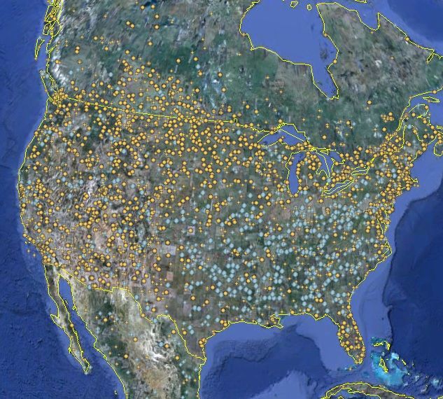
To keep the number of dots manageable, only the stations in operation for more than 50 years and have observed a best-fit temperature rise (or fall) of more than 0.5°C/century are plotted, yellow for a temperature rise and blue for a fall. The United States oddly has a large region where temperatures have fallen on the average over the last decades. That's unusual, as yellow placemarks (temperature rise) dominate globally.
Here's a station in New York City:
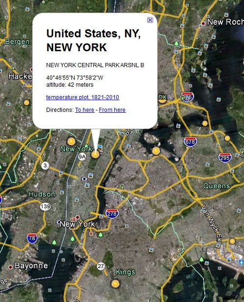
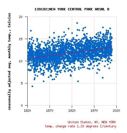
Clicking on the placemarks brings up an information balloon as above, with a link to see the temperature data over the time interval given, in this case, 1821-2010:
Another from Japan:
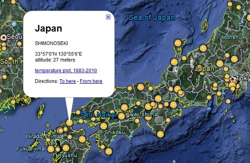
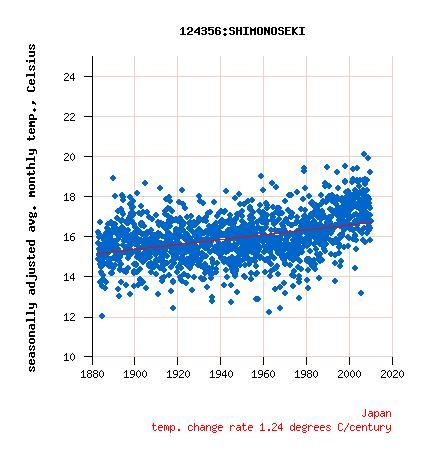
The vast majority of the stations in Japan show a temperature rise.
Greenland:
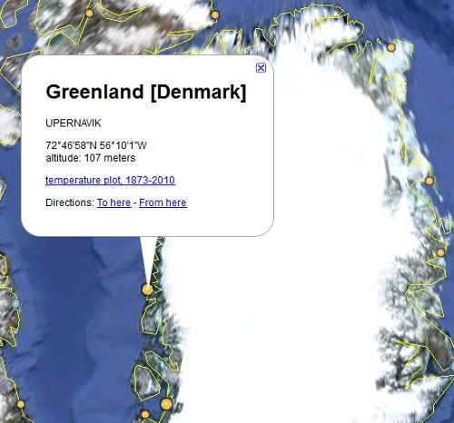
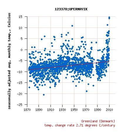
Upernavik, we have a problem!
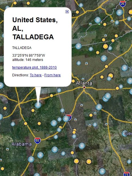
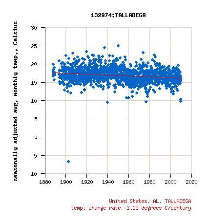
Finally here's an example of a station near Atlanta that recorded a temperature drop:
If you have Google Earth installed on your machine, download the kmz file above and give it (the earth) a whirl!
