The other day Ezra Klein tweeted this:
And if you followed that link, you would see charts that looked like this:
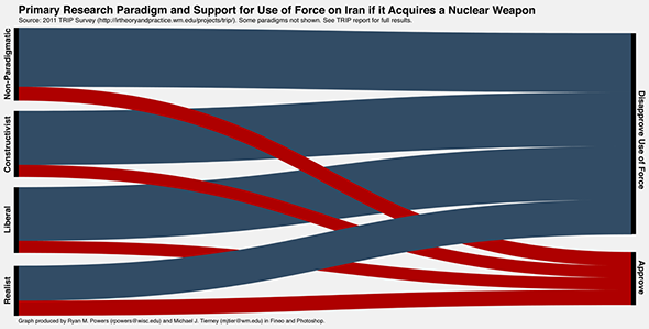
Cool chart from Monkeycage report
And I thought, "cool." It's a really appealing way to illustrate cross tabs data from polling. (I didn't read much about the report that is linked, just enough to know that it has something to do with opinions about whether to invade Iran or something.)
Then, because I'm a programmer and a nerd, I decided to write my own program to produce cool charts like that.
So I wrote this little MFC-based app:
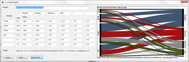
You can enter all your polling data into the form and it draws the graph in real-time, updating as you change values. It’s neat. You can also save and load the data you’ve entered, and it saves to a simple text file so you can edit the data by hand if you want. It also exports the generated chart to a PNG file for uploading to the intertubes. (Every instance of “you can” in the preceding sentences should read “I can.” You can’t for two reasons: you probably have no desire to. And I haven’t made an installer package for the app yet, but I will. Right now I'm deciding on making it open source or not)
Now there’s probably a simple Excel spreadsheet plugin or some nonsense that does this and has way more features and prettier colors than mine. I just thought it looked like a cool problem to solve, so I wrote it myself. For those wondering, the secret is a sine wave from negative pi/2 to pi/2, halved. That’s all I’m saying.
Here are some of the charts I generated. First of all, as each chart says, I got this data from this CNN Page.
Obviously CNN owns this data (or its pollster does) but I think I am within fair use guidelines in using it. I’ve modified the data slightly (combining their “Perry” and “Other or N/A” columns into a single column which I helpfully labeled “*”), changed the order of the columns to reflect the final vote totals, and I’ve added value to the data by presenting it in pretty chart form. If I’m wrong about this (and if SOPA passes) I guess this diary will be disappeared!
On to the charts. Here is voting by age:

Voters 18-29 make up only 9% of the South Carolina GOP Primary voters. That sounds really low, but is probably not too out of line with Primary elections in the past. This is the group that Ron Paul won with 31% of the vote. I think this is the biggest danger for the GOP. They aren’t attracting young people, and the young people they DO attract are interested in a guy who isn’t going to win the nomination.
Here are the charts for gender, income, ideology, and education.

Another bad chart for the GOP. Women usually make up well over 50% of voters, but in the SC GOP primary, they made up only 49%. And they don't like Newt all that much. I can't imagine why.


All pretty standard stuff, here, and not particularly different than what the overall breakdown is. However, here’s a chart for voting by opinion about the Tea Party.

The Tea Party chart is again bad for the GOP. Can we stop with the fiction that Ron Paul is the father of what we now call the Tea Party? People who showed support for the Tea Party made up 64% of those polled, and among these, Ron Paul came in 4th place, with 12% of the vote. 45% of Tea Party supporters polled voted for Newt Gingrich. This is where the energy is coming from in the GOP? No, the only energy you see is at Ron Paul rallies, because those attendants are young enough to be excited about something. But the Tea Party and Ron Paul supporters are not the same.
I know that Ron Paul thinks that the Tea Party movement is a plus for him, but the data don’t (w00t! correct plural usage of data!) show that. Obviously… some disagree.
I hope you enjoyed these charts (unless you are a Republican). I'll probably be uploading CrossTabsGrapher to a shareware site soon, with an installer, and after some thorough testing. Even when releasing free software, you have to make it safe!
Crossposted at somedisagree.com
