Ever notice how red the country looks even after a veritable drubbing like the one we inflicted on the right wing this year?
Well, there is a way to fix all that. (Now that America's wang has finally announced its election results.)
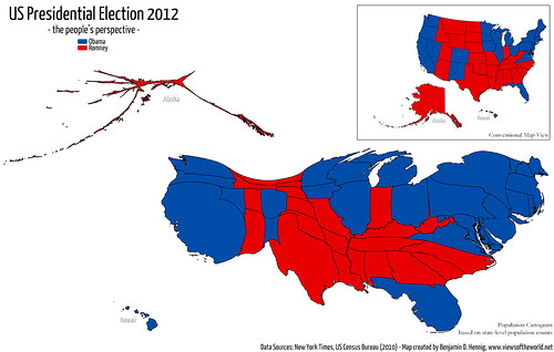
Instead of the normal maps that show 49 states proportionate in terms of geography,
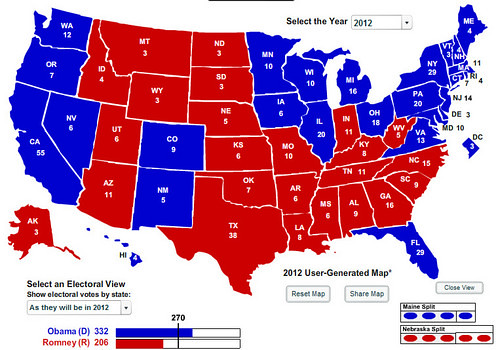
we can show those results using population as the metric instead.
Rocks, dirt and cattle do not vote.
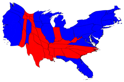
We can correct for this by making use of a cartogram, a map in which the sizes of states are rescaled according to their population. That is, states are drawn with size proportional not to their acreage but to the number of their inhabitants, states with more people appearing larger than states with fewer, regardless of their actual area on the ground. On such a map, for example, the state of Rhode Island, with its 1.1 million inhabitants, would appear about twice the size of Wyoming, which has half a million, even though Wyoming has 60 times the acreage of Rhode Island.
These maps are not only super cool to look at; they more accurately show that the country is not a "center right nation" as the Trad Med loves to claim, but a very left leaning nation. The blue and purple overwhelms the red in every such map you find.
More cool visuals below the divider doodle.
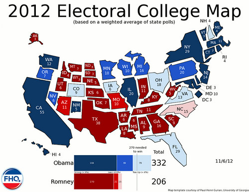
This one labels each state with its number of EVs:
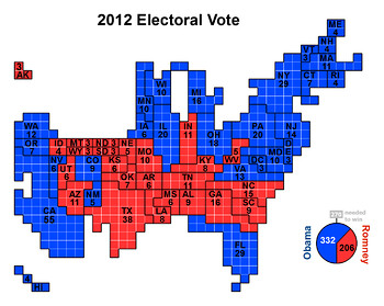
This one uses squares:
Here is one that shrinks Alaska from its actual size to the relevance it imposes on our elections. Are you listening & learning, Sarah?
And finally, one that shows election SPENDING by state. Did you know this was a $6 BILLION election?
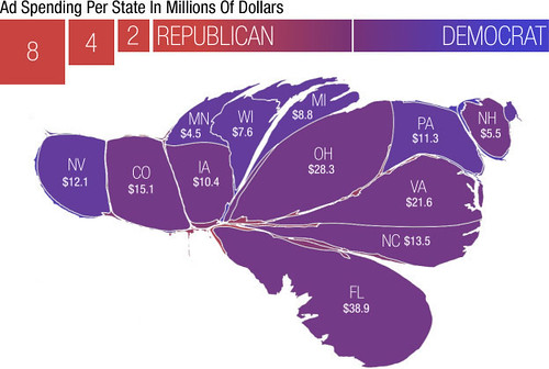
(I believe this is from 2008, but data from this year is similar to that election cycle.)
It may seem less than useful on some levels. But you may be amazed by the power of visuals to get people to begin to see things differently. Big Bird and the gang were a big topic during this election. Remember that Sesame Street song?
"That's about the size of it."
So when it comes to national politics, Rhode Island is 80 times larger than Wyoming as it appears on a normal map.
Pass it on.
Resources used:
http://frontloading.blogspot.com/
http://chartporn.org/
http://www.viewsoftheworld.net/
http://daggle.com/...
The best of these sites is this one:
http://www-personal.umich.edu/...
by Mark Newman, Department of Physics and Center for the Study of Complex Systems, University of Michigan
(Images used with permission)
Wed Nov 14, 2012 at 12:46 PM PT: Thank you to the rescue rangers. I do kinda miss the old "Diary Rescue" format so I knew who specifically to mention.
Nevertheless, we do appreciate your tireless efforts to bring obscure posts more eyeballs, anonymous or otherwise.
