One of the best things about vinyl LP's was the album art. It was tactile. Large format. Sometimes it was even textural. While you listened to the music, you could hold the album jacket in your hands...look at the artwork, read the liner notes, and sometimes find even more goodies within the packaging. The advent of CD's more or less put and end to that. Sure...there were still slick inserts inside of the small plastic cases, but it really wasn't the same. It was like comparing a postage stamp to a painting. And now, most music is consumed online. So, while some may disagree...I assert that the Digital Age has pretty much killed album cover art.
I was thinking about some of the album covers that captured my eye and my imagination, and continue to hold it, over the years. Sometimes the cover was actually better than the music on the vinyl disc inside the jacket. But it was part of the marketing, and part of the experience, of buying an LP. Today's technology of delivering music to the masses has made cover art largely superfluous and obsolete. That's the way technology works, I suppose. One new innovation creates something new, while simultaneously sealing the coffin upon something old. Something is gained, and something is lost.
Rolling Stone has a list for everything, so it's no surprise that they have compiled a list of what they deem to be the "100 best album covers." It was compiled in 1991...but let's face it....there haven't been any vinyl records to speak of since sometime in the mid-eigthies. So their list is probably good. Even before I checked it out, I had made a short list of my favorite album covers....they were all on the list. (Well, almost all of them)
Below the fold, in no particular order, are 6 of my favorite album covers, with some background on how they were chosen/developed. There are many other great ones that didn't make the cut, but you have to choose, and my choices are based mostly upon the flair of the design and the background story that you might not be familiar with.
Weasels Ripped My Flesh, Frank Zappa
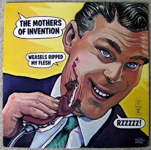
This has always, always been among my favorite album covers, even though I found the music largely hard to approach or embrace. It's just such a subversive image of American Consumer Culture. Frank Zappa was presented with a vintage copy of the men's magazine "Man's Life", dating from the Fifties, by a fan who had access to him. The cover illustration of the magazine depicted a man waiste deep in water, fending off an attack of ravenous weasels, with the subtitle "Weasels ripped my flesh."
He was in the process of releasing a new album of Mothers of Invention music recorded live, and instantly decided he wanted this to be the album's title. HE also knew just who he wanted to do the cover art: A guy by the name of Neon Park. a graphic artist who was part of the Berkeley, California, scene. He approached Neon, showed him the magazine cover, and asked "can you make this worse?" Neon took the magazine, and the job offer, and went to work.
Somewhere in the magazine was a vintage print ad for Schick electric razors, which caught his eye. And thus, an album cover was borne. I don't want to load up this diary with too many pics, so I will simply provide this link to a site that shows both the magazine cover and the Schick advertisement that inspired Neon Park's album cover art. You need to check it out to really appreciate the genius of this album cover:
http://www.google.com/...
By the way...among the musicians on Zappa's "Weasels Ripped My Flesh" album were guitarist Lowell George and bassist Roy Estrada. They soon left the Mothers to form their own band, Little Feat. Aside from their debut album, they commissioned Neon Park to do the cover art for most of their subsequent albums, including Sailing Shoes, Last Record Album, Waiting for Columbus, and several others.
Neon Park was later diagnosed with ALS...Lou Gehrig's Disease, and eventually was unable to draw. He resorted to poetry, which towards the end of his life he pounded out one key at a time, with one finger, on a manual typewriter. He passed away in 1993.
When I look at his cover art for Weasels Ripped My Flesh and the original Schick advertisement, I am surprised the company didn't go after him legally for subverting so effectively one of their advertising images. I'm sure they considered it.
London Calling, The Clash

This is one of my top five album covers...not because of it's originality or visual busyness...but because of how effectively it captures the music inside the sleeve, and how the artwork broadcasts to the record buyer: "This is not going to be easy listening rock." It wasn't so much imagery as it was a visual clue that what you were in for store was something you had better brace yourself for. It was angry, it was energetic, it was spontaneous...and it is a foto right up there with the one of an irritated Johnny Cash who flips the bird to a photographer during one of his rehearsal sessions leading up to his Folsom Prison Blues Live Album. It is iconic. It is Rock and Roll.
And it made the album cover over the objections of the photographer, Pennie Smith, who thought it was too out of focus and technically deficient to be used for an album cover. The band, wisely, overruled her. Technical proficiency wasn't what their music was about...energy, emotion, spirit, spontaneity was. The picture was perfect.
It was taken at a 1979 concert at NYC at the Palladium Theater, which had fixed/assigned seating. The Clash was performing an energetic set, yet the crowd seemed not to be responding. They weren't up out of their seats. They weren't moving. They seemed passive. An irritated Paul Simonon, the band's bassist, had finally had enough...What does it take to get these people moving and involved?
He proceeded to slam and smash his bass onto the stage out of anger and frustration.
Pennie Smith captured it on film, though slightly out of focus.
London Calling, IMHO, is one of the finest rock albums ever made, and the cover is simply perfect. What I didn't know, and I am a Boomer, is that the album cover art was a direct and undisguised homage to another pioneer of Rock 'n Roll...Elvis Presley. Everything from the B&W photo of a rebellious musician, to the typography on the cover art, down to the colors used, was a direct tip of the hat to Presley's debut album with RCA:
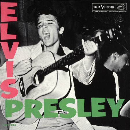
I have to believe that The Clash deliberately chose to leapfrog a generation of rock musicians who had preceded them, and lost their way into various genres of music that had lost its soul even as the musicianship had become so much better. They weren't going to offer up the mellow sounds of the Eagles, or the studio expertise of Steely Dan, or the lumbering, overwrought pretentiousness of Yes...they were going to tear the place up. Just like Elvis did when he first hit the scene.
Abraxis, Santana
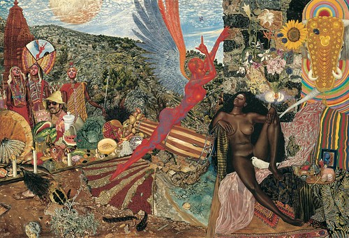
When this album came out in 1970 I was 14 years old. I still remember my Mother's somewhat scolding, disapproving verdict upon the album cover. She didn't think it was appropriate for a boy of my tender age to gaze at...and gaze at it I did. I found it wildly, surrealistically erotic. What I didn't know until, again, I researched this diary, is that the album cover was based upon an original piece of art that was religious in nature.
The image I have posted here is of the actual painting, by the artist Mati Klarwein. Its title is "Annunciation." There are several layers of irony here, not the least of which is that Klarwein is Jewish, born in Germany, and depicting a New Testament mythology in an African, nativist style. The painting was done in 1961, but Carlos Santana discovered it in a magazine many years later, and knew instantly he wanted to use it for his forthcoming sophomore album, Abraxis. He contacted Mati, and the deal was done. The version of artwork that appears on the Santana album crops out about a third of the original painting, in order to accommodate the square format of an album cover.
The artwork is stunning, and it depicts a bible story that I was unfamiliar with: The Angel Gabriel, depicted in the artwork astride the conga drums, visiting Mary, depicted as the Black nude, to inform her that she will soon be giving birth to a child who will be the Son of God.
It is a Catholic myth, rendered visually by a Jew, in the style of nativist surrealism. Mati, in a book he authored, recounts that he has travelled the globe and found copies of either the Santana album cover or reproductions of his painting displayed in places as far ranging as a Shaman's hut in the African nation of Niger to a ganja dealer's truck in Kingston, Jamaica. It's a stunning piece of art, and a great album cover.
White Album, The Beatles
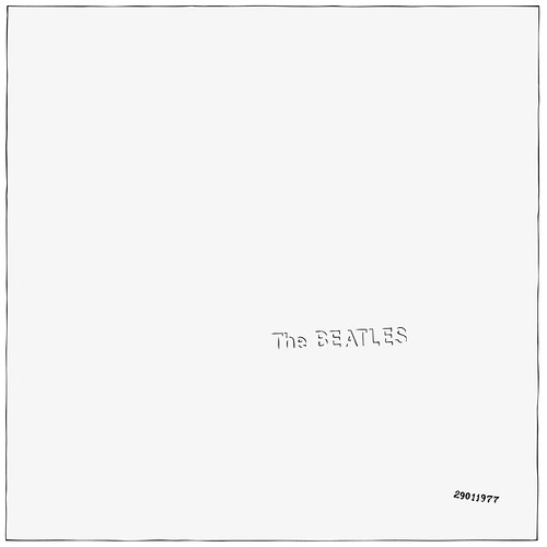
The most minimalist album cover ever created, perhaps, is also one of the most expensive, as it turns out. How could a blank, white album cover turn out to be so costly? And why the white?
We''ll take he second question first. The album's designer, British Pop artist Richard Hamilton, wanted to create a deliberately minimalist cover in response to the elaborately ornate and detailed album which preceded it...Sgt Peppers Lonely Hearts Club Band. He only partially succeeded in carrying out his vision, however.
While the original release of the White Album certainly appeared to be just that...plain white...it took a lot of work to produce it. The "slicks"...the glossy layer which is affixed to the thicker jackets, were printed at one shop, along with the info on the spine and the track listings in the gatefold (inside cover). Then they shipped to another company for the embossing of "The Beatles" on the front, along with the serial number. A third company then received the slicks and affixed them to the thicker jackets. Finally, the finished album jackets were sent to a plant in Scranton, PA, where the vinyl discs were pressed. Oh...and then there were the 8 X 10 color portraits of each Beatle and the larger photo collage poster that was included inside.
Just try doing that with a CD. It was not only expensive to do...it was a testament to the group's commercial and artistic standing that EMI was willing to even entertain the proposition.
They stopped printing serial numbers on the White Album in 1970, after about 3 million copies had been distributed. If you have a copy, look at your serial number. If it's in 3 digits you are sitting on a gold mine. They stopped embossing The Beatles in relief and replaced it with simple grey lettering in 1975.
Sticky Fingers, Rolling Stones
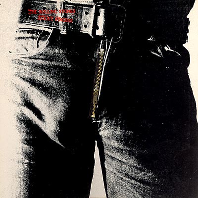
Is there a more famous crotch shot ever photographed in the annals of rock and roll? I doubt it. And for the record, that's not Mick Jagger's bulging package on the cover. Neither is it a young Carlos Danger's. The bulge belongs, according to some, to a behind the scenes "cohort" of photographer/artist Andy Warhol, who designed and conceived this album cover. It's unclear what his duties were, but he is described in various accounts of this album cover as either a "hanger on", "associate", or merely cohort of Warhols, by the name of Joe Dallesandro. Nobody really knows whose crotch it is, and who really cares? It's a classic album cover.
Except for one small thing. Well...maybe a big thing. The creative minds who conceived the idea of a working zipper on the cover of an LP obviously had no idea whatsoever regarding the practicality of packaging, crating, warehousing, loading onto trucks and distribution of millions of copies of this album. That nifty zipper? It marred the records it was stacked up against in the distribution process, regularly creating a bad skip on the track "Sister Morphine." Once the widespread problem was fed back up the food chain of the record distributor, they instructed the packagers to unzip the fly, which resulted in a dent in the label portion of the LP. Still, the design flaw created so many returns that the distributor threatened to sue Warhol for his design shortsightedness.
But there has never been another album where you could unzip a photo of a guys pants, and find white underpants behind the zipper stamped with Andy Warhol's name?
Candy-O, The Cars
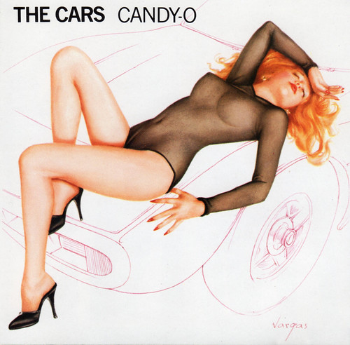
What can one say? Nobody, but nobody, could draw women like Peruvian pin-up artist Alberto Vargas. He became famous creating pin-up art for Esquire magazine after WWII, and later for Playboy magazine. His artistic renderings of the female nude were, if possible, more tantalizing than any mere photograph. But Vargas retired from doing his artwork in 1974, after the death of his wife. In 1979 The Cars were working on their 2nd album, Candy-O, and drummer David Robinson was a big fan and collector of Vargas' art. He suggested contacting the artist and asking him to design the cover. Their record label had no problem with the idea, since Rick Ocasek's face on the cover sure wasn't going to sell more copies.
Vargas wasn't interested in the job, however. He was 83 years old at the time and happily retired. It took the intervention of one of his nieces, who was a Cars fan, to persuade him to reconsider the project.
He told the band that in order to create a work that was worthy of his best post war pin-ups, he would need a photo to work with. The band scheduled a photo shoot with model Nancy Beth at a Ferrari dealership in Los Angeles. She posed on the hood of a 1972 365 GTC/4, though in the album cover art the car is only drawn in lines. Only the hood ornament is fleshed out.
When Vargas was finished with his artwork, the original model had some second thoughts about gracing the cover of an album that might sell a million copies. A second model was brought in, who coincidentally was named Candy Moore, and Vargas was able to use her face instead of the original models. Still...the artwork was all done by hand, with no airbrushing. The only feedback that the recod label gave to Vargas before greenlighting the printing was to "soften" the nipples a bit and make them a bit less...there. He obliged.
Alberto Vargas died 3 years later in 1982.
