As pollwatcher so adeptly showed us, in a recent post:
#######################################################
On the left is what a normal polar vortex should look like. On the right is what the polar vortex looked like this year. Take a look at how the jet stream is all over and dipping deep into the U.S.
#######################################################
This collapse of the polar vortex created some extreme temperature differences known as a dipole.
NASA Study; Cal. Drought, Polar Vortex, El Nino, Linked To Global Warming.
by pollwatcher -- Apr 18, 2014
Today, I hope to build on this example, and provide some maps and some entry-level science, that may help us better understand "the terrain" of our upper atmosphere. And so better interpret the events, such as the Polar Vortex, when it strays from "normal" -- as when it adopts more than one pole.
It may be hard to fathom, but our atmosphere has "a terrain" -- much like the mountains, hills, plains, and valleys of our geographical terrain. The thing is, this "atmospheric terrain" is in constant motion, somewhat like the waves of the sea. The atmosphere is a fluid afterall. And it is very pliable to the laws of physics. And once again like water, the atmosphere is constantly 'trying to seek its own level' (find "equilibrium") -- in reaction to a world of external forces (such as melting ice sheets, etc.) that are working to constantly re-fuel it.
Imagine you were hiking cross-country in the western U.S. and you suddenly ran into to this obstacle. Would the 'path of least resistance' direct your course, the long-way around it, or would you take the obstacle head-on, in hopes of seeing the view from the top?
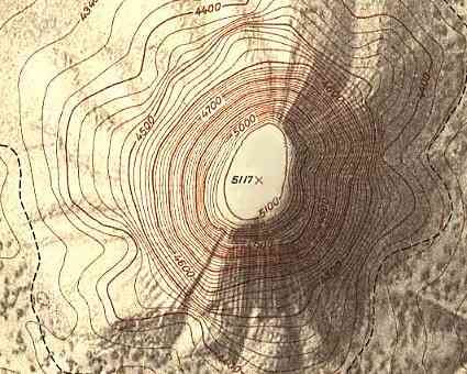 Devils tower, WY
Contour Map Quiz -- compassdude.com
Well, such 'towering' obstacles (of stability) are what used to 'anchor' the center of the polar vortex, in more or less, a semi-permanent polar place. In recent years, multiples of these 'towering' obstacles have formed -- in di-pole, and tri-pole, and even in quad-pole topographical formations. This unusual dispersing of the once 'immovable object' -- have resulted in, all those arctic polar winds choosing to "hike around them," to take some rather serious southerly detours -- from their 'normal' more-northerly arctic tracks:
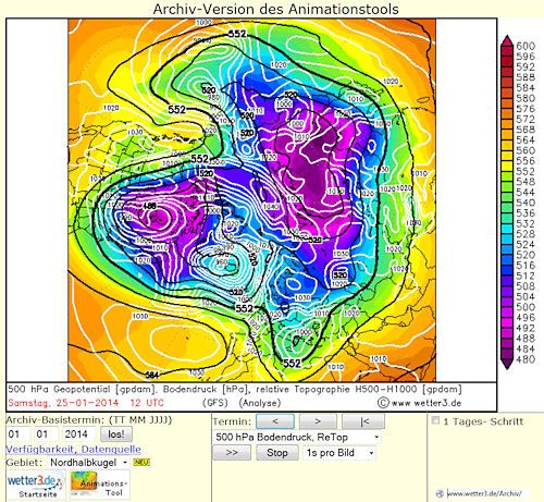
Polar Vortex -- Jan 25, 2014 -- larger
Notice the 2 very well-defined centers of purple arctic air -- located quite far from the actual spinning-pole of the world. Those di-poles have even lower pressure ratings, than even the north-pole itself.
Something odd is kicking them out of the normal position of 'least resistance' ... from the once-peak heat-vacuum, found at the top of the world.
If you have any interest in geography, or hiking, or even taking road-trips -- you are probably familiar with the visual display known as a Contour Map. The lines on the map show "locations of equal height" (ie. the contours). If you could walk along one of those "equal" contour lines, you would neither go up, nor go down in altitude -- but rather maintain a level path of even walking effort (or constant height with respect to sea level):
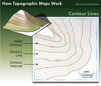
Topographic Map Contour Lines -- howstuffworks.com
Well understanding "the terrain" of our upper Atmosphere, often requires the use of similar 'contour-type' data visualization tools. In the Atmosphere though, instead of mapping lines of "equal height," scientists are usually more interested in the contours that map "equal pressure." In the physics of moving air, pressure (and its equalization) is the key variable that is driving most of it. Take "winds" for example; the phenomena of wind [at ground level] is quite simply the movement of air from areas of "high pressure" to areas of "low pressure" -- the fluid (under pressure) seeking its level.
OK, so what is "pressure"? Well if you were suddenly transported to the bottom of the sea, the "pressure" (ie. the weight) of all that water above would be very apparent. Well, guess what -- we are at the bottom of a sea -- at the bottom of an ocean of air, that presses down on us constantly, from miles above. This phenomena is usually represented by a "column of air" -- so that the complex math can be easily calculated, as illustrated next:
Constant Pressure Surfaces -- University of Illinois
a surface of equal pressure, also called an isobaric surface
A constant pressure (or isobaric) surface is a surface in the atmosphere where the pressure is equal everywhere along that surface. For example, the 100 millibar (mb) surface is the surface in the atmosphere where the pressure at every point along that surface is 100 mb. Since pressure decreases with height, the altitude of the 100 mb surface is higher than the 500 mb surface, which is likewise higher than 1000 mb. Meteorologists use pressure as a vertical coordinate to simplify thermodynamic computations which are performed on a routine basis.

Measurements of the upper atmosphere (temperature, pressure, winds, etc.) are taken by instruments on weather balloons as they rise upward from the earth. When referring to the 500 mb surface, we mean a location in the atmosphere where the pressure has been measured to be 500 mb.
Pressure Approximate Height Approximate Temperature
500 mb 5000 m, 18000 ft -20 C, -4 F
What is millibar (unit)
Millibar (mbar) [or mb] is a metric measurement unit of pressure.
The non-metric unit of air pressure is called "
an Atmosphere" (which is
14.7 pounds per square inch, at sea level).
Convert millibar to atmosphere [standard]
How many mb in 1 atm? The answer is 1013.2501.
Ugh, thanks jamess for the Chem-exam flashbacks! What is the point of all this millibar trivia?
Well, the contour maps that best show the structures of the upper atmosphere -- the peaks and the valleys, the towering obstacles and the wide-open expressways -- those atmospheric maps are usually recorded in millibars. Using contour lines of "equal 500 mb pressure" -- to be exact. This baseline is approximately half-way up, our theoretical columns of air. These 500 millibar pressure points (as recorded by heights) will vary from region to region, week to week, or more climatically-related: from Ridge to Trough.
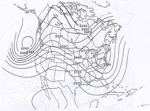
Introduction to 500 mb maps -- atmo.arizona.edu -- sample 500 mb height map.
Notice in that above map, how the equal-bars lines (isobars), are where the height of local Atmosphere finds its "500 mb pressure point" -- notice how it does NOT always occur at the "rough average" of 5000 meters above sea level (for 500 mb). Those bulges and wallows are "the terrain" of the upper atmosphere; they are the waves of its pressure-equalizing sea. Those structures drive the planet's local weather ... and ultimately, when statistically averaged over time, its climate patterns too.
Weather Informer -- brianmejia.wordpress.com
Trough vs. Ridge
The primary characteristic of a trough is that a trough is a region of lower heights. Height is a function of the average temperature of air below that height surface. For example, if you are looking at 500 mb heights (on a 500 mb map), then you are looking at 500 mb heights based on the average temperature from the surface to 500 mb. You may or may not know that air density changes with temperature. As the air temperature cools, it becomes heavier, compacted, and more dense, and thus takes up less volume. Therefore, as air cools, it becomes more dense and the height lowers. This would be classified as a trough. A ridge is the opposite of a trough. As air sinks from above, it warms. Warm air expands and is less dense than cool air, thus, heights are raised. Ridges tend to bring warmer, drier weather. Troughs and ridges are usually associated and more visible in the middle and upper levels of the atmosphere. Below are examples of both ridges and troughs, description in caption:
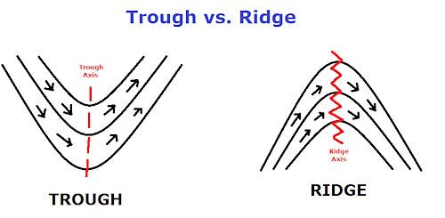
Trough (left) and Ridge (right). These are what you would typically see on an upper-level weather map (850-250mb). Solid black lines are isoheights (lines of constant height). Black arrows indicated general wind flow around a trough and ridge.
Shortwave Trough, a.k.a Shortwave: Embedded waves within the longwave trough/ridge pattern. Shortwave troughs tend to be associated with a upper-level front or a cold pool aloft. They also tend to move twice as fast as the longer-wave pattern. In Laymen’s terms, shortwave troughs are associated with bad weather at the surface. Below is an example at 500 mb of a shortwave embedded in a long wave from a 12Z map December 12, 2006.
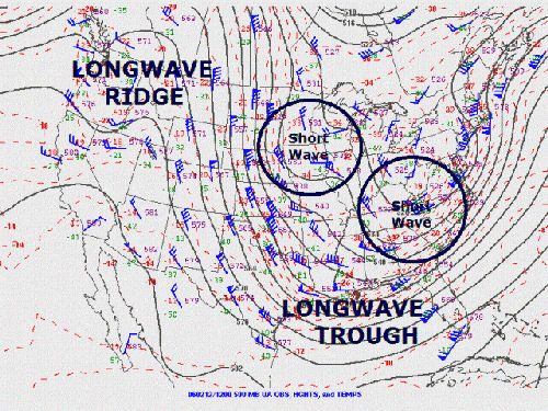
12Z 500mb map from 060212. Two shortwave troughs are circled, embedded in a longwave system. larger image
Those "
cold pools aloft" are what Polar air masses act like, when they stray too far south -- they end up as intense "troughs" of "bad weather" that the surrounding temperate air, generally ends up steering around (or riding-over, as freezing rain). Until the polar trough subsides, according to its own "condensing air," mosey-along recede northward schedule. (This behavior is evident in the animations, to be explored soon.)
This next site does a great job explaining some of the technical details of Troughs and Ridges, but in the interest of "brevity" I'll leave that to you to pursue, as your interest leads. But I do like their idealized global image of these Troughs and Ridges, though:
Module 9 -- Westerlies and the Jet Stream
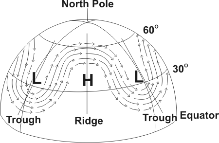
Eldon J. Oja, Project Leader Project Atmosphere Canada -- On behalf of Environment Canada and the Canadian Meteorological and Oceanographic Society
I personally
think (and there is some
recent research taking place along these lines, that seems to
confirm this) that
the increasing occurrence of open waters (ie melting ice sheets) in the arctic ocean is
changing/disrupting the "normal" cooling, and seasonal "condensing" of the Polar air mass in the arctic.
The frozen areas adjacent to the open waters, are relatively cooler, and so "getting the jump on" the tower-building process [or really,
canyon-carving in pressure terms], that naturally results from the winter's long-night, deep freeze. Thus the most intense cold, condensed air is no longer occurring strictly at the northern most point.
Multiple polar spikes are developing, as di-poles and tri-poles, and
as the last three northern winters have demonstrated, in their historical 500 mb maps.
And it is these more-widely dispersed "polar obstacles" (mountains deep canyons of low pressure) that are steering the surrounding Arctic winds (and weather) to places, it would not normally go.
After many hour of searching this is the best map site I have found to date, that shows these upper Atmosphere structures, using height contour lines and color coding, to easily visualize the wave-like motion of the 500 mb troughs and ridges -- as they change over time:
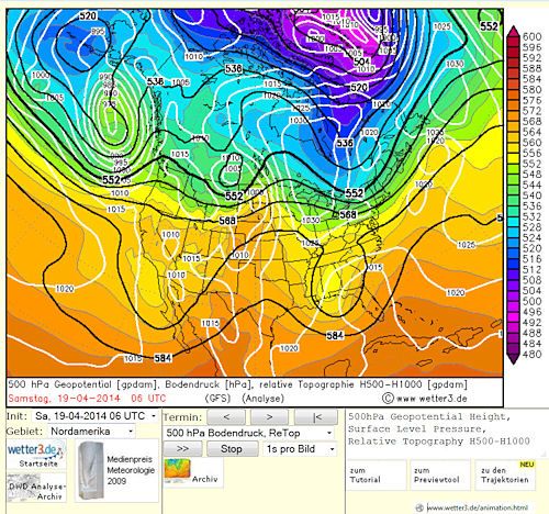
North American 500 mb -- Apr 19, 2014 (today) -- larger
Compare with this next one, and notice the "building trough" predicted for the eastern U.S.:
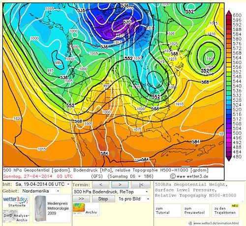
North American 500 mb -- Apr 27, 2014 (in a week) -- larger
Unfortunately, this site is in German, but that is not a big deal since they easily let you toggle the map to view any continent, and even the north or south poles, too. (If any one knows of similar dynamic 500 mb maps, in English, please post the links in the comments.)
To appreciate the wave-like structures of our upper atmosphere, you really need to experience it for yourself. Just click this link, and BE SURE to follow the simple instructions given next:

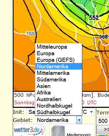
1. In the picklist on the left, choose: Nordamerika (North America)
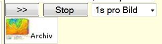
2. In the center panel, click the button with the double arrows to start the animation. (Click the Stop button, to stop the animation.)
The blues and the purples indicate the deepest upper atmosphere, Low-pressure Troughs, and generally the coldest air too.
In this post's intro, I displayed the di-pole structures of the Arctic Vortex (using this site), that occurred earlier this year on: Jan 25, 2014 -- larger image link.
To dynamically view similar Atmospheric Polar Vortex events from the past, using this unique intuitive display -- is pretty simple, but it takes a few more prep-steps, to dial-in the way back machine. And first you have to go their related Archive site:

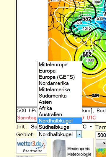
1. In the picklist on the left, choose: Nordhalbkugel (Northern Hemisphere) [ie. Polar View.]
2. Set the Date from which you want to start the animation from, in the boxes on the left. Note: the date format is DD - MM - YYYY (date first, then month, then year).
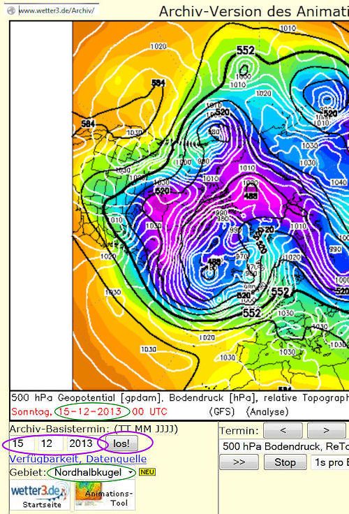
AND you must click the Button labeled "los!" to reset the first map to that date entered.
I found setting the first Date to 15 - 12 - 2013 (Dec 15th) made for a good recap of last winter's "Arctic wanderings."
3. In the center panel, click the button with the double arrows to start the animation. (Click the Stop button, to stop the animation.)
4. Since this animation (from Archives) will just keep going and going, you may want to speed it up some:
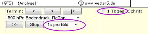
The default "display speed" is 1 second per picture (1s pro Bild). But you can speed up or slow down that display rate, to suit your patience.
The default "frequency" between sequential maps is 4 maps per day (every 6 hours). But you can change that to 1 map per day, by clicking the check box labeled: 1 Tages schritt. [Tag = day; schritt = step]
And that's it! Sit back and enjoy your very dynamic planet in action.
The next time someone blames the Polar Vortex for our economy stunting weather, you can with just a few clicks, show them what that Vortex really means. (That the North Pole is just not as "uni-polar" as it once used to be! )
Some boring techie footnotes:
Since the above maps are labeled with "Geopotential" (which appear to what the colors represent) -- I've looked up what that techie-term means from another university site:
Geopotential Height -- nc-climate.ncsu.edu
Geopotential height approximates the actual height of a pressure surface above mean sea-level. Therefore, a geopotential height observation represents the height of the pressure surface on which the observation was taken.
Since cold air is more dense than warm air, it causes pressure surfaces to be lower in colder air masses, while less dense, warmer air allows the pressure surfaces to be higher. Thus, heights are lower in cold air masses, and higher in warm air masses.
A line drawn on a weather map connecting points of equal height (in meters) is called a height contour. That means, at every point along a given contour, the values of geopotential height are the same. An image depicting the geopotential height field is given below.
Source: ww2010.atmos.uiuc.edu
The
white isobars in the animated maps are showing ground-surface pressures. [
Bodendruck {m} = ground pressure].
The black isobars in the animated maps, I think, are showing 500 mb pressure heights (in Decametre [10-m increments]).
The color-coded regions in the animated maps, I think, are showing "geopotential height" just described, which seem to take into account, the relative effects of cooling and warming air-masses to ''approximate the actual pressure surface" (vs. the balloon recorded one ?). (These color gradations appear also to be in Decametres scales too [10-m increments].)
If any one in our esteemed community, has a more definitive answer on why the color-coded regions, don't exactly match the black isobars (500 mb) -- and what "geopotential height" may have to do with this -- please let us "inquiring minds" know ... what's up with that. Thanks!


