Good morning, readers and book lovers, welcome to another open forum, because—get ready for this—no one has contributed a diary about a life-changing book! Shame, really, but we’ll bravely carry on. This morning we’ll talk about cover art, a fascinating subject.
But first, let’s see what’s for breakfast. Today we have sunflower seed bread, fresh out of the oven.
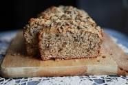
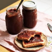
How wonderful it smells! Now, spread a slice of the yum-a-licious bread with apple butter (just apples and water, no sugar) and enjoy.
There’s strong tea to go with it as well as regular coffee and hot apple cider. I’ve included the cider because this is a rainy Friday the thirteenth, and hot cider is nice on a day of fog and gloom.
When you’ve swallowed the last crumb, bring your coffee mugs into the salon and we’ll begin.
The importance of art has been sand-blasted into my brain for umpteen years. In my late, unlamented career as a proposal slave, I heard the words “A picture is worth a thousand words” so many times it made me want to gag those who uttered them. “No,” I used to think rebelliously, “a thousand words is better than a picture. A really good writer can use words to make you visualize an object or a person more powerfully than a picture ever could.”
But the managers and techies, all of whom possessed more clout than I, ploughed on, even insisting on graphics in the Executive Summary. “Why not just make the proposal a comic book with the text in little balloons?” I used to think crossly.
As you can tell, I’m word-oriented, not picture-oriented. When I used to buy magazines (another lifetime ago), I didn’t even see the cover art depicting some vapid, heavily made up model or actress wearing an improbable hat. All I saw was the titles of the magazine articles inside and it was those that made me fork over my hard-earned dinars.
When I buy books, generally it’s the name of the author that makes me buy. There are writers that I can count on to provide a delightful read. I will admit that sometimes the right title, even if by an unknown (unknown to me, that is) writer, will also cause me to choose a book. I picked up Daughter of the Shining Isles years ago because of the clues in the title.
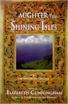
The word “daughter” let me know the book was very likely written from a feminist point of view (it was); the word “shining” let me know that there might be something Otherworldly about the story (indeed there was), and “isles” immediately made me think of Britannia, the misty isles where anything can happen and frequently does. My hot buttons therefore having been hit, I read the book and was enraptured.
Later, as Elizabeth Cunningham gained a wide readership, the protagonist was recharacterized as Mary Magdalen, so the cover of the second book in the Maeve chronicles looked like this.
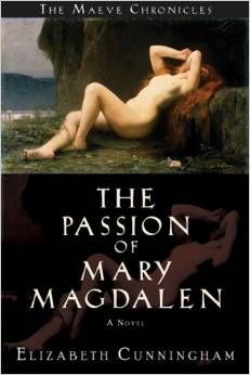
However, by that time I was so hooked on Ms. Cunningham’s writing and the character Maeve I would have read her books no matter what the title was or what the cover depicted.
In trying to think of a book whose cover art would induce me to buy it I could come up with only one example, this one.
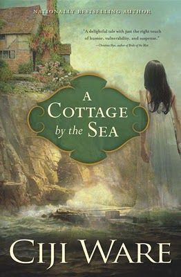
Even then it would be the words “cottage” and "sea" (Americans tend to say "ocean," but most Britons say "sea") that would induce me to investigate the the book, not necessarily the cover itself. (Full disclosure: I downloaded a sample of the book to my Kindle, could not even get through the first three pages, and deleted it.)
All right, I’m weird, but enough about me. What about YOU? Are you visually oriented? Do you see an enticing cover and then pick up the book? Would you ever buy a book that had a plain gray cover with only the title and the author’s name on it? Tell us, we’re all dying to hear!

