If you are like me, you have always wondered about a puzzling aspect of the Presidential exit polls, and that's the seeming contradiction between the exit poll data by income and by education.
First off, you will have read the endless punditry about how the Democratic Party, while gaining ever more ground among white-collar upper-middle-class voters in the coastal states, has lost a lot of its regular-folk appeal to ordinary working-class Americans -- much of it vacuous, some of it thoughtful. But you will also have looked at the exit polls for the last few elections, and seen that, in fact, Democratic candidates still do better among lower-income voters - the higher the income group, the worse they have fared, actually, in general.
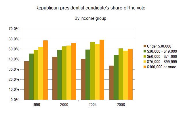
The correlation seems clear: the GOP is still the party of the better-off, and the Dems are the party of the less fortunate, even if the GOP's relative advantage among the upper two income classes has levelled off between Clinton's days and Obama's election). So what gives? Part of the contrast between the popular impression of the Democrats (at least among some pundits, as well as the GOP peanut gallery) as some kind of party of the "coastal elites" on the one hand and these exit poll data on the other lies in the contrast between data by state and data by individual. As James K. Galbraith explained in a recent Reuters post, "Columbia political scientist Andrew Gelman has noted an apparent paradox: in presidential elections rich people tend to vote Republican, but rich states tend to vote Democratic."
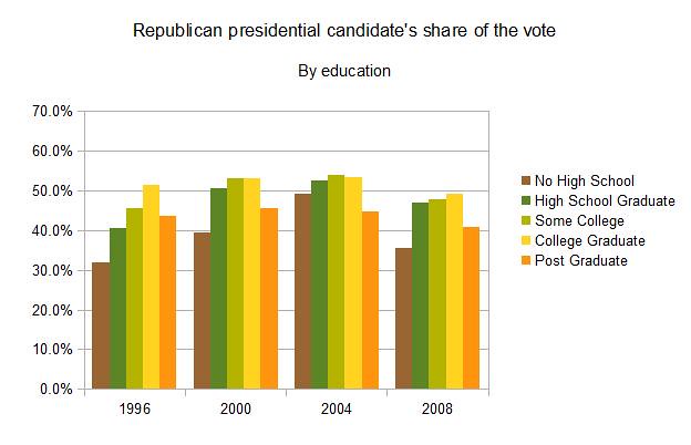
He proceeds to explain why in some interesting detail, but in the meantime the impression of the Democrats as a party with elite-appeal also has some exit poll data to back it up. The exit poll numbers by education level, in these last few presidential elections, have shown a much more mixed picture than those by income, with the Democrats holding a consistent edge among the highest-educated and losing some of its edge among the lowest-educated, among whom the Republican candidates (in particular GWB) gained significant ground.
But how does this make sense? Generally speaking, there's a strong correlation between education and income - so this contradiction between the data by education and by income has always puzzled me. Are there really so many Democratic postgrads living on a shoestring? Is the electorate of lowly-educated, high-earning Republican self-made men really that big? The stereotypes almost draw themselves, for sure, but they can't affect the overall numbers that much, can they?
A couple of days ago, however, in one of the DKE threads, a commenter left a link to a site that I'd somehow never seen before: Dimpledchad.info. Belying its dodgy domain name, the site is run by a bunch of PoliSci profs, and it collects all the raw exit poll data from past elections. They've cleaned up the data so they are comparable between the elections - and the site doesn't just have the percentages (which are adjusted during election night to match the actual outcome), but the raw numbers of respondents too. Without the adjustment, those don't exactly match the final election results, but what they do allow the site to do is to calculate subsets combining different variables. And so it becomes possible to drill down in the variables of race, gender, age et cetera and look at the exit poll numbers for, say, white young voters or female evangelicals. More to the point, it makes it possible to combine the data by education and income, and look at the voting behavior of each individual combination of education level and income level. E.g.: how did those who had some college education but earned less than $30,000 vote?
Below the fold I have charts that do this for the last four presidential elections, and therewith clear up the paradox that puzzled me. And no, it's not really all about unschooled billionaires and skint postgrads. Next time you wonder in frustration about all those people voting against their own economic interests, these charts might provide a little perspective.
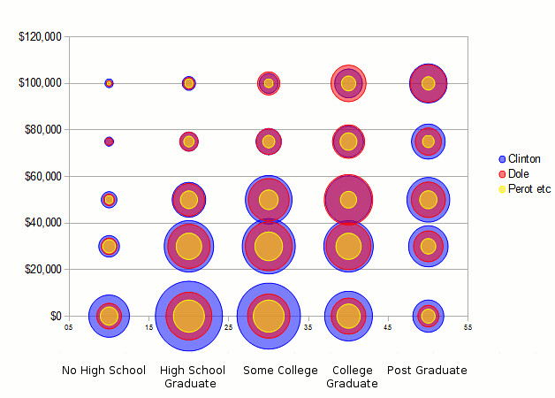
The 1996 elections
First, let's go back - way back. Bill Clinton vs. Bob Dole, 1996. The exit pollsters queried over seven thousand people, which means that many of the individual crosstabs (eg Clinton-voting college grads earning less than $30,000) have hundreds of people in them. I created tables with these numbers in a Google spreadsheet. Here I will just post the charts, and this is the one for 1996, with just Clinton and Dole. Note that on the income axis, $0 means $0-29,999; $30,000 means $30,000-49,999; $50,000 means $50,000-74,999 ... et cetera.
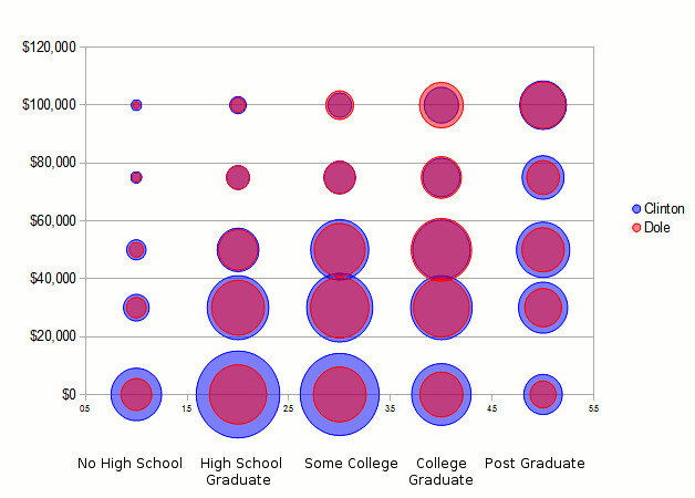
You can see that Clinton really ran up the margins among the lowest income group, $0-29,999, and did so practically regardless of education level. This is where some two-thirds of his total vote lead over Dole came from!
In the next income group, $30,000-49,999, he still enjoyed a healthy lead over Dole, regardless of education level, though his strongest lead here came among postgrads. Among the higher income levels, however, education starts paying a starker differential role.
Whereas Clinton consistently posted strong leads among the lowest education group all the way up to the highest income level (though sample sizes become tiny there), and consistently posted strong leads among the highest education group up through the $75,000-99,000 income group, he did significantly worse among the in-between education groups at these higher income levels.
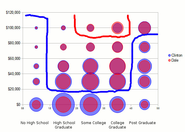
The result is a kind of lobsterclaws-shaped pattern when it comes to his strongholds (with my apologies for the MS-Paint style drawing here):
In total, if you add up all of the lowest income category (less than $30,000), regardless of education level, and all the highest education category (postgrads) regardless of income level, you have explained over 80% of Clinton's margin over Dole.
It bears mentioning of course that 1996 also saw a strong Perot vote still. This is what the picture looks like if you draw in his vote as well. He got some of his best scores in the lower left quadrant, so to say: his appeal reached throughout the lowest income category, but was the more limited to the lower-education categories the higher up in income you go. A Republican might speculate that he took the low-information voters that would otherwise lean to the GOP candidate, leaving Dole only with the more 'sophisticated' conservative electorate - well off, decently educated.
The 2000 elections
The 2000 race was close and it shows. (And these raw, unadjusted exit poll data actually still overstate Gore's popular vote lead.) In the lower middle part of the chart, where most of the votes were, margins were very tight.
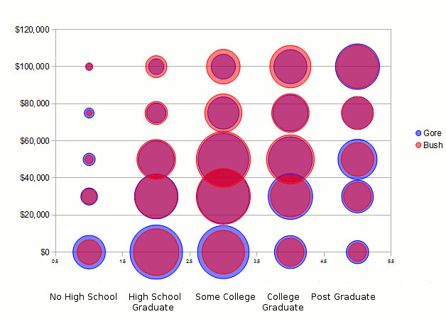
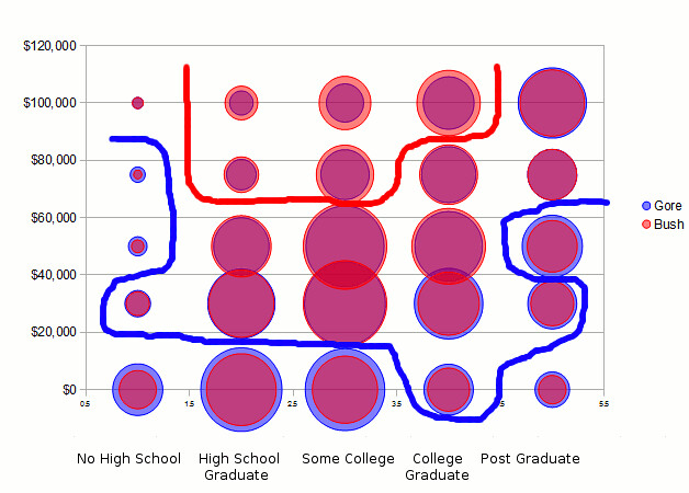
Bush had a clear lead among those with the highest income and mid-level education. The Democratic "lobster claws", however, had eroded. Gore still had the lead throughout the lowest income group, regardless of education level, but he didn't romp home among them like Clinton had. And though he wasn't behind in any of the "claw" groups - postgrads regardless of income level on the one hand, and those without high school regardless of income level - Bush pulled into a tie among a couple of them. There was one circle in the matrix where Gore actually pulled into a narrow lead that Clinton had not achieved, and that was in the top right corner: postgrads earning more than $100,000.
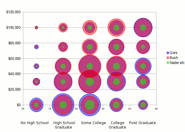
What about Ralph Nader? Here's the chart including the third-party vote. Note that the raw exit poll data slightly overstated the third-party share of the vote, at 5.2% when in reality it was 3.7% - Nader got 2.7% and Buchanan, Browne and others the remaining percentage point. The strongest percentages for Nader c.s. came in the bottom right quadrant of the chart: postgrads earning less than $50,000 and those who did some or all of college but still earned less than $30,000. Nevertheless, the exit polls showed at least a 4-5% share through most combinations of income and education levels. Only among those with no college and middle-to-higher income levels did Nader fail to appeal at all.
The 2004 elections
In the 2004 elections, Bush's biggest advantages slightly migrated on the chart. Drastically reduced was his lead among the wealthiest college grads. Instead, new clear leads appeared further to the left and down. A key constituency right at the middle of the chart - those in the middle income group with a high school diploma or some college education - suddenly yielded some of the biggest vote leads for the Republican.
In that sense, this was a notably different chart than that of 1996. Bush's strengths were distinctly more middle-class than Dole's. Before buying into the image of Bush's common-man appeal to the working-class voter, however, do keep in mind that this is all relative. Over two-thirds of Bush's victory margin still came from the higher income categories.
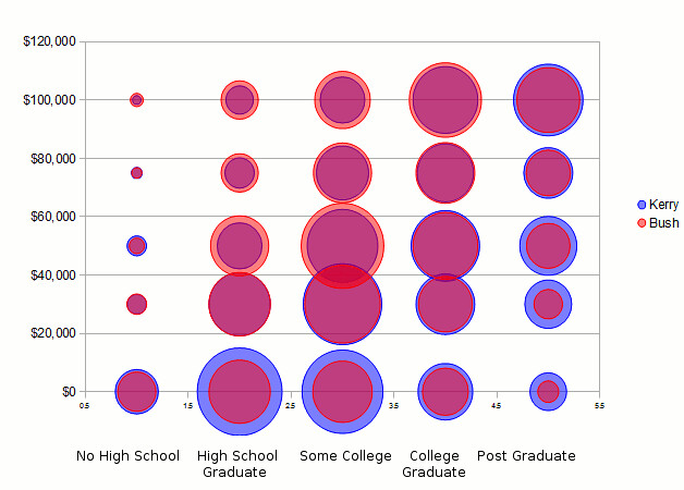
John Kerry, on the other hand, relied on two familiar Democratic bulwarks to provide some his best vote margins: the lowest income group ($0-29,999), and postgrads earning less than $75,000. In particular among said postgrads did Kerry actually make gains compared to Gore. (Keep in mind that the raw exit poll data were again more Democrat-friendly than the actual results were, though.)
A noteworthy weak point however was Kerry's appeal to the lowest education level (no high school). Overall he still carried them, but by less than 10%, and his score in each income group at this education level was worse than Gore's. And with that, the 'left claw' was essentially broken:

The Democrat's electoral advantage was now heavily concentrated in the lower right quadrant. The stereotype of the prototypical Democrat as a high-education/low-income voter (students!) comes a little closer in view here - though of course you don't necessarily need to be a skint anthropolgist to fit in the bottom right category. It is, however, important not to confuse the size of Kerry's lead with the size of his vote. As you can see, the biggest circles in the chart are roughly those in the lower middle of the chart, and in each case Kerry got the same ballpark of votes as Bush. The mass of Democratic voters was there; but they didn't yield a lead.
The 2008 elections
The 2008 elections saw Obama leads almost across the board. Those included healthy margins in both lower-than-average income categories (ie up to $45,000), regardless of education. Obama regained the firm lead among the lowest-education, below-average-income voters that had been melting under Gore and then Kerry. But he also carried the two highest education categories - not just postgrads but college grads too - across all income categories, all the way up to the wealthiest. In fact, the second biggest vote lead, in absolute terms, from among all these 25 subsets came from postgrads earning over $100,000, among whom Obama lead 66% to 33% in the raw exit poll data (and 57% to 41% in the adjusted data).
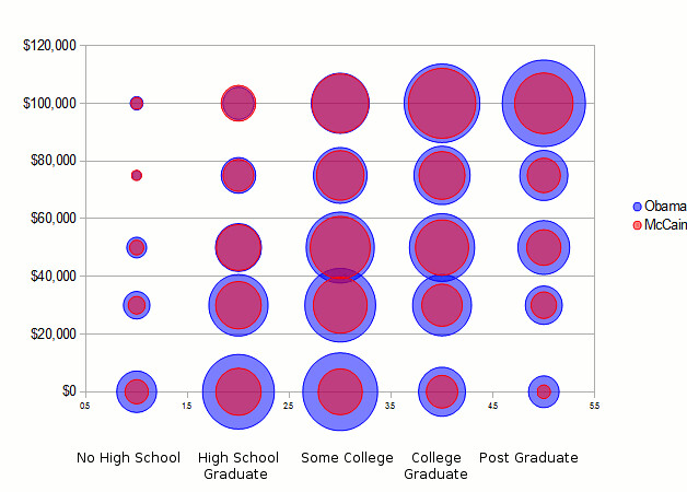
In the raw exit poll data, McCain only had a lead in two of the subsets: Those without high school earning $75,000-99,999; and those with high school only earning more than $100,000. You can't get any closer to the stereotype sketched at the beginning of the post, of the self-made man with little education but a (very) good income. The sample sizes are very modest at this level though, because there just aren't a lot of people in that category: n = 14 and a less idiotically small 165, respectively. The largest amount of McCain voters were further to the right as well as a little below: college grads and postgrads at the highest income levels (the old Dole bulwarks), and people with some college in the middle-to-higher income groups. But Obama surpassed McCain's appeal in those groups.
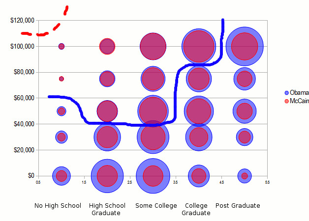
In short: no, the contradiction between the exit poll data by income and by education does not mean that the two parties are full of self-made millionaires and broke academics, respectively. It's more convoluted than that, and an important bulk of voters for both parties remains at the middle of the charts: those with mid-level education and mid-level incomes. However, interesting patterns emerge, as well as changes in those patterns.
Clinton's victory depended on running up the margins among the lowest as well as highest education groups, and across the lowest income bracket regardless of education. In contrast, when you look at Obama's victory chart you can almost draw a straight diagonal line from the bottom left to the top right to identify his bulwarks. The higher people's education, the further the Democrat's appeal reaches up the income ladder. The lower their education, the sooner a higher income level implies more support for the Republican.
What will the picture tomorrow end up looking like? Thanks to the drastic curtailment of the exit polls this year, we might not properly come to know.
All exit poll data derived from: Best, Samuel J., Brian S. Krueger, Jeffrey W. Ladewig, and Clifford D. Vickrey. 2012. Dimpled Chad. Retrieved from http://www.dimpledchad.info.