Welcome to Part 5 of my series on the political geography of the states. In this latest installment, I take a look at the outcome of the 2012 elections for the US House of Representatives by district, state, and county as well as looking at where individual candidates performed differently than the presidential ticket. Additionally, I'll look at the US Senate by state and county. You can find the previous installments on the individual states grouped by the 4 census bureau regions here (the West, the Mid-West, the Northeast, the South).
So follow me over the fold for a much shorter but still worthwhile look at the US Congressional election maps.
The House of Representatives
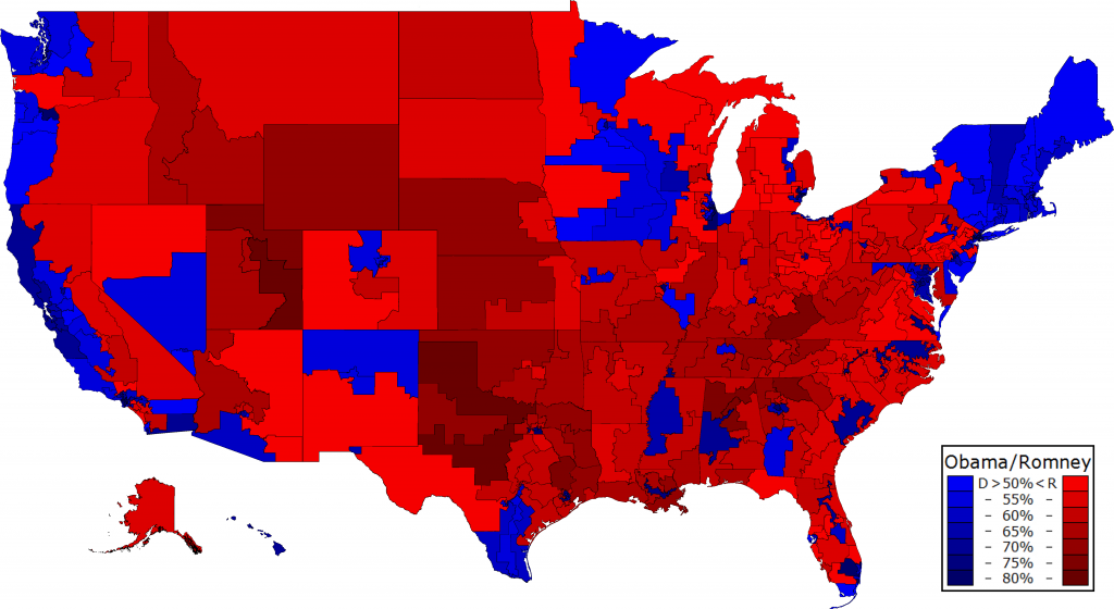
Starting off is the presidential election by district. All vote shares are two-party only and you can click through all of the maps for the full sized image. Of particular note here is just how damn red the map looks thanks to a combination Republicans being more efficiently distributed, but more importantly their massive advantage over the redistricting process. Still there are regions of solid blue, such as New England or the California Bay Area. Unfortunately a majority of 226 went for Mitt Romney while just 209 went for Obama, making our task of winning the house fairly challenging.

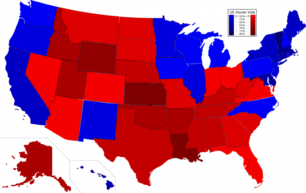
Now let's look at the House election itself. In case you weren't aware, Democratic candidates actually received more votes nationwide than Republicans, but thanks to gerrymandering received a clear minority of the seats. However just 17 Republicans represent a district Obama won while even fewer Democrats, at 9 total, represent ones carried by Mitt Romney. Note, several districts particularly in the south were uncontested by one of the major parties and thus a very dark shade of (mostly) red or blue.
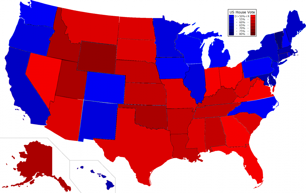
Stepping back for a moment to look at the state outcomes, we can see a fairly clear reflection of the presidential map, although four states, Florida, Ohio, Nevada, and Virginia voted Obama/Republican while North Carolina voted Romney/Dem (Colorado voted Obama/Republican only because one district was uncontested). Particularly galling is the fact that Democratic candidates carried the popular vote in four states, Michigan, Pennsylvania, North Carolina, and Wisconsin, but again because of gerrymandering were relegated to a minority of the seats in each state.
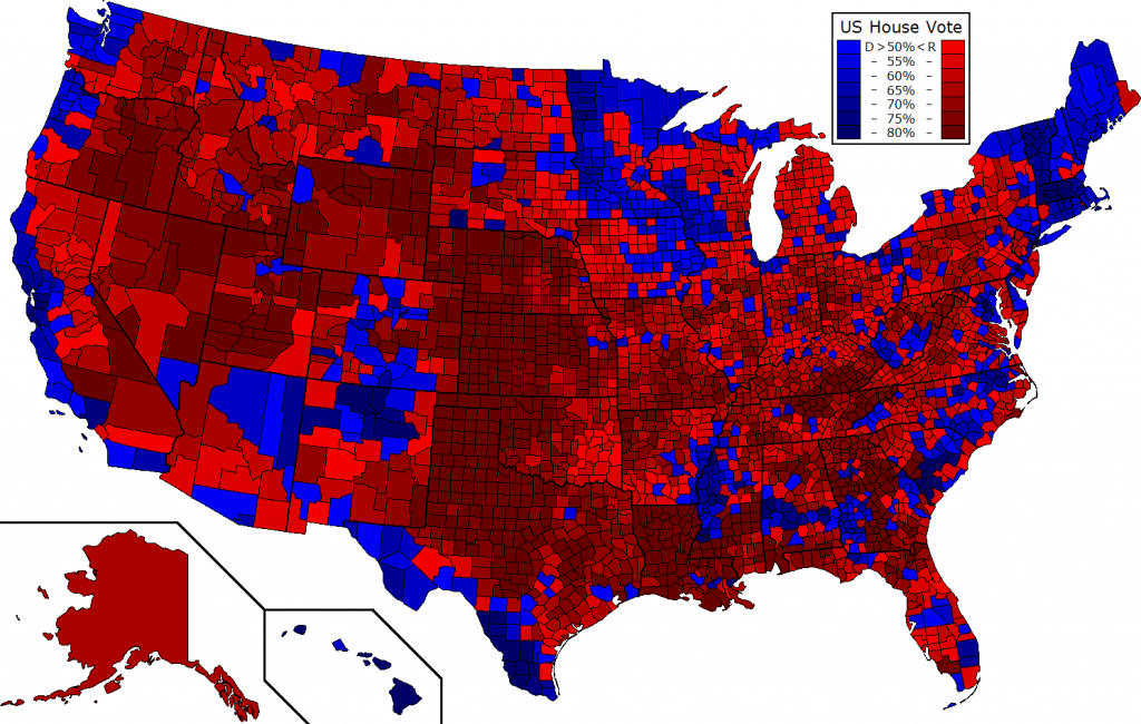
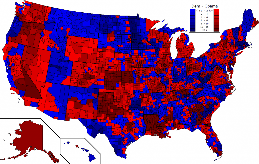
Now looking at the county-level map you can get a different look at the data yet still see clearly where Dems won districts such as in New England (where counties are ironically not very relevant). Thanks to the region's natural deep red lean and a few unchallenged Republican incumbents, Republicans ran exceedingly well in the corridor along the middle of the country stretching from North Dakota down to Texas.
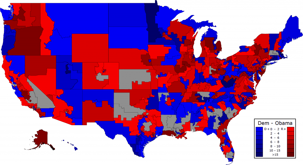
Here comes my favorite part of this segment; looking at which districts saw the Democratic candidate's vote share diverge from Obama's vote share (gray districts were uncontested). States such as Oregon give us a very clear look at incumbency effects with every incumbent Representative running far ahead of their respective presidential ticket, while states such as North Carolina let us look at how running a more ideologically in tune candidate can boost local performance.
The best overperformers are unsurprisingly longtime incumbents who also might have seen the presidential ticket perform significantly below average in their districts. Topping off the list for the Democrats were Nick Rahall in WV-03 at an impressive 20%+ over Obama's vote share, closely followed by Jim Matheson in UT-04 and Collin Peterson in MN-07. For Republicans it was actually challenger and former Rep. Charles Djou in HI-01 running 16% ahead of Romney, closely followed by Ileana Ros-Lehtinen in FL-27 and Candice Miller in MI-10.
The worst underperforming incumbents without a doubt must start with Dem Rep. Colleen Hanabusa in HI-01 at 16% below Obama thanks in part to his home state effect and facing the best possible opponent, followed by David Cicilline in RI-01 at 11%. Among Republicans it should come as no surprise that scandal-plagued Rep. Scott DesJarlais takes first place, running just under 11% behind Romney, though Michele Bachmann deserves a (dis)honorable mention, underperforming by a whopping 7% and nearly losing despite having a nominal 10-1 spending advantage.
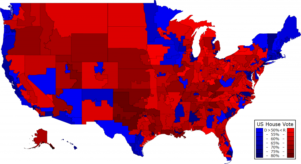
Looking at this same data by county you can get an even better sense of over/underperformance, especially in states such as Oklahoma where there was a fair amount of variance within districts, or North Carolina where Democrats ran ahead of Obama in the vast majority of counties.
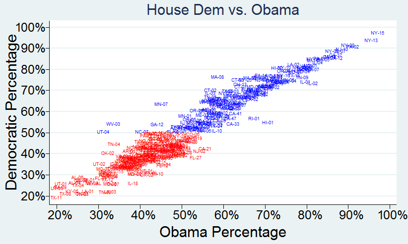
Here's this same data presented as a scatter plot. You can very clearly see the incredibly strong correlation between Presidential performance and congressional performance. The R-squared was a very high .91 for the 385 districts where we have presidential data. There are some very obvious outliers though, such as UT-04. Among just Republicans the r-squared was a relatively lower .65 while among Dems it was a much higher .82.
Now, as a bonus I've mapped out what the House elections might have looked like had all of those uncontested districts seen a token challenger put forth by the opposing party. To do this I averaged the percentage of the vote share the Dem and GOP house candidates received compared to the presidential ticket in all contested districts, which was about 94% for Dems and 97% for Republicans, and then applied that to the Obama/Romney numbers in the those uncontested districts. The only one that actually changes hands outright was CA-31 where Gary Miller benefited from facing a fellow Republican thanks to the top two primary. Obviously this is an imperfect method as some candidates and incumbents do better or worse than others, but it's a quick fix that gives the map a somewhat needed correction.
Where this looks more interesting though is at the state level where several states shift multiple shades towards the middle. Colorado actually flips outright since just 1 Republican there went unchallenged while Kansas and Louisiana become much less red.
Democrats in reality won the house popular vote 50.6% to 49.4%, but had we fielded a warm body for every seat and Republicans done the same, Dems would have likely received about 51.2% to Republicans' 48.8% which is a good deal closer to the presidential outcome of Obama 52.0% to Romney 48.0%. The American public very clearly voted for Democratic control of the White House and both chambers of Congress in 2012. Still, Democrats need to do a much better job of getting people to vote Democratic all the way down the ballot as Republicans were able to retain 3% more of their presidential votes (looking at it very broadly).
The Senate
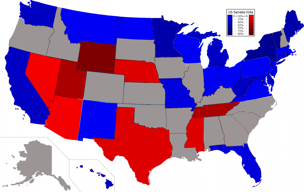
This map probably doesn't look too unfamiliar as you probably saw something similar on election night and in the weeks afterwards. The major difference is that it is again just the two party vote share, but given the 3 way races in Maine and Maryland I aggregated the independent with their logical party to remove unnecessary distortions. Something I find particularly awesome about this map is how Democrats won every single state in the North (aside from Nebraska).
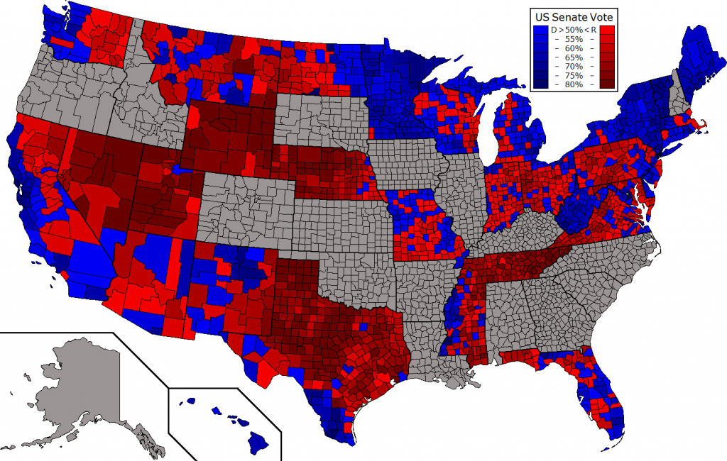
Now what you probably haven't seen is this map showing the county winner for every single state. What is particularly amazing is to look at states like West Virginia or Minnesota that usually have a fair number of counties going for both parties, yet here see an almost total sweep. You also get a fairly good picture of how much less polarized the counties in the Mid-Western states are especially compared to those in the South but also even the West.
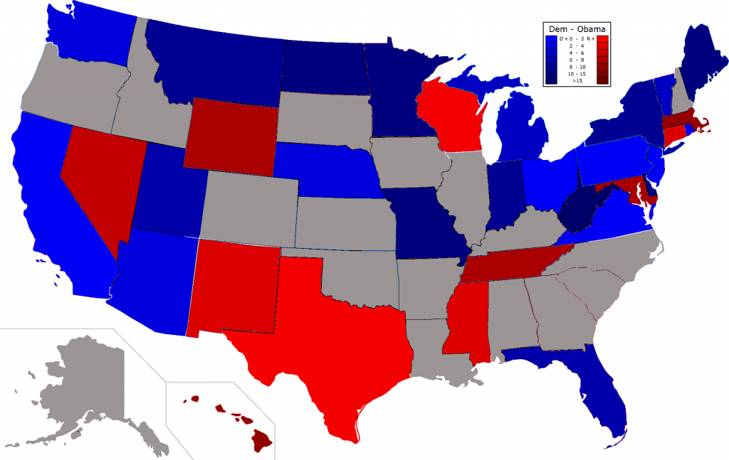
Next is the comparison of the Senate Dem candidate's vote share with that of President Obama. Unlike in the House, Senate Democratic candidates on the whole ran much better than the President and did so in a majority of the states. There were also several states where the Democrat did significantly better than Obama, such as West Virginia. On the other hand, there are noticeably a few states where the Republican did much better than Romney, such as Massachusetts.
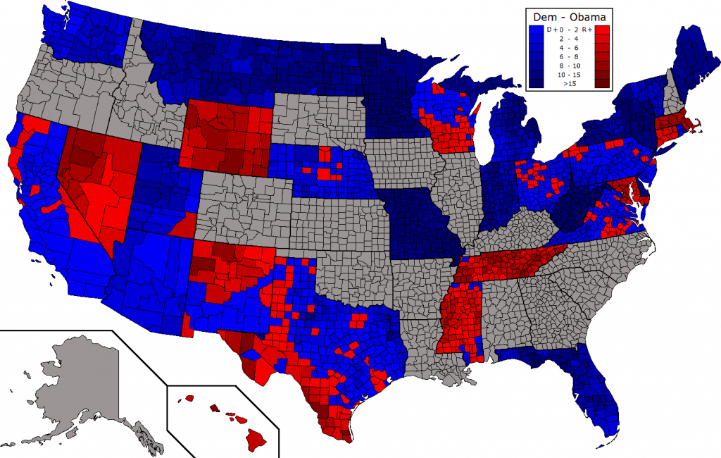
With the county-level map you can really see just how much certain senate Democrats dominated. In every single county in states such as Missouri, Minnesota, and West Virginia, the Democrat ran drastically ahead of Obama. The reverse only happened in a few states such as Wyoming. Interestingly, most of the states here see a clear pattern of only one candidate running ahead of their presidential ticket in nearly all of the counties. States like New Mexico and Wisconsin where the number of counties for each party were relatively even are the exception. Finally, it is cool to look at states such as Texas where you can clearly see a racial pattern to the ticket splitting with white Romney voters voting for the white Democrat and Hispanic Obama voters voting for the Hispanic Republican (or undervoting).
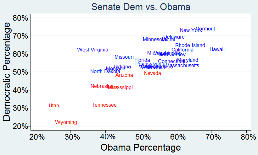
The last picture is a graph of this same data by state. Unlike in the House where the correlation was incredibly high, it was a relatively lower in the senate with an r-squared of just .61. Among just Republicans it was a higher .73 and among Democrats an incredibly lower .27 meaning there was relatively little correlation. Though you can still see the general trend towards less ticketsplitting, there are obvious outliers such as West Virginia. Generally though, incumbency played a larger role with incumbents running behind the ticket in zero states that didn't have a well-funded independent or a presidential home state effect. This shouldn't be as surprising that it mattered more in the senate than the house when you realize that senate races are a lot higher profile and thus easier to personalize whereas relatively more house voters rely on party identification.
The best performing incumbent relative to the presidential ticket was Joe Manchin in West Virginia who ran an astounding 26% ahead of Obama meaning that nearly 1/3rd of Romney voters split their ticket. However, when you realize that all but one West Virginia Democrat running statewide won and many did so by similar margins, this becomes somewhat less impressive. Thus, the very well deserved runner up is Minnesota senator Amy Klobuchar who ran an impressive 14% ahead of Obama and carried nearly every county in the state (as did Manchin). For Republicans, their best overperformer should come with little surprise as Linda Lingle in Hawaii at 9% given that Obama saw a large native son boost there, but in second was senator Scott Brown who ran 8% ahead of Romney in Massachusetts, though that wasn't enough to win when Romney was losing by more than 20%.
The worst performing incumbents were Ben Cardin for the Democrats who ran 6.5% behind Obama thanks to the presence of a Republican-turned-Independent candidate who outspent him 2:1 and his largely invisible tenure. Among Republicans it was Dick Lugar unsurprisingly Orrin Hatch in Utah by 6% thanks to Romney's homestate boost. The most surprising one to me of the entire group of 33 was Vermont, where self-described democratic socialist Bernie Sanders ran 6% ahead of Obama, meaning that there were a not-insignificant number of Romney/Sanders voters. I can't imagine what someone with that voting preference thinks (or rather doesn't).
This concludes part 5 of the series and I look forward to discussing the above maps in the comments. Remember, if you want to look directly at the data it's all been compiled very neatly for you for download from google docs here and in the congressional guide from my signature. Next week, Part 6 will take a look at the relative voting trends in local statewide elections by county for various states to get an idea of which areas are trending Dem or GOP relative to the state as a whole.

