Vincent van Gogh: The Wheat Field, Sunrise (1890)
Good evening, Kibitzers!
Last week, we saw some videos of songs whose lyrics had been illustrated by AI. (And then on Saturday, Dartagnan jumped off from there to think about some of the concerns arising from this sort of non-human art.)
Let me say a little bit about what these machines are doing. I am far from an expert on this, but I heartily recommend Janelle Shane’s You Look Like a Thing and I Love You — it’s easy to follow, and also very funny. (The title is an AI-generated pickup line.)
In the 1970s, smart people were already trying to figure out how to make computers understand, and respond in, human language, but they had to be very clever about it and they still met with limited success. That was because they had computers that were by some measures 20 billion times less powerful than the phone you had in your pocket ten years ago. The main reason all this stuff is exploding now is that we have the computing power people could only dream of back then.
The art projects are the bigger and harder flip side of getting a computer to look at an image and say what it depicts, but they are related. A computer starts out such a quest at a serious disadvantage to a human infant, because the infant has the physical body and senses to directly perceive the world of physical objects and beings that images represent. The computer brings NO background to the table that can give it clues; it has to teach itself everything, using whatever information you provide, and it still doesn’t really know what the things in the images are. It has no “lived experience”.
Projects like these drawing programs commonly use a two-part process called a GAN, for “generative adversarial network”. First, you give the computer data to look at — millions of images of things you want it to be able to draw, which in the case of these programs is All The Things. Then, part A of its logic starts drawing things, and part B looks them over and gives feedback on how close it thinks the images are to what they’re supposed to be. Ultimately, humans look at the output and decide what the machine needs to see more examples of in order to improve.
Here’s an article from the “parents” of such a program, talking more about what they do and what they can and cannot offer. They’re making the case for their baby, named AICAN, but way down near the end, they offer a useful observation:
Still, there’s something missing in AICAN’s artistic process: The algorithm might create appealing images, but it lives in an isolated creative space that lacks social context. Human artists, on the other hand, are inspired by people, places, and politics. They create art to tell stories and make sense of the world.
I’m going to put two videos here, each less than 15 minutes, that you don’t need to see to enjoy the pictures below, but they do give a little more background on what’s going on.
This video is a really good explanation of how it works and what’s going on in the machine (detail starts at about 6 minutes). I’d recommend this one if you’re at all interested in knowing more. [13:32]
This one is specifically a guide to Midjourney, the AI that created almost all of the song-lyric art we saw last week. It’s more focused on how to use that specific product, but since we saw so much of Midjourney’s output, I thought some people might like to know how it’s used. This is not an endorsement by me of the attitudes toward art expressed herein. [12:38]
So, as you know, I went to craiyon.com and started messing with the phrase “kitchen table kibitzing”. I started out entering just “kitchen table kibitzing” to see what would happen. I did three passes at that, and then, at the site’s suggestion, I tried adding “high definition”. What I learned is that the images on which the AI had trained offered it no knowledge of this “kibitzing” of which I spoke. You can see that it took a wild guess and added a lot of what appears to be “kibble”, on the chance that’s what I meant. This path was not likely to get more interesting very soon, although the deformed utensils and the pi-shaped bagel were kind of trippy. (Links in all this text are to original-size images.)
 Prompt: kitchen table kibitzing (far right: high definition kitchen table kibitzing)
So then, on the further advice of the site, I tried “painting of kitchen table kibitzing”. NOW we were getting somewhere. It was still making images of weird scenes, with misshapen people if any, but they were surreal in a much more interesting way. The two enlarged frames were my favorite from each batch. Special shoutout to the sparsely-legged table with the platter of giant garlic-pistachio hybrids and tiny, I’m gonna say, guillotine?, and the M.C. Escher chair. [Other one: cocktail swizzle sticks gather at the table.]
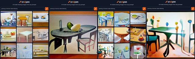 Prompt: painting of kitchen table kibitzing
Oh, and seeing that chair, I tried M.C. Escher — the results were kind of disturbing. I feel like it’s really not getting Escher’s work the way it does some artists. His images are so symmetrical, and this image feels almost organic in its twisting disorder. It’s like a monster that ate an Escher.
 Prompt: kitchen table kibitzing by m c escher
Before I took off down the “painted by” path, I did a short detour inspired by the Bayeux Tapestry KTK title image. I started with “tapestry”, but that turned out to be more Carole King-y, so I added in “medieval”. (Okay, those specific links aren’t to the full-size image, but this one is.)
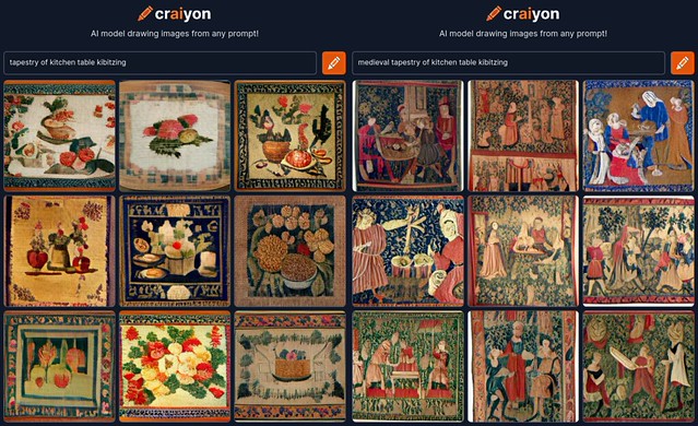 Prompt: tapestry of kitchen table kibitzing (L); medieval tapestry of kitchen table kibitzing (R)
I’ve put all the images into stitched-together bars grouped in very rough chronological order (of the emulated artists), because there are a lot, and diaries aren’t very friendly to placing a lot of individual pictures to the left and right of the text. Also, I’m moving the big-picture links to the captions from here down.
I like that it has decided on its own to depict frames around some images and/or white space as if they were hanging on a wall and we’re a little off to the side. As to the image content, it looks almost normal at this scale, but if you look at the enlargements, they get weird. That “Degas” for instance — it is really unclear which elements of the picture are dancers and which are furniture.
I went with “a pointillist” because it knows about only one work from obvious choice Seurat. That first image, of what appears to be a shrub in a dress sitting at a seaside table, is more interesting than nine tries at the Island of La Grande Jatte. On the other hand, it also knows only one work from Klimt and gave me nine of those. They all look roughly like the actual work; this one went the furthest in turning the couple into a large, fancy tea cozy with a black button on the top.
As discussed, it does especially poorly at realistic humans, because it doesn’t know what they are or why it would bother us when they’re distorted in a way not consistent with life. The “Dorothea Lange” image is creepy. The “Diego Rivera” figure in his jaunty fried-egg hat is only a “painting” so it’s not troubling.
There’s a girl in an actual Carl Larsson painting wearing a dress like that, but today the dress has come to kibitz with no occupant. The “Ansel Adams” kitchen table in the wilderness looks like some kind of statement about the second amendment, doesn’t it?
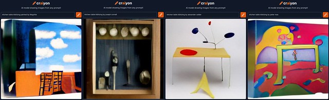
Once we get to an era where there’s some art that’s not representational to begin with, the machine’s interpretations get a whole lot better. I loved every one of the “Joseph Cornell” boxes it made, and the “Calder” kitchen table is genius.
Oh! I see I have one more thing stashed in my working draft I wanted to show you. Wonkette has occasionally been using AI art as title images on their stories. They use an AI called DreamStudio, and they always use it to create snark, because they are Wonkette. I enjoyed the art for this recent story by Doktor Zoom; the image is captioned, “What the AI thinks Ron DeSantis and an AR-15 look like. I removed the extra hand it gave DeSantis.”
Don McLean: Vincent [4:06]
Paul Simon, with yMusic chamber music quintet: René and Georgette Magritte with Their Dog After the War [5:07]