The LA Times ran a story last weekend titled, Still Betting on Economic Doomsday -- and Still Waiting. The article highlighted the plight of what Barry Ritholtz calls the Zombie Bears -- "pundits" who will state the economy is on the brink of economic collapse regardless of the underlying data. What is most important is these "pundits" have been wrong for the last five quarters when the economy has grown and all evidence indicates a recovery is underway. Yet, for reasons unknown, their writings still spread like wildfire throughout the blogsphere.
Let's look in a bit more detail how the zombie bears work.
The recovery is a sham, the bears say, because the global economy's dive in 2008 and early 2009 was halted by massive financial intervention by governments and central banks worldwide: unprecedented money-printing and rock-bottom interest rates.
With Europe's debt crisis flaring again, and with the Federal Reserve this month committing to spending nearly $900 billion more to buy U.S. Treasury bonds by mid-2011, it's clear that governments' previous efforts weren't enough. They've been trying to solve a debt problem by papering it over with more debt.
This is one of the classic ZB arguments: government spending used to prevent an economic free fall is no way to come out of a recession. At the heart of this argument is the attempt at discrediting Keynes' economic theories. In short, Keynes recognized that the government can spend money during a downturn to prevent the recession from getting worse. It can do this because it can borrow money in the capital markets. At the core of the ZB arguments is a distrust of government spending and intervention; they simply believe that government can't help, that the government should simply let the economy fall to whatever bottom it can find and then repair itself. Here, the ZB's are relying on the idea that in the long-run, economic equilibrium (a general condition of growth and a balance between supply and demand) will return. What they can never state with certainty is how long this will take. In response to this argument, Keynes famously said, "In the long run, we're all dead." Simply put, waiting for the long-run to emerge is not a valid strategy when there are millions of people suffering from unemployment. You will notice the ZBs have no response to the plight of people hurt by the economic downturn; they simply turn a deaf ear. Simply put, the ZB argument in response to government spending to prevent a complete economy calamity is at best unsatisfying: data indicates that government spending can help to prevent a depression from emerging and helping the plight of people hurt by the downturn.
Let's look at the next argument advanced by the ZBs:
So what if the stock market hit two-year highs this month? Isn't trusting the market only slightly dumber than trusting government statistics?
Actually, I believe the correct argument advanced by the ZBs is this: if a statistic advanced by the government is bad, then it is a valid statistic. For example, very rarely do you hear a ZB questioning the veracity of the U-6 unemployment rate or the increase in the poverty rate. Those numbers demonstrate bad aspects of the economy and should therefore be trusted completely. However, when GDP growth was reported over 5%, the ZBs argued the numbers were cooked and somehow irrelevant. Or, when we learned that inventory stocking was a primary driver of economy recovery, somehow inventory restocking became a less-then-honorable method of growing the economy (although an explanation as to why was ever proffered). In addition, any economist who is bearish is to be imminently trusted but any bullish economist is a "tool of the man." For example, Nouriel Roubini's bearish statements are clarion calls for the ZB movement, whereas Bloomberg and CNBC television are home to Wall Street Harpies who don't know what they are talking about. At this point it's also extremely important to add this: there is no debate among academic circles regarding the veracity of the government's economic numbers. Go to the website SSRN (the social science research network). Look for any paper from an economist or statistician challenging the veracity of the government statistics. In short, if there were a fundamental problem, we'd be seeing the academic community pointing out the problems and argument for solutions. But we aren't seeing that debate.
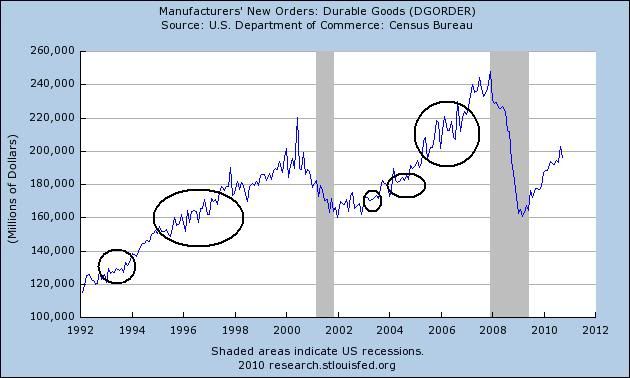
Finally, the ZB bears are great at snapshot predictions. By this I mean talking a single economic statistic that is bad and then screaming, "we're doomed." However, what they fail to do is provide any context for the statistic. For example, what do the people who collect and analyze the data think about the number? Is the current print of the economic number abnormal or is the data series volatile? How has the number performed in other, similar situations? For example, the latest durable goods numbers printed at -3.3%. According to the ZBs, this was obviously the sign of a coming Apocalypse. What they failed to note was this data series is extremely volatile and prone to whipsaws (see the chart below).
In short, the ZBs arguments are intellectually hollow and dishonest. They have missed five quarters of U.S. GDP growth. As I will demonstrate below, the economy continues on the road of recovery.
Consumer spending:
Let's start with the largest part of GDP: personal consumption expenditures, or PCEs, which account for about 70% of GDP growth.
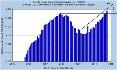
Real PCEs are now above their peak from the previous recession.
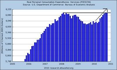
Real service expenditures (which account for about 65% of PCEs) dropped during the recession, but are now right at their previous highs from the previous expansion.
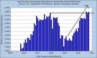
Real non-durable PCEs (which account for 22.18% of PCEs) are now at levels above previous highs. Also note they have bounced back strongly from their lows.
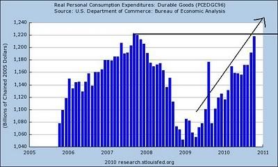
Real durable goods (which account for 12.61% of PCEs) are now approaching their highs from the previous expansion.
Let's look at this data from another perspective: real retail sales:
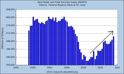
As this chart shows, real retail sales have also been increasing at a strong rate. Let's compare this expansions recovery rate to other recoveries:
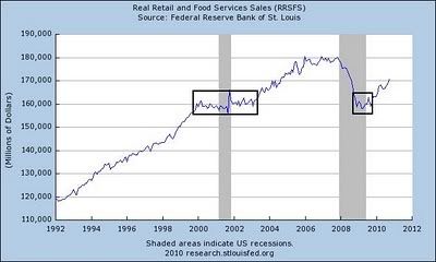
At the end of the 1990s to after the beginning of the previous expansion, real retail sales moved sideways. They started to increase about a year or so into the last expansion. Notice that in this situation, real retail sales dropped to the level of the last recession, but have bounced back faster.
Simply put, the numbers indicate the consumer is bouncing back. PCEs are near peaks seen from the previous expansion. Real retail sales are mirroring fairly closely their performance from the previous expansion as well.
Let's move to investment:
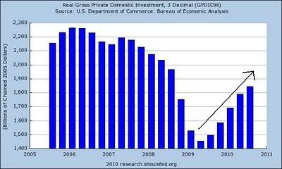
Let's start with the macro picture of investment, which has been steadily increasing for the last five quarters.
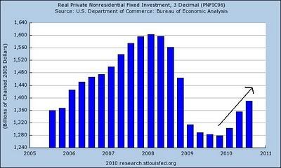
Private non-residential investment has increased the last three quarters, indicating that business is investing in some real estate development.
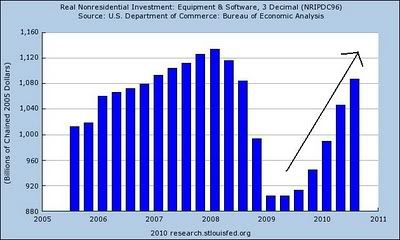
However, it's the equipment and software investment that is the real reason for the increase. Notice the size of the quarter to quarter increases for the last three quarters.
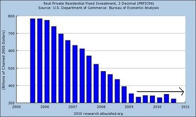
Residential investment is still low, and will probably be that way for some time.
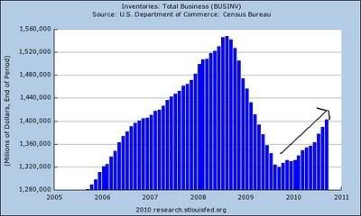
Inventories are being restocked; this overall number has been increasing solidly since the end of 2009.
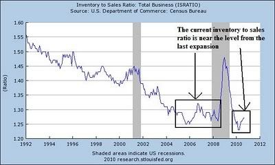
However, the inventory to sales ratio is about halfway between 1.25 and 1.30, which is about halfway between the high and the low from the last expansion. Also note this number has been decreasing since the early 1990s. So, for inventories to continue their contribution to the expansion, we need to see sales increase.
As the data above shows, investment is also on track and adding to the expansion. Let's turn to manufacturing.
Manufacturing activity was one of the primary drivers of the latest expansion. It was one of the first economic areas to show a rebound. However, over the past few months it has since slowed a bit, although it is hardly crashing. I believe the best description of the growth in this sector is "moderating." However, this does not mean "crashing;" it means growth is still occurring, albeit at a slower pace.
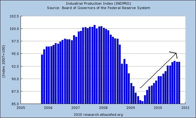
Overall industrial production has bounced back from its post recession lows. While the last four months have shown slower growth, note that periods similar to this were evidence in the previous expansion and are also evident from a longer view of the data (which goes back to 1910).
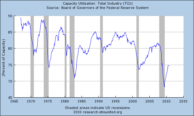
Capacity utilization cratered during the recession, printing its lowest level in almost 40 years. However, it too is bouncing back.
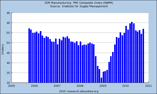
The ISM national manufacturing numbers have been consistently printing about 50 for over a year, indicating the manufacturing sector is doing well.
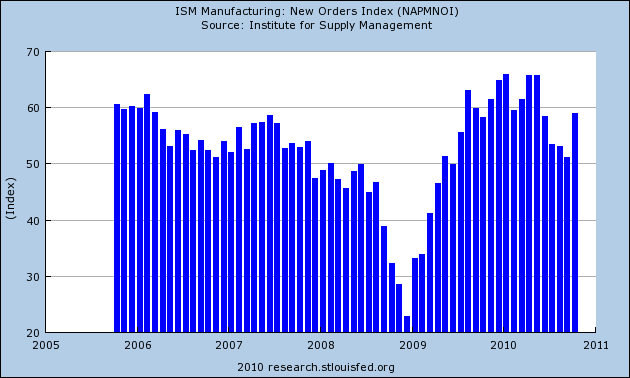
The ISM new orders index was approaching 50 -- the line that delineates between expansion and contraction -- but bounced back strongly in the latest report:
"The manufacturing sector grew during October, with both new orders and production making significant gains. Since hitting a peak in April, the trend for manufacturing has been toward slower growth. However, this month's report signals a continuation of the recovery that began 15 months ago, and its strength raises expectations for growth in the balance of the quarter. Survey respondents note the recovery in autos, computers and exports as key drivers of this growth. Concerns about inventory growth are lessened by the improvement in new orders during October. With 14 of 18 industries reporting growth in October, manufacturing continues to outperform the other sectors of the economy."
The durable goods new orders numbers have been near stagnant for the last 4-6 months:
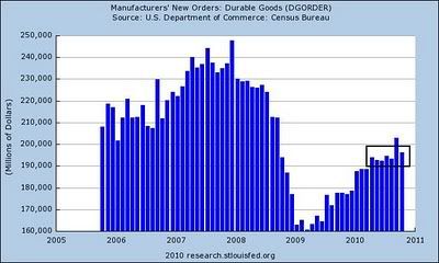
However, this number is extremely volatile. As the chart below shows, long periods of near stagnation and volatility occur during expansions. In addition, note the long-term trend is still clearly higher.
Let's look at the regional indicators.
The NY Fed's latest numbers were horrible:
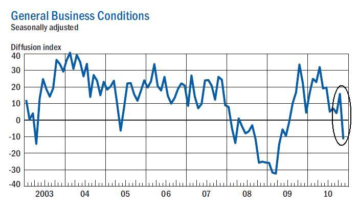
The Empire State Manufacturing Survey indicates that conditions deteriorated in November for New York State manufacturers. For the first time since mid-2009, the general business conditions index fell below zero, declining 27 points to 11.1. The new orders index plummeted 37 points to 24.4, and the shipments index also fell below zero. The indexes for both prices paid and prices received declined, with the latter falling into negative territory. The index for number of employees remained above zero but was well below its October level, and the average workweek index dropped to -13.0. Future indexes generally climbed, suggesting that conditions were expected to improve in the months ahead, although the capital spending and technology spending indexes inched lower.
However, this report was balanced out by the Philly Fed's numbers:
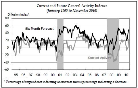
The survey's broadest measure of manufacturing conditions, the diffusion index of current activity, increased from a reading of 1.0 in October to 22.5 in November (see Chart). This is the highest reading in the index since last December. Indexes for new orders and shipments also improved this month, and each index increased 15 points. Indexes for both delivery times and un-filled orders changed from negative to positive this month, suggesting improvement.
And the Richmond Fed also printed an improved number, although not as strong as the Philly Fed's numbers:
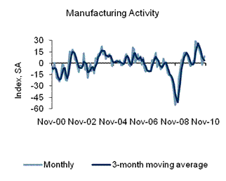
In November, the seasonally adjusted composite index of manufacturing activity — our broadest measure of manufacturing — rose four points to 9 from October's reading of 5. Among the index's components, shipments rose four points to 7, new orders edged up two points to finish at 10, and the jobs index increased six points to 10.
Other indicators also suggested generally stronger activity. The index for capacity utilization moved up three points to 9, while the backlogs of orders contracted at a much slower pace, gaining nine points to −3. The delivery times index added one point to end at 6, and our gauges for inventories were somewhat higher in November. The finished goods inventory index increased ten points to 16, and the raw materials inventory index advanced five points to finish at 15.
Overall, the Eastern seaboard looks to be in fair shape. This is important, as this geographical area was a problem area in the latest Beige Book. While this region is not out of the woods, it is in a clearly better position than a few months ago.
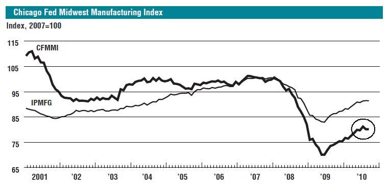
The Chicago Fed was up slightly in its latest report, but has been printing a horizontal number for the last few months:
The Kansas City Manufacturing index has printed three strong months:
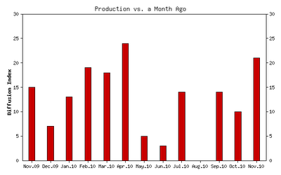
While this index was near 0 in August, it has since bounced back, printing a very strong reading last month.
The net percentage of firms reporting month-over-month increases in production in November was 21, up from 10 in October and 14 in September (Tables 1 & 2, Chart). The increase in production occurred among both durable and nondurable goods producing plants, with a sharp rise in machinery, high-tech, printing, and transportation equipment activity partly due to higher export orders. All other month-over-month indicators also improved from the previous month. The shipments, new orders, and order backlog indexes climbed higher, and the employment index reached its highest level since late 2007. The new orders for exports index rose from 0 to 11, and both inventory indexes moved into positive territory.
Texas area factory activity has been bouncing near 0 for the better part of this year:
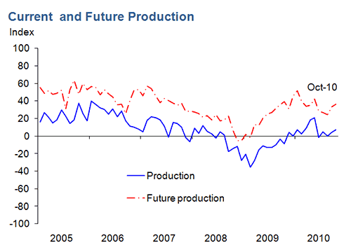
Texas factory activity increased in October, according to business executives responding to the Texas Manufacturing Outlook Survey. The production index, a key measure of state manufacturing conditions, was positive for the second consecutive month and slightly higher than its September reading.
Despite the rise in output, several other manufacturing activity indicators fell again. The new orders and shipments indexes were negative for the fifth consecutive month. The capacity utilization index dipped below zero, with more than one-quarter of respondents reporting a decrease.
Measures of general business conditions improved markedly in October, suggesting the broader economy strengthened. After four months in negative territory, the general business activity index rose sharply from –18 in September to 3 this month. The company outlook index also jumped up, rising from –4 to 13. The advance in the index was largely due to a sharp decline in the share of manufacturers reporting a worsened outlook, falling from 25 percent to 13 percent.
The above numbers show a sector that is slowing as demonstrated by the moderating pace of industrial production growth over the last new months. In addition, capacity utilization is still low and several regional federal reserve manufacturing numbers (New York, Richmond and Texas) show clear signs of slowing. While the durable goods numbers have been near stagnant for the last 4-6 months, this is typical of this particular data series. On the positive side, the ISM number's latest number showed a strong pick-up in the latest report, the overall number has been positive for over a year and the Philly and Kansas City Fed showed strong improvement. In addition, the Chicago Fed manufacturing index is still printing a positive number, although at a moderating pace.
Finally, let's look at employment.
While the unemployment rate is concerning, it's important to note the current experience is hardly new; in fact, we've been here after each recession since the mid 1970s recession.
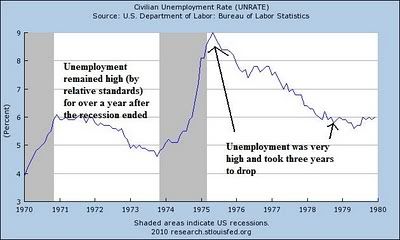
Note that after the mid-1970s recession, unemployment hit 9%. After four years it dropped to 6%, but never hit 5% -- the level most economists use to describe full employment.
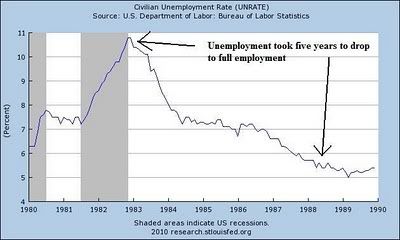
After the second recession of the early 1980s, unemployment was nearly 11%. It took over 5 years to get back to "full employment."
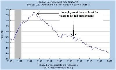
After the early 1990s recession, unemployment rose to over 7.5%. Again, it took over five years to get back to full employment.
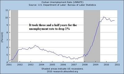
Although the unemployment rate increased after the early 2000s recession, it didn't hit very high levels. But like the last three recoveries, it took a long time (as in nearly four years) for the unemployment rate to drop.
This commonality with previous recoveries does not make the current situation any easier, and should not be used as justification for doing nothing. However, it is important to remember we've been here before.
Initial unemployment claims have remained at a stubbornly annoying high level for the better part of the year. However, this is not the first time we have seen this behavior from initial claims.
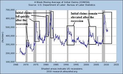
Notice in the above graph of initial claims there have been two different types of "recoveries" in initial unemployment claims; fast recoveries that occurred before the early 1990s expansion, and slow recoveries that occurred in the last three expansions. This is one of the primary reasons the last three expansions have been labeled "jobless" recoveries. I explained the reasons for this development of "jobless recoveries" in two posts, located here and here. NDD offered a rebuttal here.
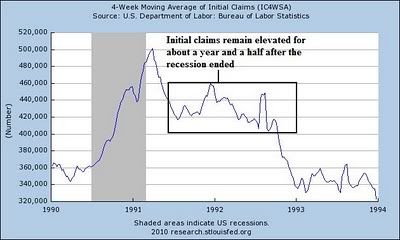
Taking a closer look at the early 1990s expansion, notice the initial unemployment claims remained elevated for about a year and a half after the recession ended.
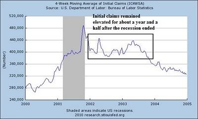
The same is true for the early 2000s recovery -- initial unemployment claims remained high for about a year and a half after the recession ended.
Notice that with this recovery, we are experiencing the same developments.
In short, it appears that while concerning, initial unemployment claims are behaving much as they have in the last two recoveries. This leads to a question regarding the definition of recovery -- that is, can you have a recovery without a drop in initial unemployment claims below a level of say, 400,000?
Conclusion:
In conclusion, the zombie bears are great at drawing attention to themselves and appealing to a reading populace conditioned to think the worst. However, they have been wrong on a continuing basis for the last five quarters in their predictions of impending doom. Economic analysis is about looking at data and interpreting data. That means the data will show expansion and contraction at different times. Noticing when that occurs is exceedingly important.


