As many of you know, I have a strong interest in political geography and making maps of election results and demographics. Therefore, when I had the opportunity to spend the month of January doing an independent study collecting election data and making maps, I jumped at the chance.
When most people analyze election results, they do so at the county level. However, being from New England, a region where local government is centered in the towns and where the counties are in various stages of irrelevance, I have long thought that county-level analysis simply wasn't good enough. This January, I made it my goal to collect the election results of the 2012 Presidential election, by municipality, for every county in New York, Pennsylvania, and Ohio (there are 218 in total). These three states do not have precinct-level election results on their Secretary of State's websites, and so collecting data from each county individually was the only way to go. Many of these counties had their election results on their websites. However, for about 150 of them, I had to e-mail the county and ask for them to send me the election results. By the end of the month, I was able to collect municipality-level election data from 211 of the 218 counties in those three states. The only holdouts were five counties in Pennsylvania and two in Ohio.
Using this data, along with ArcGIS, I was able to make maps of the election results. I thus present the maps below the fold. You can click on any of these maps to see larger versions of them. There won't be much commentary on the maps, but if you have any questions or comments about the maps, particularly about the patterns shown in them, feel free to ask in the comments.
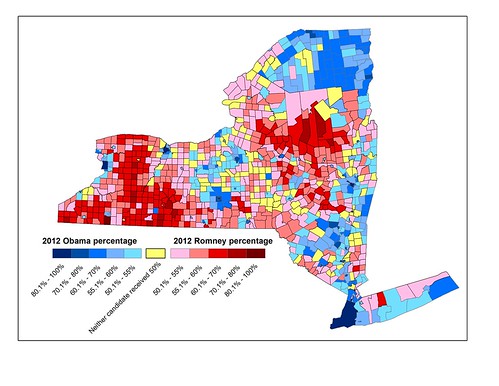
New York
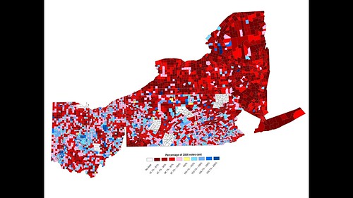
First I have my New York maps. This first map is the simplest: Obama's and Romney's performance in each town in New York.
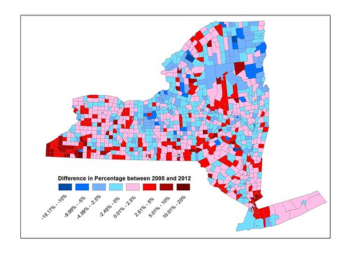
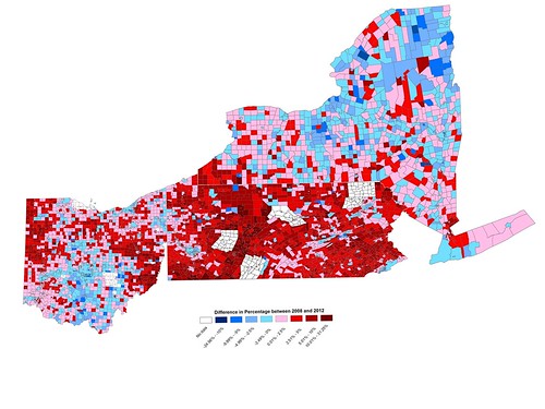
This next map shows the change in Obama's performance from 2008 to 2012. Unsurprisingly, blue means a town swung toward Obama, red means it swung away from him.
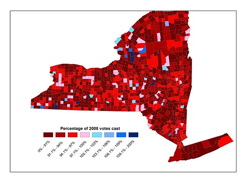
My final map of just New York shows the turnout in 2012 compared to 2008, calculated by taking 2012 votes cast / 2008 votes cast. Red means that more votes were cast in 2008 than 2012, and blue means vice versa. As the map makes clear, turnout in 2012 was much lower than in 2008 all across New York.
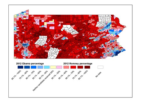
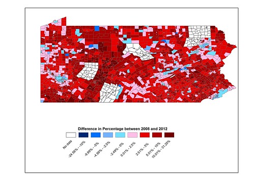
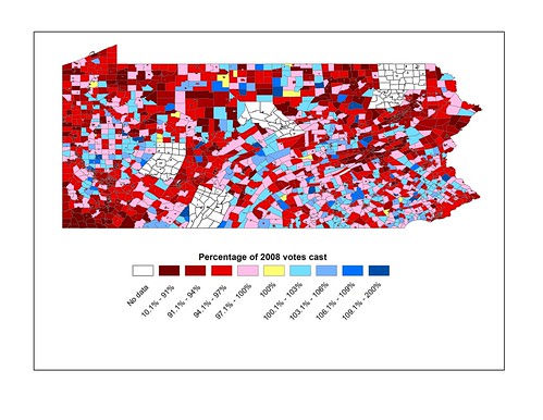
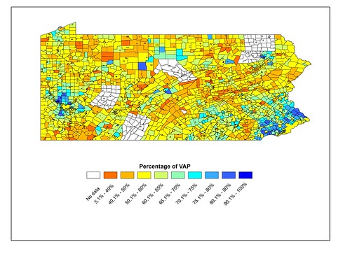
Pennsylvania
I now move on to Pennsylvania. Here is the Obama/Romney percentages for Pennsylvania.
Here is the change in Obama's performance, using the same scale as New York.
Here is the change in turnout from 2008 to 2012, again using the same scale as New York.
Finally, for Pennsylvania I also made a map showing the 2012 turnout not compared to 2008, but as a percentage of the voting age population (VAP) of each municipality.
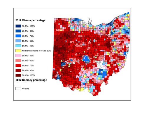
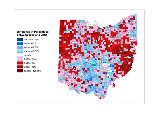
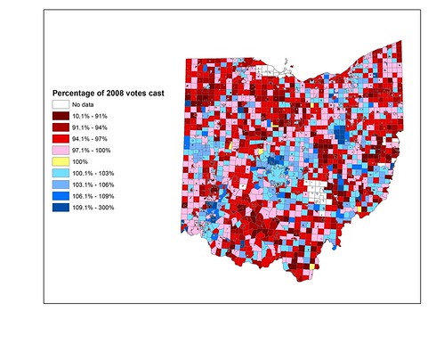
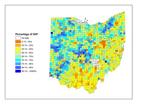
Ohio
And here are the maps for Ohio. All use the same scales as the maps of Pennsylvania and New York. I tried to be consistent when making these maps.
Obama's and Romney's performance:
Obama's swing from 2008 to 2012:
Turnout as a percentage of 2008 turnout:
And turnout as a percentage of VAP:
Grand Finale
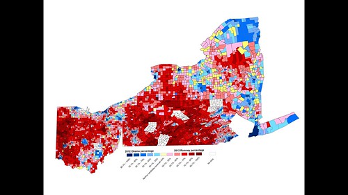
So now you've seen the maps of the individual states. However, you may be wondering what the maps of the states would look like if they were put together. Well, don't worry, because I've made maps of that as well.
Obama's and Romney's performance in all three states:
Obama's swing from 2008 to 2012 in all three states:
And turnout as a percentage of 2008 turnout in all three states:
Now that I've shown you these maps, what do you think? Any patterns that you notice? I'd love to hear your thoughts about them.

