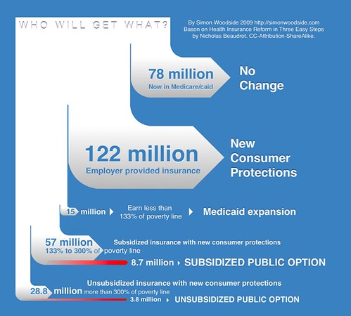
Here's another information graphic tribute to the "Simple Explanation" talk given by Christopher Hayes. I was inspired by Nicholas Beaudrot's flowchart but decided to take a slightly different tack, and show the # of people taking each option by the thickness of lines, and highlight those taking the public option in red.
This is licenced CC-BY-SA, so feel free to use it wherever youlike. If you have updates to the numbers or suggestions for improvements, I'd love to have them.
If you want to embed this image you can use this code:
<a href="http://www.flickr.com/photos/sbwoodside/3841492892/" title="Who will get What? by sbwoodside, on Flickr"><img src="http://farm4.static.flickr.com/3552/3841492892_864d5c0be2.jpg" width="500" height="450" alt="Who will get What?" /></a>
A bit related: my friend Paul Schreiber has been developing this site: Stories of Health. It's really good -- videos of people's health care/insurance stories.
