It's been almost 2 months since I wrote a diary about the state of the Arctic sea ice; at that point the melt season had just begun. Since then, things have moved along, at first slowly, but during May at an increasingly accelerated rate. The melt rate presently is comparable to last year's according to the latest press release from the National Snow and Ice Data Center (NSIDC), but in the graphic I'll show (and that has been front paged by MeteorBlades) sea ice is melting much more quickly than in the record minimum year of 2007. It should be noted that 2007 saw rapid melt later in the melt season that may not be replicated this year (shorter comment: current trends don't necessarily reflect future results).
One problem in quantifying the melt season this year has been the failure of the DoD satellite used to determine sea ice areal coverage. More on how that has been handled, and more details on the melt season to date and why it is proceeding as it is, below the fold.
An Aside: Climate change monitoring and creating time series from disparate data sets
Climate scientists looking to the past to get a handle on future climates run into a problem with how to reconcile the modern record with other ways of measuring climate state, including tree rings, pollen in lake varves (annual accumulations of layers of sediment), animal plankton, ice cores ... the list goes on and on). The reconciliation of these records can be
Even current observations from different platforms need to be reconciled with each other. And this is what has happened with satellite measurement of arctic sea ice. The sensor in the DoD polar orbiting satellite that was recording sea ice concentrations, DMSP13, was failing and then one day last month just went kaput. This was known to be happening and calibration had begun between the old data from DMSP F13 and a new satellite, DMSP F17, over a year prior. Information on this process can be seen at the NSIDC website here. The short version is that sensor instruments are NOT identical (even if they're built the same way) and even the same instrument can degrade over time; this results in the need to have overlapping data sets for calibration of old with new once the old sensor fails. That process for these satellites was completed on 2 June, and the interruption in the sea ice data was filled in with the results. The calibration results are shown in the graphic below:

You can see that the differences between the old and new are almost imperceptible. The press release states that mean absolute value of (positive and negative) differences were about 28,000 km2, on total area of from 5,000,000 to 15,000,000 km2, or about 0.5 to 0.16%. Not enough to matter.
Where Things Stand Now
Here is the situation, current as of 4 June:
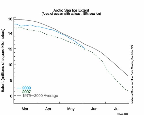
The current rate of decrease appears to be pretty alarming, though it is on par with last year's rate according to NSIDC. We went from approaching close to, though still a bit below, the long term normal by the end of April to the level near the 2007 record minimum season now, in a month's time. Why the rapid melt now?
Because we're standing on thin ice in the Arctic. I used this picture in a past diary. Note the location of the orange (as in Kos great satan) color depicting ice that is 1 year of age or less. There was lots more than normal at the maximum ice extent last March, as can be seen below.

This has been true for the last several seasons, in fact, and increases the variability of ice cover from month to month and from year to year, even with the secular downward trend.
The coverage of at least 15% per 25 km2 is shown here:
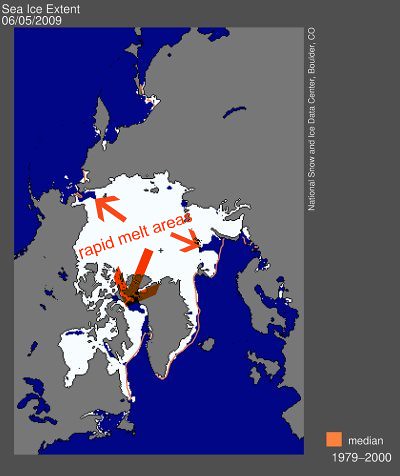
I've drawn in orange arrows to indicate where the sea ice margin is decreasing most rapidly. It's no coincidence that it is where the sea ice is youngest.
What to Watch for This Summer with Arctic Sea Ice
The relative progress of sea ice reduction will be the result of temperature (melting) and wind (moving and aggregating the sea ice) anomalies from now until September. Because of the inherent lack of predictability of the atmosphere beyond a week or so, it's pretty tough to make any hard and fast conclusions. However, we do have the current sea ice concentrations to look at for a few hints:
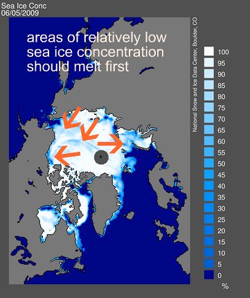
Concentrations are as in the color legend to the right. The bluer the area, the less ice there is. Areas where the sea ice concentration is relatively low are highlighted; again, note they are in the general areas where the sea ice and young and thus thin. These areas are where we should watch for rapid decreases in coverage.
It'll be interesting to see how things progress. After I saw the April report from the NSIDC, I was hoping sea ice loss on a year-over-year basis might actually be slowing down in a more significant way. But it's difficult to maintain young, thin ice, and the May weather pattern in the arctic, mild with south winds pushing the ice away from the Asian, North American, and especially Greenland land masses, resulted in a more rapid loss of ice.
