Yesterday I presented a visual representation of language used in the first 100 diaries collected from the Diaries page on the evening of 3/8/2011 and the morning of 3/9/2011 and asked for feedback on what, if anything, the visualization informed readers about.
I was pleased with the response, hey it made the rec list (first time on DK4), but I didn't get as much response with respect to the visualization as I'd hoped to. Seneca Doane challenged the utillty of the viz on plausible grounds, and I agreed to put up another version based on this morning's Diary list.
So, without further ado, join us beyond the doodle for the first Picture This smackdown.
The picture (click on it for a larger version:
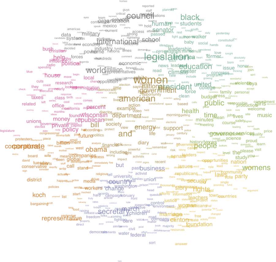
A few guide points:
All the words shown are in the top 25% of all words occurring the most recent 100 diaries (collected 3/9/2011 8:35 AM PST). Words that are close together co-occur in many diaries, those that are far apart are found together in fewer diaries. The colors indicate groups of words that may possibly suggest an underlying topic.
The challenge:
What do you glean from this picture? What insights on Daily Kos?
Do the colored groups of words indicate topics? What are they? Did you have to squint?
Does the central group of words strike as you correspondingly central to current concerns at Daily Kos?
Does the picture in any way inform you of "what's up" at Daily Kos?
On a scale of 1-5, does the picture rate a 1 - useless up to 5 - useful?
Any other comments welcome.
A reminder: this is produced in an effort to produce helpful or interesting views of the community product which is dailykos. It is a small beginning ... your help is needed to guide further work, so don't hold back!
Thanks to Seneca Doane for the challenge.
