Public Policy Polling for Daily Kos and SEIU (6/2-5, MoE: ±3.1, registered voters, Obama trendlines 5/19-22, all others 5/12-15):
We didn't poll over Memorial Day weekend on account of the holiday, but we were back in the field this past weekend, and as you can see, Barack Obama's numbers have returned to the levels we saw before Osama bin Laden was killed. But I'd mostly like to discuss the
awesome new visualization tool developed for us by Tableau Software, which is now embeddable, as shown below:
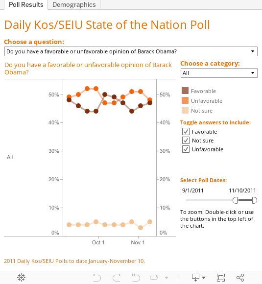
The tool (or "viz") is fully interactive and very powerful. Right now, it should be defaulted to Obama's favorability numbers, and his recent drop might look very steep. That's partly because the left-hand y-axis is showing a very narrow percentage range. Look for the "Toggle Answers to Include" area just to the right of the graph and click on "All." That will change the visualization to include those who answered "unsure." The y-axis should in turn change to reflect that, stretching out to accomodate the much lower percentages of people who don't have an opinion about the president (and making Obama's decline look less precipitous).
Now take a look at the very top of the viz. You'll see an area which says "Choose a question," below which is a pull-down menu. You can select any recurring question we've ever asked - Obama job approvals, Pelosi approvals, generic ballot, right track/wrong track, and more. Try selecting the question "Do you approve of the job Congressional Democrats are doing?" The viz should change accordingly. You'll also notice there are fewer data points than on the Obama favorables you were looking at previously, because we only ask this question every other week.
Toward the top right, you'll see a section called "Choose a category." This lets you zero in on the demographic groups you're most interested in. Perhaps you want to see how women feel about Dems in Congress versus men. Click on the pull-down menu and select "Gender." The viz will reconfigure itself yet again, offering separate trendlines for women and men. Unsurprisingly, women view Democrats more favorably than men. But perhaps more surprisingly, Dems saw a much bigger bump in their approval among women right after bin Laden's death — that's the narrowing between the lines you see on May 12.
Anyhow, those are just a few of the ways in which you can play with the new visualization tool. We're still tweaking and improving it, and we'll keep adding our polling data to it, which will make it even more robust as we move forward. What creative uses can you put it to? And what interesting trends lurking in the data can you spot? Let us know in comments!


