(For notes on how I put this graph together, see me after the flip...)
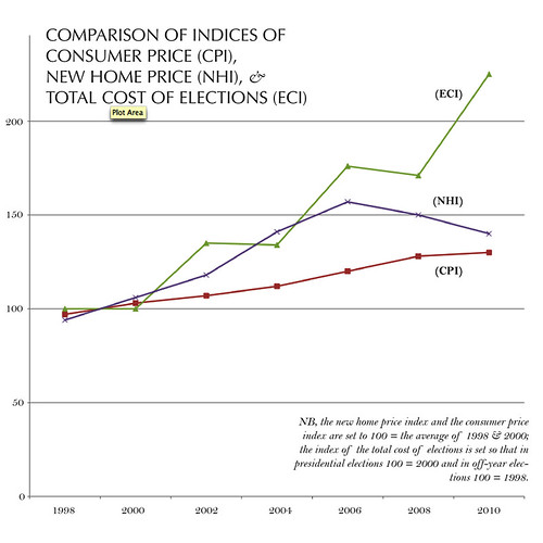
That bump you see in the New Home Price Index is the housing bubble. If that's a bubble, what do you call the skyrocketing cost of elections? I'm not sure what it means that the last decade has seen such a massive spike in the amount of money floating around, but it can't mean anything good.
That last spike, the one in 2010, that is just the start of Citizen's United; just imagine the spike in 2012 when President Obama's up for reelection and the inevitable corporate-backed attack ads hit.
As I see it, there are three ways to defend ourselves. If you're like me, then you don't have a lot of money to give, but you do have enthusiasm. I know that I intend to give my time and energy—and lots of it. The second way to defend ourselves is to support the few progressive counterweights we have, organized labor and groups like MoveOn.org. Lastly, information is power, and if we can shine a light on this money by passing something like the DISCLOSE act, then we might have a shot at shaming corporations when and if they give big money to conservative causes.
A bleg: I have no idea how to go about uploading the raw data that I used (an excel file); if you have any suggestions, let me know. In the meantime, if you're curious, I can email you with the raw data.
Total Cost of Elections from OpenSecrets.org: http://www.opensecrets.org/...
CPI from US Dept of Labor: ftp://ftp.bls.gov/...
Avg. Cost of New Homes from US Census data: http://www.census.gov/...
It's been a little while since I've done this sort of number-crunching, and if I made any errors or have completely mucked things up, please do let me know.
NB: the new home price and the consumer price indices are set to 100 = the average of 1998 & 2000; the index of the total cost of elections is set so that in presidential elections 100 = 2000 and in off-year elections 100 = 1998.
