Last week we joined with the Natural Resources Defense Council and the League of Conservation Voters in sharing our effort to map out gasoline use across the country, on a county by county basis. Our interest was to see if this data and maps would yield an interesting look at oil consumption and hot spots for consumption.
As a follow up, we are sharing some additional maps and a ranging of the top oil consuming states.
For the full story, check out the blog by Deron Lovaas.
Based on the map of total annual consumption by county, there was interest in a map on per capita consumption. As Deron notes in his blog, we were concerned that a per capita oil map would put a spot light on rural areas and communities well beyond urban areas where distances may be large between destinations but population is low. Deron notes that these areas may also appear "hot" because of through-traffic.
Below are excerpts from Deron's blog explaining this new map and ranking of top oil consuming counties:
We now present the new map (courtesy of NRDC’s map expert Rachel Fried) showing distinctions between counties based on gasoline consumption per capita (click image to enlarge):
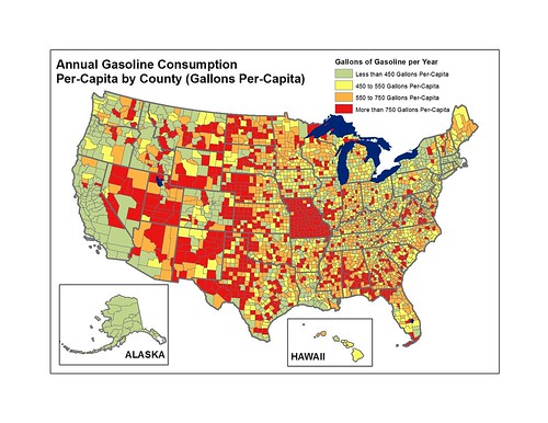
Counties that jump out can be found especially in the northern plains, the southwest and southeast. We do need to be cautious here, since the data may be poorly reported or otherwise faulty as we thought it might be for St. Louis County individually and likely for the entire state of Missouri. Overall, these are the places with relatively low population and therefore not the biggest drivers of absolute gasoline use even though each person is doing more driving to meet their daily needs.
We also have a new version of last week’s map. In that map, we looked at gasoline consumption based on last year's national average fuel economy standard. However, there's a difference between the test-value standard and the on-road standard plus there's a lag time between the application of that standard and what happens on our roads. Consequently while the relationships between counties were well-reflected in that map, the overall gasoline consumption numbers are actually higher when we went back and used a more accurate estimate of the national average miles-per-gallon of the fleet of vehicles on the road today. Here is a new map reflecting that reality (click image to enlarge):
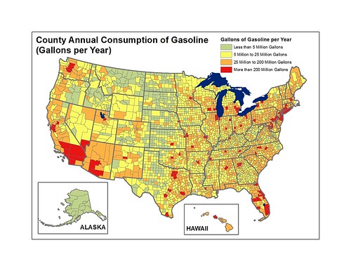
The biggest difference is an increase in the number of counties moving up to "yellow" status. And interestingly, both maps are probably more accurate for different parts of the country. This one probably overestimates consumption by counties with fleets that are more fuel-efficient such as those in California. And last week’s probably underestimates consumption in counties with less efficient fleets. What would really be useful for painting an even more accurate picture would be if states and counties tracked and published fuel-efficiency data for registered vehicles!
And thankfully the whole picture will get rosier as the fuel economy of vehicles on the roads improves thanks to the new standards the Obama administration has put in place.
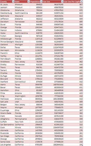
The most interesting thing we can do is to combine these two approaches -- looking at counties with the highest annual oil consumption with per capita consumption -- in order to identify the greatest opportunities for reducing oil addiction. For that purpose we have created a new table below. This table takes the top 50 counties for annual gasoline consumption and then ranks these based on per capita gas-guzzling. Here’s that ranking (click chart to enlarge):
Based on the results, and the response to them, NRDC will continue working with LCV and Sierra Club to analyze oil addiction geographically in order to determine the most compelling opportunities for reducing it
We hope you will stay tuned.
