A cartogram is a map which relays statistical data by rescaling geographical representations. In this case, the cartogram rescales the U.S. map by weight of electoral vote giving a much more realistic visual of how electoral votes aligned for Democrats & Republicans in the 2012 U.S. presidential election.
Let's compare:
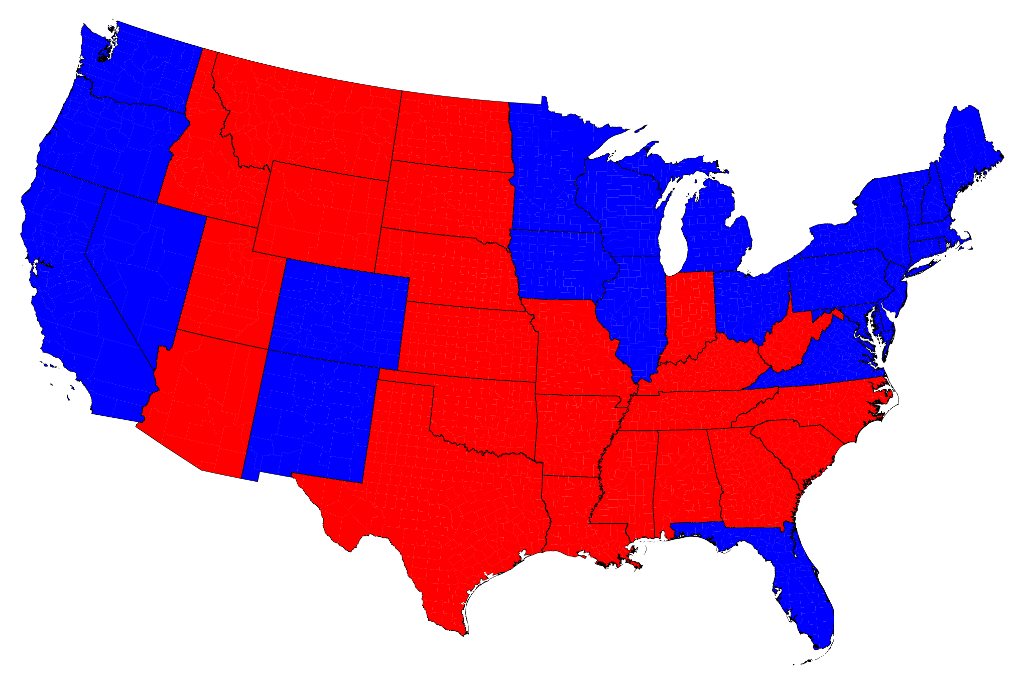
Here's a traditionally drawn map showing the presidential election results. The expanse of red gives a misleading visual impression. Although the final electoral vote overwhelmingly favored Barack Obama over Mitt Romney (332-206), the large swath of red makes it appear as if Republicans won.
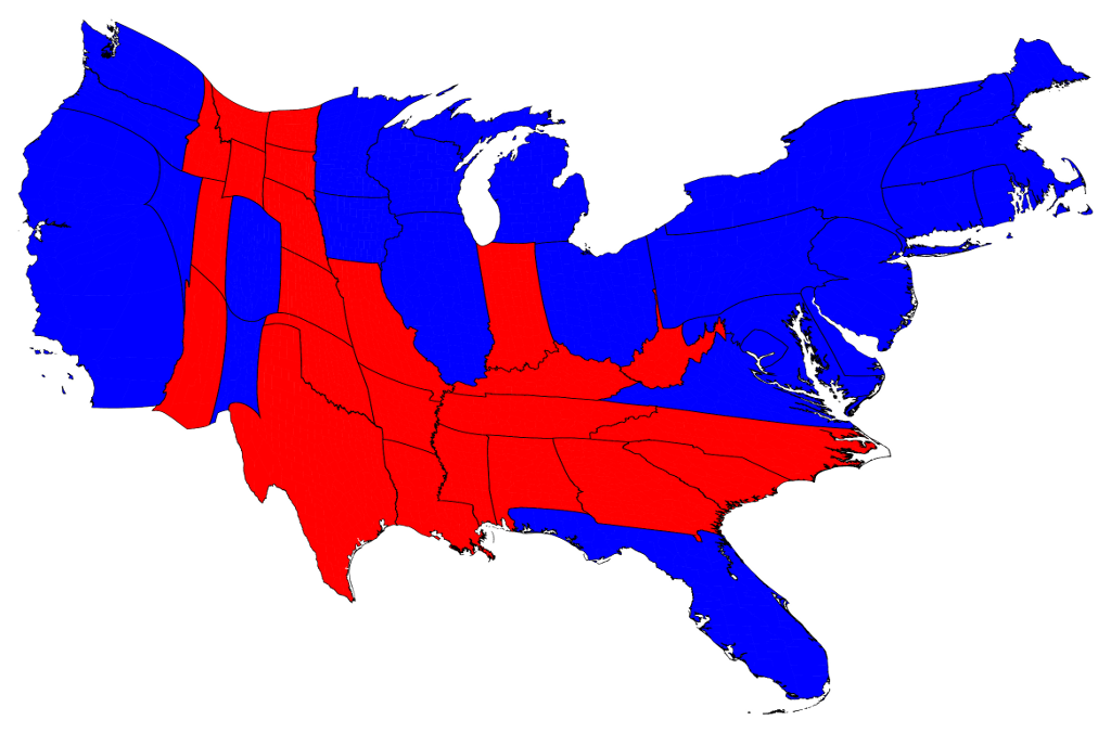
Mark Newman is the author of The Atlas of the Real World: Mapping the Way We Live and he's created more realistic views of the election results. His cartograms account for population density and number of electoral votes per state. He rescales states based on the data to show votes cast per presidential candidate.
Here's Newman's more accurate rendering of the 2012 Presidential Election Results:
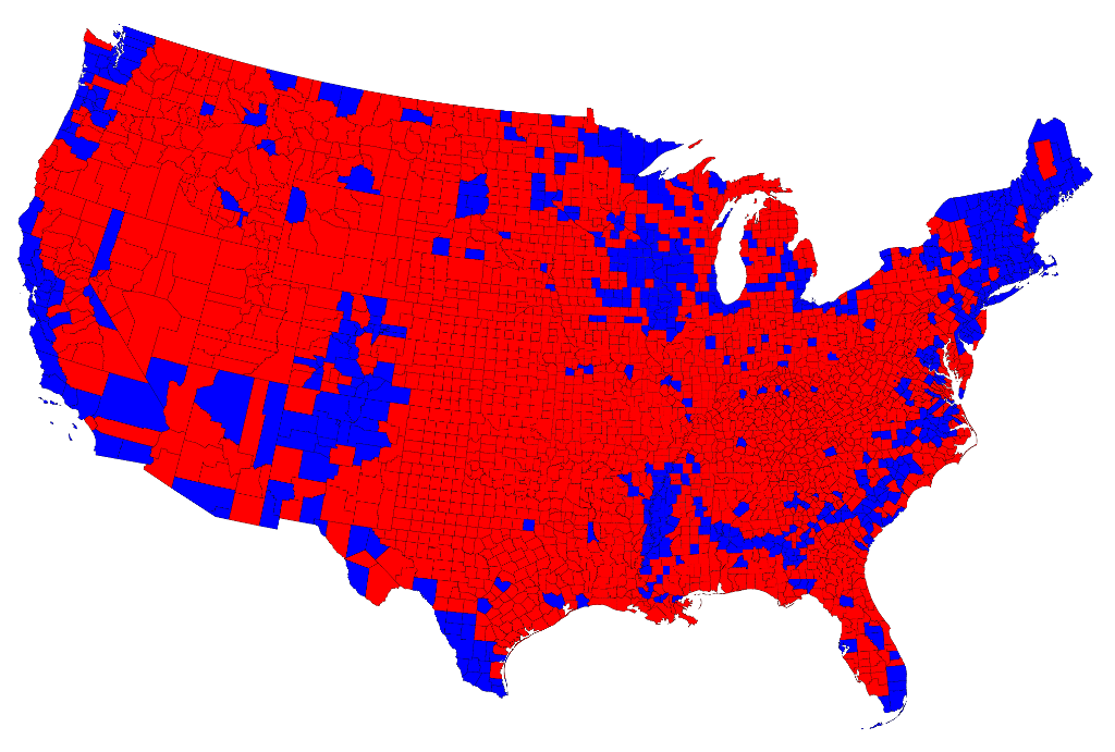
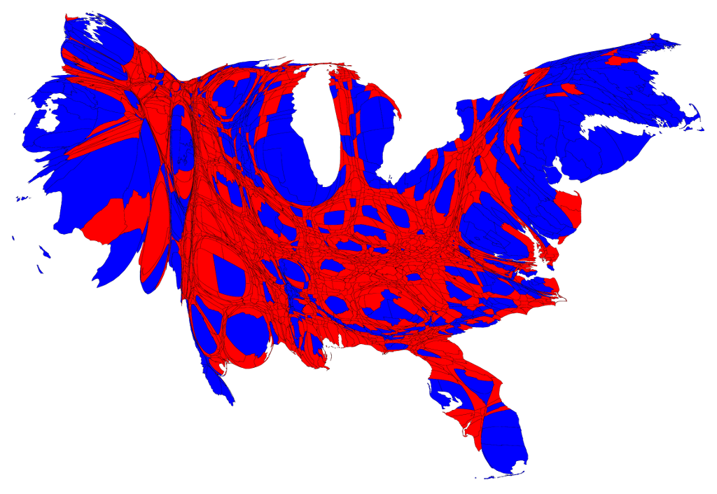
A cartogram was also created to reflect election results by county with counties divided red or blue by party majority.
Here is the traditional map we're accustomed to seeing:
And here's the cartogram with a much more accurate representation of Democratic rule (emphasis on 'rule'):
You can read and see more about Newman's cartograms at his website.
