Dartmouth College scholar Garrett Dash Nelson and co-author Alasdair Rae of the UK’s University of Sheffield created an illuminating map of America broken down by commuter patterns based on Census data. The map above illustrates how economic and living patterns often don’t match up with the existing state boundaries. Americans often live not just in metropolitan areas, but in an even broader patchwork of mega-regions.
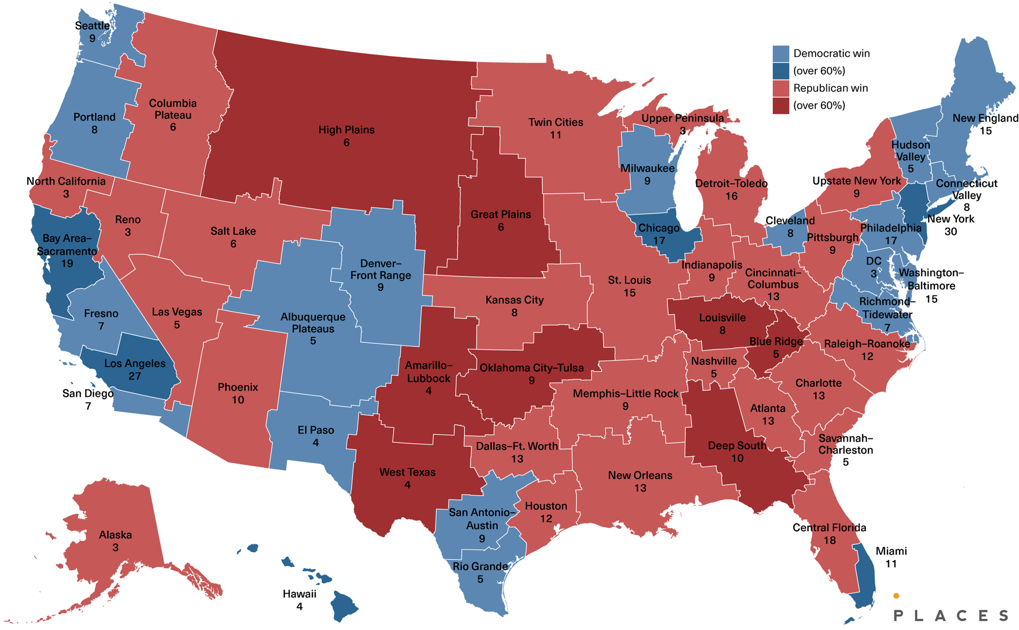
If this map weren’t cool enough already, artist and urban planner Neil Freeman calculated the 2016 presidential Electoral College outcome if these commuter regions had been states. You could even do something similar for your own hypothetical state boundaries by using this awesome tool that data scientist Kevin Wilson created recently that lets you reassign counties between states. As shown below, Donald Trump would have won 294 electoral votes Clinton’s 258, with a margin just half the size of his 306 to 232 victory in reality.
It just goes to show how arbitrary the existing state boundaries are thanks to quirks of historical cartographic decisions taken decades or even centuries ago. If we had somehow redrawn our state boundaries to better reflect how Americans actually live today, we just might have ended up with a different president in 2016.
 Click to enlarge
The above map shows what the states would look like if they were redrawn based on the commuter patterns seen at the top of this post.
 Click to enlarge
And here is the approximate Electoral College outcome courtesy of Neil Freeman for Places Journal.


