In a previous diary someone asked me about contrast and more specifically how my photography had more contrast than others. I was about three paragraphs into the reply when it dawned on me that the topic was a much more complex one than I'd originally thought and I said at the time that I would write a post on the subject. Unfortunately I cannot find the original comment, so if the person who asked knows where it is I'll happily add it to this post and beg forgiveness for not bookmarking it at the time.
Crossposted on my blog: Contrast | Minimalist Photography
The Independent UK Changes My Life
In 1986 something momentous happened in the world of British journalism. A new broadsheet was launched, It was touted as center left and largely out of the tensions created by Murdoch but that was not the momentous thing. The momentous thing was that the paper put emphasis on the quality of the photography that it used. The newspaper in question? The Independent, one of only two British papers worth a look - the other being the Guardian.
In 1986 I was running a non-descript bar, or pub, in a town in the West of England. I had yet to pick up a camera seriously. I was into politics though and wanted to read what the journalists who had rejected the union busting Murdoch business model were writing. I purchased issue number one of the Indy.
I was impressed by the quality of writing but I was blown away by the quality of the photography. The lines were clean, the images themselves were uncluttered and they were obviously considered as important as the writing - which was far from tabloid, believe me. It is hard to get across just how revolutionary the idea that a news picture could have aesthetic qualities and not just be a grainy hard to interpret space filler.
At the time I couldn't put my finger on why the images were so good, sure, I could see that the newsprint was a little whiter and that the image composition was better, less cluttered and that the pictures were given room to 'breathe' in the layout but there was something else. It was only years later when I started developing my own images that I realized what the difference was that I was missing - It was contrast pure. I suspect that the photo editor was taking advantage of the then brand new computer technology to make more of the light areas white and more of the dark areas black - in other words increasing the contrast.
This simplifying by reducing the number of different shades of gray gave the images punch. It made them pop. Rather than the viewer having to make a decision to decode the various fuzzy bits of gray the images now jumped out at the viewer and demanded attention. They demanded to be looked at and absorbed before a word of type was read. To this day I'll never forget my reaction to those black and white images on the first edition of the Independent, those wonderfully clean lines. Looking back, I suspect that was one of those moments that changes a life but seems so inconsequential at the time.
Typical Independent photograph
Here is another one
They are both small and have copyright emblazoned across them but they should be enough to get an idea of what I'm going on about.
Although I've only recently realized it, it is that aesthetic that I've used as a foundation for just about everything that I've done with a camera. It allowed for relatively complex images to be reduced, to be simplified into something that the brain could absorb and hold.
I was going to go into some detail about the technical side of contrast and explain the joys of histograms and the zone system but while I was using the internet tubes to brush up I came across this which does a better job of explaining than I ever could. This will not make your eyes glaze over.
explanation of contrast that I have read anywhere
In traditional black and white photography, the aim is to present a picture where there is at least one area of the picture which is as dark as your display medium, whether it be printed paper or a computer screen, will allow and another area which is as bright as it is possible to be.
If you have achieved this, the picture is said to have maximum contrast and the image will appear punchy and alive, with very rich tones.
The article goes on to explain the very closely related topics of histograms and the zone system with amazing clarity.
Final Thoughts
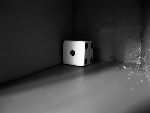
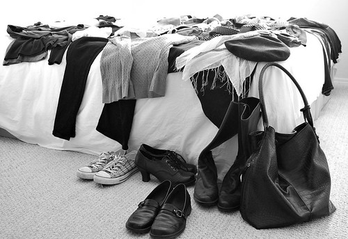
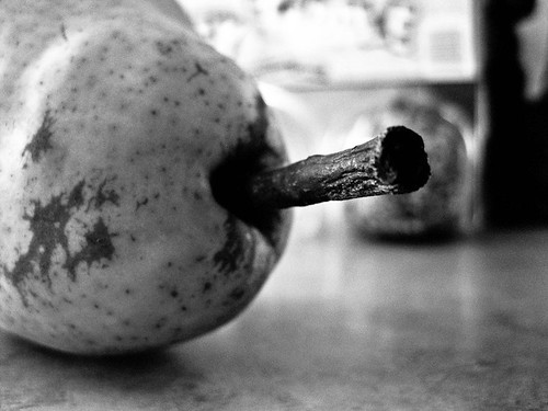
The images used in this article have all been modified with regard to contrast.
The clothes on the bed didn't need a lot of work so I just used the basic control that is available on every piece of imaging software on the market which basically works by making the lightest tone white and the darkest tone black regardless of what they are to start with and stretches all of the midtones between the two extremes.
The pear on the other hand got a more sophisticated treatment which involved sharpening up the edges in the midtone range.
Everything concerning contrast applies to color images as well as black and white. Color just introduces more variables but the principles are exactly the same.
