Sometimes a graph is worth a thousand surges.
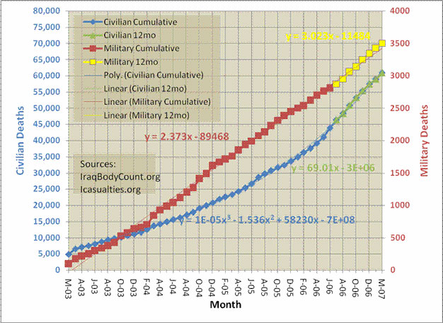
We've all heard the statistics. Over 3,330 dead US soldiers, something like 65,000 Iraqi civilians killed (if you believe the reports).
Maybe I haven't been paying attention, but when a friend recently sent me the graph below, I was stunned. How long do we continue to beat our head against the wall, over and over and over, before we try SOMETHING else?
Here is the graph:
Here are the comments Bob sent with his graph:
I’ve been poking around with Iraq war numbers and put together this depressing chart.
If you do linear regression on military deaths for the entire war you get about 2.4 deaths per day. If you do the same analysis for just the last year you get 3.0 deaths per day. Just looking at it you can see it is pretty linear.
Of course there have been almost 20x civilian deaths in total. You get a pretty good fit using a 3d order polynomial approximation. But if you want to just look at the last year and do linear regression on it you get about 70 deaths per day.
What is amazing to me is just how consistent these numbers have been for years now. Zero progress on rate of military deaths. Increasing rate of civilian deaths. For the last year civilian deaths > 20x military deaths.
Have you seen this chart before? I’ve been watching it for a long time but I always wanted to see the civilian count overlaid.
Just look at the trajectory. Just think of the continuing sacrifice shouldered by our military and the civilian population of Iraq. Just ask yourself - aren't we smart enough to try something different? What Albert Einstein said: "Insanity: doing the same thing over and over again and expecting different results."
