 You may remember me reviewing the Republican and Democratic primary candidates' campaign logos 15 months ago—yes, it's really been that long. I mentioned in July that I'd come back after the vice presidential picks were named and give my thoughts on the two nominees' fall collections, as it were. My verdict: both candidates display a regrettable retreat from their pre-convention high points, but overall this is a very, very good year for campaign logos.
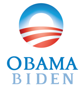
Obama/Biden 2008
No candidate in recent memory has drawn more attention for his campaign graphics than Barack Obama, whose elegant "O" logomark and insanely disciplined use of fonts and colors (about which I hope to write another diary soon) have stood out in an area—political campaigning—that is not generally known for producing memorable graphics. 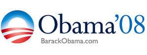 When I reviewed Obama's original primary logo last year, I gave it a B+, citing a couple of rather obscure technical issues I had with it. Today, I think I'd retroactively raise that grade to a solid A. The interplay between Perpetua and Gill Sans, two gorgeous fonts by brilliant-designer-slash-sick-bastard Eric Gill, is just too heartbreakingly beautiful to ignore... plus there's that "O" mark, at once evoking the American flag and the sun rising over farmland. This is a logo that deserves to be remembered by history.
 Then, just when everything was going so well, the campaign switched over to this funny-looking thing for some reason. The obvious impetus was the campaign's adoption of the striking sans-serif Gotham (used to render the URL here) for anything and everything coming out of their house, as well as the palette of muted blues that they'd adopted for their signage. But that neither explains nor excuses the bizarre "dog bone" shape created by setting the capital O and the numeral 8 below the baseline. Nor did it require throwing over Perpetua, one of the most beautiful serifs in existence, in favor of a heavily-modified rendition of a relatively new and untested font, Requiem. (You'll note, by the way, that both Gotham and Requiem are produced by the same foundry, Hoefler & Frere-Jones. When Obama becomes president I think we're going to need a special prosecutor to look into this.) If I were to review this in isolation I'd probably conclude that it's a pretty good logo, but I can't help but compare it to the much better version that came before. Call it a B-minus.
So now Joe Biden is on the ticket, and we have a new logo. This one uses the color palette from the second logo and of course maintains the "O" wordmark everyone likes so much, and ohh thank you Jesus the text no longer looks like a giant dumbbell. I don't think anyone would deny that it's a pretty good mark. Still, there are things about it that bother me. Surprisingly for a "change" candidate, it violates the First Law of Campaign Logos (serif for incumbents, sans-serif for challengers). One might suppose that the idea is to convey a sense of wisdom, stability, whatever, but I don't think it really works. I think the problem is that I just don't care for the goofy font that much. Requiem is a Renaissance-style typeface that features fine, delicate serifs on even the display-friendly weights. Here, they've pumped the serifs and strokes up so much that the font becomes almost a slab serif, which just ends up looking strange. Compare the stroke of the elegant, classically-styled numeral 0 in Obama's second primary logo with the much thicker, almost loutish stroke on the capital O at left, which looks like it got lost on the way to another font somewhere. I guess I can live with the capital B, but don't get me started about the capital E.
But look, all these complaints make it sound like I hate the logo, which I really don't. It's a very strong mark that any one of us should be proud to sport on our bumpers (unlike, say, 2004, about which I'm still angry.) Grade: B+
McCain/Palin 2008

John McCain also had one of the strongest logos during the primary campaign, featuring the classic Hermann Zapf typeface Optima--an overused face, to be sure, but never a tiresome one. 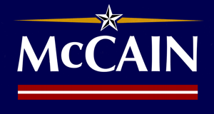 One aspect of this logo that has received surprisingly little play in the media is that Optima is the face that was used to inscribe the names on the Vietnam Veterans Memorial in Washington, something that you can be damn sure is not a coincidence. Indeed, McCain's primary logo was shot through with nicely subtle quasi-military embellishments, the most overt of which was the "general's star" above his name. Less remarked on, probably because it rarely appeared anywhere but on yard signs, was the red-white-red stripe underneath, reminiscient of a military campaign ribbon. With a little imagination, one might even liken the golden rays on the right and left of the star to the "scrambled eggs" on a Naval dress hat. When I reviewed the primary logos last year I gave this one a B+, the same grade I initially gave to Obama's first logo.
Like Obama, McCain didn't change his logo very much for the general. The colors are the same, the star and rays are still there, and it still uses the same font. For some reason, though, the new logo features a distinctly bolder weight of Optima, making it look less like the Vietnam Veterans Memorial than like the cover of a 1970s sociology textbook. As elegant as Optima's gently flared strokes look in its thinner weights, they just look exaggerated and weird when the face gets this heavy. Like many general election logos, this one displays the telltale signs of being thrown together too hastily: notice in particular the amateurish misalignment of the golden rays. Click around McCain's site and you can see examples where the rays are too high, too low, too far apart, and generally all over the place. It's like they don't even care.
Implementation difficulties aside, it's still a quality logo, and certainly light-years ahead of the uggo marks used by every Republican presidential candidate since 1988. I worry that McCain's increasingly inevitable loss next month is going to send Republicans the message that good-looking logos lose elections. That's not change we can believe in. Grade: B

