Given the attention that polling error has received this cycle, I thought it might be useful to compare Sen. Clinton and Obama's actual votes against their polling averages.
My guess before running the numbers was that Sen. Clinton faced a much stiffer ceiling and floor than Sen. Obama, whereas his numbers would be more fluid.
Considering that the following could be seen as a report card of sorts for both the candidates and polling organizations, I'd like to point out that prognosticators of any breed face a difficult task. When it comes to weather forecasts, movie reviews, and yes, political polling, it seems the public often ascribes a generic distrust of results, because they remember the one time polling was off by 20 points and not the 19 times it was right on the mark. Below for charts...
Now to the good stuff. I charted Hillary Clinton and Barack Obama's performances in each state with available data. Each plotted point represents one state. The x axis represents the forecast, and the y axis represents the actual results. Sounds complicated, but I promise it's actually pretty simple.
First, Obama. The sideways line indicates where polling and reality meet -- i.e. a perfect bullseye. Basically, any point under the line equals Obama underperforming in the state, and any point over the line is Obama overperforming in the state.
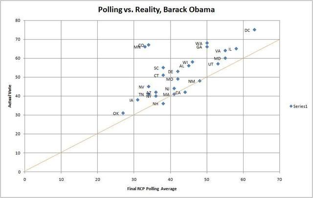
As we can see, Obama slipped below the polls in New Hampshire and California. Polling was dead on in Massachusetts and New Mexico. Other than that, Obama overperformed in every state, to varying degrees. What is also interesting to me are the geographic patterns: Nevada and Arizona are clustered, as are the caucus states of Colorado and Minnesota, and the Northeastern states of New Jersey, Massachusetts and New York. In the Southern states, however, polling has varied. Final key stat: Obama beat the polls by double digits in 11 of 25 states examined. Now for Clinton.
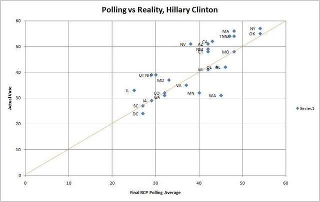
Clinton is a gift to pollsters. Her chart looks almost as if the line were fitted. In 9 of 25 states, the pollster average was either her exact percentage or only off by a point or two. Among the other notables, she actually solidly overperformed Illinois, which makes me wonder if sending Bill there helped. Also, the Western states all clustered for her nicely above what polling indicated, except for Washington where she badly underperformed. I was going to attribute this to post super tuesday momentum, but Wisconsin doesnt display this. So you might argue that she should have contested Washington State more.
Visually, you can see the difference from Obama's overperformances to Clinton's core base that polling picks up and actually turns out on election day.
To me, this is an indication that there truly is something to be said for a narrow Clinton floor-ceiling.
A final stat I took from this data:
Average Clinton variance from polls: +2.5%
Average Obama variance from polls: +9.5%
It will be interesting to take these trends and see how March 4th plays out. I think Clinton is probably hanging on for dear life in Ohio but holding at 50% is definitely a good sign for her. Texas, not so much.
I thought it might also be fun to see if maybe ad spending is affecting performance, or look into crosstabs and see if any particular subgroups are being under or over represented. But what do you guys think? Looking at the charts yourself, did I miss anything else interesting?
