Yesterday, the NYT made an excellent Graphic showing how a few demographic questions about a county make it highly likely it was carried by Clinton or Obama. I decided to look at all the upcoming races, and post maps to show my findings.
North Carolina:
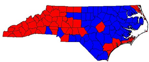
This was an easy map to do. Since North Carolina is a state in the South, the "only" counties Obama is favored to carry are those which are over 20% African-American or very highly educated. Fortunately for Obama, almost all of the Piedmont and coastal counties meet the black threshold. The only counties which are overwhelmingly white he will probably win regardless are Orange (home of UNC Chapel Hill), and Dare (a Republican-leaning county which is mainly made up of the outer banks). The Clinton-leaning areas extend further in from Appalachia than I expected, but all of the major, democratic-leaning population centers are going to be carried by Obama, which suggests a major win as expected.
Indiana:
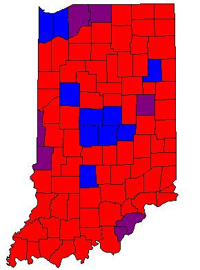
Indiana was the most complicated state to analyze, as several counties needed to be followed all the way down to their PVI in the last election. Unlike other maps, I included "purple counties." These are counties of moderate education (between 78% and 87% HS graduation rates). In the South, these overwhelmingly go for Clinton, while in the North, it depends upon poverty rates, population density, and partisanship. Essentially, if Indiana acts like a midwestern state, Obama will carry these counties, but if it acts like a Southern state, he will only carry the blue counties. My guess is it will be a little of both, with the Ohio river counties opposite Louisville out of reach, but the northern purple counties winnable. Either way, he should be strong in both NW Indiana and Indianapolis, and the contest itself is on a knife's edge.
Kentucky
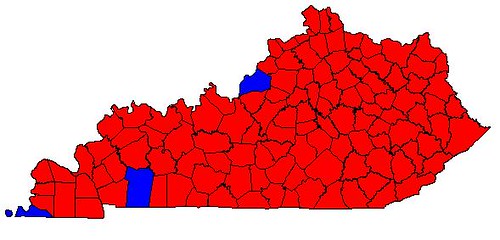
Outside of metro Louisville, there are only two counties in southern Kentucky Obama is likely to carry - the only other two counties in the state with substantial African-American populations. This bodes very, very poorly for his statewide margin.
Oregon:
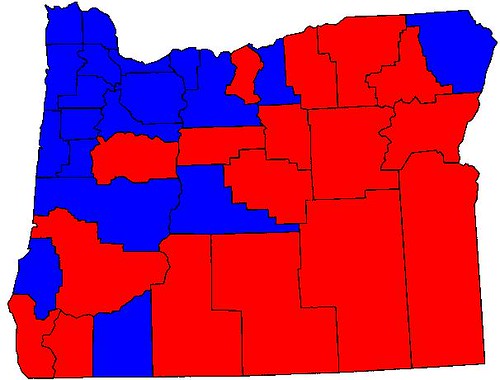
Obama should easily carry the entirety of metro Portland, as well as most of the Willamette valley. The regions he is projected to do poorly in are very sparsely populated. This suggests to me a romp even larger than North Carolina percentage-wise, although the model doesn't project the margins within the counties
West Virginia:
No map here. Why? Because Obama will lose every county. It's a southern state with almost no blacks, where not a single county is highly educated. He might pull off a win in Putnam (suburban, rapidly developing), Monogalia (home of WVU), or Kanawha (state capitol, 7.4% black), but the numbers make this look unlikely.
South Dakota

On the face of it, this map looks horrible for Obama. However, his counties are all of the population centers: The area around the State Capital, Greater Siouxland, and the Black Hills. Much of the rest of the state is sparsely-populated farmland. This means he should win here, although it will likely be closer than some think.
As an aside, a lot of the "Clinton counties" both here and in Montana, have a large Native American population. The low family income and low graduation rate suggest that these would be Clinton counties, but I don't think that we have enough information about how Obama does with Native Americans to make a determination.
Montana:
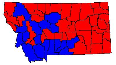
Again, this map isn't as bad for Obama as it seems. He carries every single county in Western and South Central Montana which has a major population center.
I think this model has its flaws, but it is interesting. Thoughts?
