Becca of DelphiForums noticed an interesting coincidence between the current gas price temperature map and the results of the 2004 Presidential election: can you spot it?
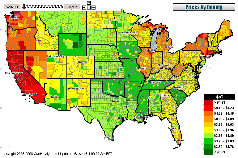
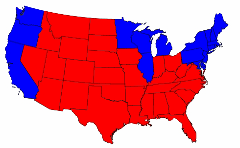
Could this simply be a coincidental reflection of relative demand, population density or other economic demographics, or potential market manipulation by commodity traders, now under investigation?
It's not as thought there's any kind of evidence of Republicans ever gaming the system, right?
If this has been diaried already, let me know -- thought I saw it elsewhere, but can't find it.
