Because I am a nerd, and find strange things fascinating, one day, a couple years back, I started noodling around in the CIA World Factbook Now, I know some folks are going to say that some of that data isn't reliable, that it presents the history and so forth inaccurately, and that's ok.
But open the file for a few countries you're curious about, or interested in, and scroll down the page to the economic data. It gives statistics on all kinds of stuff from literacy to infant and child mortality, to GDP and something I didn't know about before my first meandering there. The GINI Coefficient. Today, I'd like to introduce you to my friend GINI, because I think she'll become your friend too. She's got the kinds of stats that can throw you for a loop. But be prepared. GINI is brutally frank, and not for the faint of heart.
WTF is the GINI Coefficient?
Briefly, a measure of the distribution of income within an economy.
More specifically from Wikipedia:
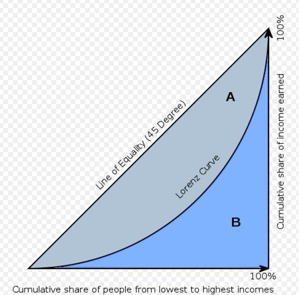
The Gini coefficient is usually defined mathematically based on the Lorenz curve, which plots the proportion of the total income of the population (y axis) that is cumulatively earned by the bottom x% of the population (see diagram). The line at 45 degrees thus represents perfect equality of incomes. The Gini coefficient can then be thought of as the ratio of the area that lies between the line of equality and the Lorenz curve (marked 'A' in the diagram) over the total area under the line of equality (marked 'A' and 'B' in the diagram); i.e., G=A/(A+B).
The Gini coefficient can range from 0 to 1; it is sometimes multiplied by 100 to range between 0 and 100. A low Gini coefficient indicates a more equal distribution, with 0 corresponding to complete equality, while higher Gini coefficients indicate more unequal distribution, with 1 corresponding to complete inequality.
The lower the GINI, the more equally is wealth distributed in a country.
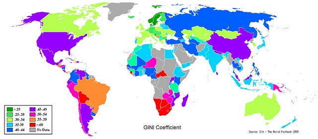
For the more visually rather than numerically oriented, here's a pretty colored picture to look at. Please note the countries which share the US's pretty purple GINI costume.
H/t to Dbug for explaining how to include this table.
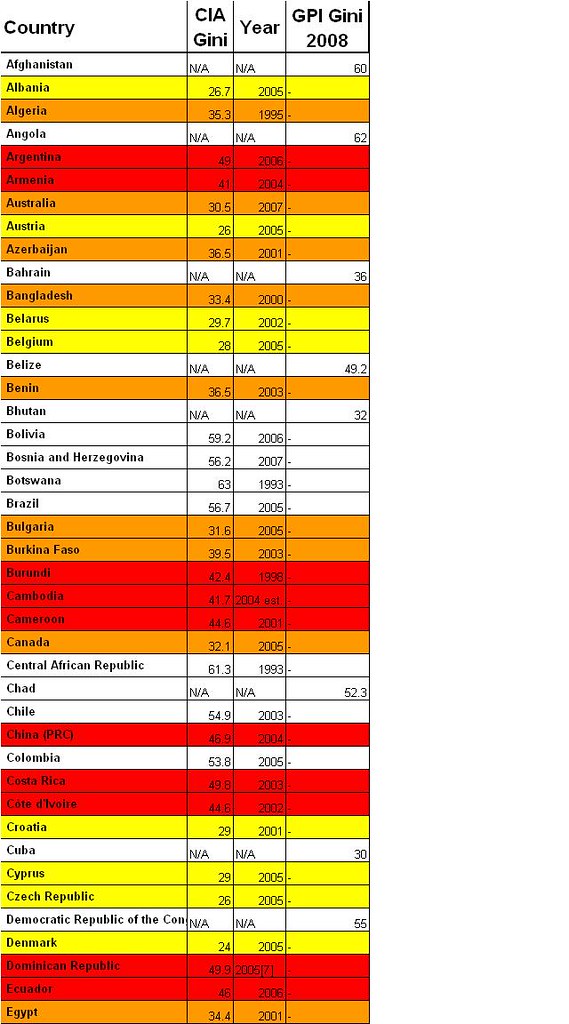
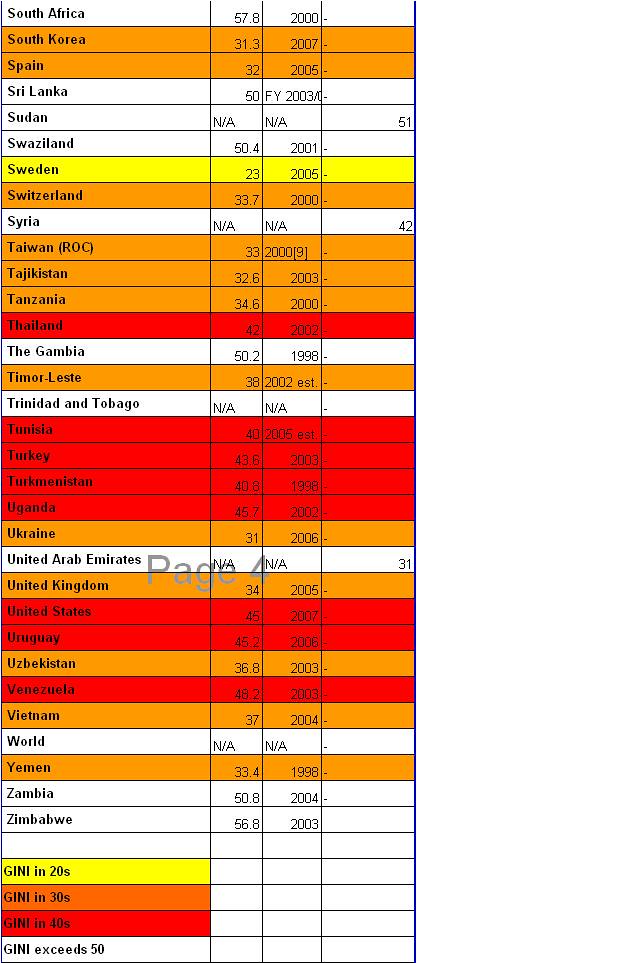
For the numerically inclined, here are the hard numbers. There are still a few imperfections in this table, but I've reached my limit of being willing to finesse the details.
Legend to the colors at the bottom:
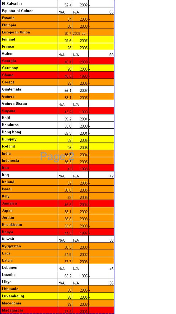
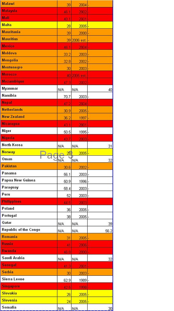
Would you just LOOK at the other countries we share the 40s with! It's absolutely appalling! What is even more appalling, is that these numbers exist and yet, in the minds of so many Americans, we've just got everything so much better here than does the rest of the world.
H/t to Dbug for explaining how to include this table.
If someone would tell me how the heck to insert an excel chart with a numerical breakdown for the GINI, I'd be very grateful, because I cannot figure out how to get those handy dandy tables in this space.
We would really be leaving off an important part of the discussion about my friend GINI if we didn't discuss trends, now, wouldn't we?
So, take a sneak peak at GINI's trendline since WWII. EEwww. WHO decided to give the US that awful puke green color to wear?!!!!
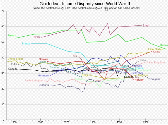
Take notice of something. Check out our good friend the UK (they gave HER a pretty pink dress! ::pout pout::) and the US. Notice how things were going till about 1980? Notice how things have gone since then? Iron Lady Maggie and Ronnie Raygun had quite the lasting trendy impact, haven't they?
I think it's clear to just about everyone that the middle class in the US is disappearing. There have been a few diaries lately about some American 'truths'. Here are a couple of them:
make a difference
teacherken
For my money (of which there isn't any lately), there is absolutely nothing as disruptive to the idea of American Exceptionalism as is intimacy with my friend GINI. I hope you've enjoyed getting to know her as much as I have.
If you want to read more than Wiki about GINI, here are some other sources:
World Bank
Hofstra University
Sustainable Middle Class
