The following is a set of charts explaining the US tax code, or more appropriately, the net effects of the tax code. It is more straightforward than you might think, but I'm assuming readers know something about taxes. This is mostly to put into pictures alot of the themes of taxes and tax reforms. A picture is worth a thousand words (or so they say) and hopefully a good mental image of what is going on will tune you to the dog whistles of tax reform. So, here it goes:
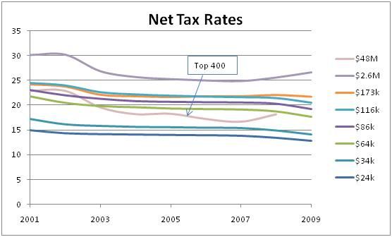
The tax code starts with tax brackets. In general, the more you earn, the higher the tax rate. This first chart shows the net income tax for various incomes and how they have changed over the last ten years:
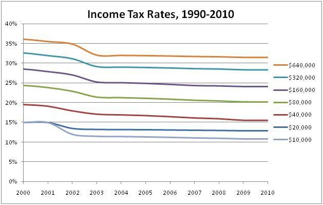
To use this chart, pick a year and move up to the line closest to your income. For example, in 2007 a person making $40k was facing an income tax rate of about 16%.
Notions of fairness aside, the lowest incomes are taxed at about 1/3 the rate of the highest incomes. But, the brackets are only the start. Next come the deductions. Deductions allow you to reduce the amount of income you pay taxes on. They could be unavoidable costs associated with work (such as a gas for your car because you travel for work), things the government wants to encourage (such as home efficiency improvements), or whatever. But, we don't need to go into detail, all we need to see is the net effect of deductions.
This next chart is average deduction taken by income range for 2009:
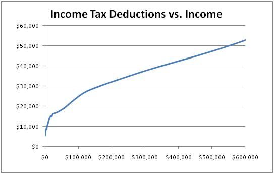
The more money you make, the more you can claim as deductions. It might look outrageous for high earners to claim more and more as deductions, but beware of “friends” offering to close those deduction loopholes and make everyone pay a “fair share”. If you look at deductions as a percentage of income, you get this:
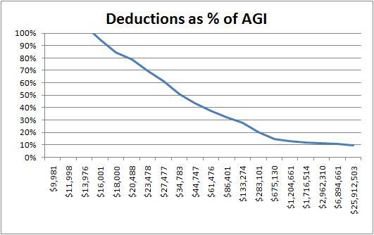
Deductions increase with income, but not as quickly as the tax rate. Lower income earners benefit by being able to deduct a larger percentage of income. Many people can deduct all of their income and pay no income taxes. If you don’t pay very close attention, “closing those loopholes” is going to kill the lowest wage earners with massive tax increases.
When deductions are figured in, the tax code looks something more like this:
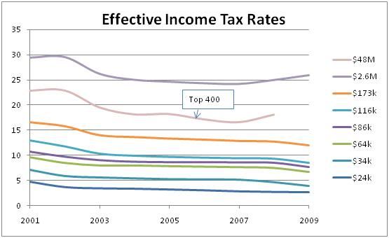
This is the chart most people look at and whine that “it isn’t fair” that low earners pay such a small percentage in income taxes. Of course, the “Top 400” earners aren’t usually added. Way out beyond the edge, the deductions trend line must shoot straight up, because the Top 400 are paying a lower rate the simple millionaires.
Of course, just because the conversation usually ends here doesn’t mean the story ends here. Next up is the great equalizer: FICA taxes.
FICA taxes are paid at a constant rate up to a cap, and then they max out. For 2009, they looked like this:
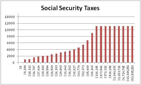
This chart includes both employer and employee taxes. The employee side taxes (1/2 of the total) only show up on your w2 and are not part of your income tax calculation (which is probably why people forget about them). The employer side taxes you never see. When these taxes are figured in, the net tax chart looks more like this:
Now the tax code looks much flatter and the Top 400 are at the low end of the rate scale. FICA taxes have such a dramatic effect because most people pay more in FICA taxes than they do in income taxes:
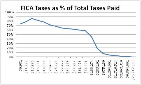
It sure would be nice if people looked at their tax filings before putting on their pointy hats and protesting income taxes. This chart is for 2009 and doesn't reflect the payroll tax holiday of 2010.
Of course, you could argue that social security taxes are returned at retirement and therefore shouldn’t be included. Yeah, but people who make less than $86k shouldn’t be donning pointy hats and protesting income taxes. They should be protesting the crappy interest rate being forced on their social security retirement savings. And, considering the crappy rate and $2.6T surplus, it cannot be denied that social security is subsidizing the federal budget.
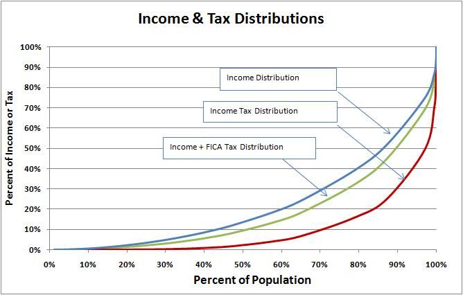
Here is one last chart to throw it all together: income distribution (blue line), income tax distribution (red line), and income + FICA tax distribution (green line). The x-axis is the percentage of the population, the y-axis is the percentage of income or tax that they receive or pay. If the tax line were on the income line, that would be a flat tax.
So, what are the take-aways?
Deductions help the lower-income earners the most. Making the tax code "flatter" or "eliminating deductions" will most likely hurt the low income earners the most.
A cap on deductions would have the opposite effect.
Most people pay far more in FICA taxes than they do in income taxes. They should check their w2s before they go protest.
Side note: if the payroll tax holiday is charged against social security as a revenue loss, well congress just gave your employer your 401k contribution. It would have been more effective to mail the refund checks to the employees.
For more fun, I've posted the spreadsheets. Download copies and mail them to your tea-bagger friends and ask them to do the math themselves:
Here are the Income Tax Brackets as a web page spreadsheet.
Here are most of the tax calculations as a web page spreadsheet,
and also as an excel spreadsheet

