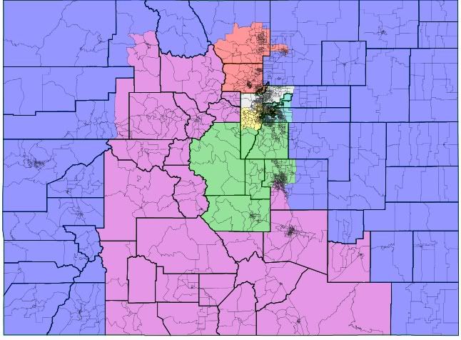
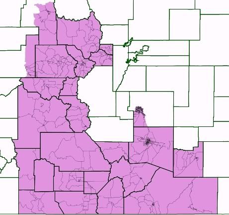
After posting my pinwheel 5-2 map, I was inspired to make a better map. In that map, I used 55% from last year's statewide elections as a benchmark. With this map, I dropped that to 51% for one Dem district, and what a difference that makes! (Note that that 51% district can easily be made into a 53% district, but it's about 1/10 as aesthetically pleasing.) My other map had nothing on North Carolina's ugliness, but I wouldn't have wanted it. It had too many county splits, totally ignored communities and split the Denver area six ways (this map markes it three). I would love to see this enacted, but one stupid state house seat makes that impossible. The 51% would translate to about a 57-58% Obama district, while the four other Dem seats would be about 61-64%.
The State:
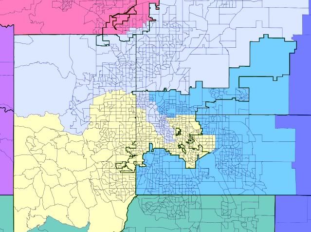
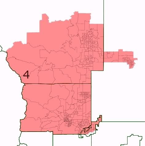
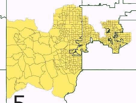
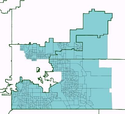
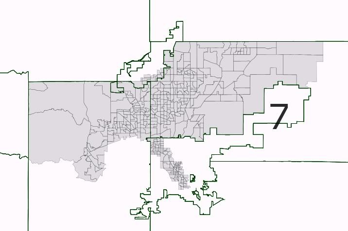
The Denver Area:
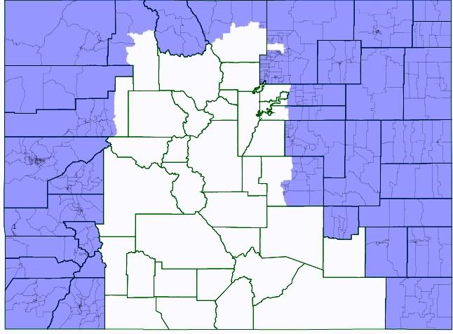
GOP Sink 1:
34.5% Dem, 65.5% GOP
81.2% White, 14.4% Hispanic
GOP Sink 2:
32.0% Dem, 68.0% GOP
83.9% White, 8.1% Hispanic
Dem Seat 1:
51.5% Dem, 48.5% GOP
69.4% White, 23.4% Hispanic
Dem Seat 2:
56.1% Dem, 43.9% GOP
81.9% White, 12.5% Hispanic
Dem Seat 3:
55.0% Dem, 45.0% GOP
70.2% White, 20.0% Hispanic
Dem Seat 4:
55.7% Dem, 44.3% GOP
60.4% White, 20.5% Hispanic
Dem Seat 5:
55.0% Dem, 45.0% GOP
70.1% White, 23.2% Hispanic
