Look at this graph. Isn't it pretty? All those lovely pastel colors. Oh but wait, it's more than a pretty picture. It actually represents some very real facts.
Are you an average American? Look! There you are in pretty lime green right there on the graph. Which one of those green lines would you like to represent you in the future?
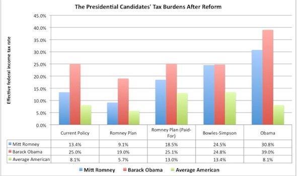
After reading purohit's diary about an article at Politico, I read the entire article and learned “Conducting a PowerPoint presentation is a lot like smoking a cigar. Only the person doing it likes it. The people around him want to hit him with a chair.” My attention was then drawn to an article by Dylan Matthews at the WonkBlog at The Washington Post which displayed the pretty graph. Okay, this isn't a Power Point presentation. Hasn't it been said that a picture is worth a thousand words? This picture sure says a lot.
Whoever is elected in November is likely to enact big changes in the tax code. Mitt Romney promises a 20 percent cut in rates. Barack Obama wants a 30 percent minimum rate on millionaires, limits on deductions, and a return to Clinton-era tax rates for high earners. And Bowles-Simpson could be adopted by either.
So no matter what happens, we can look forward to big changes in the tax code. What kind of change we'll get will depend on who wins the presidency, and I suspect also who controls Congress. This graph certainly gives me pause. Isn't it interesting that President Obama's plan raises his own taxes more than those of average Americans as well as Mitt Romney? I don't know about you, but I'm impressed by somebody who's willing to set things up so the he pays the most when it comes to taxes.
Now that all the candidates have released their 2011 tax returns, it’s possible to calculate what these policies mean for them. I did the taxes for Romney, Obama, and an average household (two adults, one child, making the median household income of $49,445) under Obama’s plan, Romney’s plan (both the paid for and not paid for versions, using the Tax Policy Center’s estimates [PDF]), and Bowles-Simpson.
You know what else gives me pause? There are two versions of Romney's plan. Paid for and not paid for? Wow! It sure would be nice if Mitt Romney would tell us exactly what his plan is. Oh wait, he won't because he says he will be attacked for it and we should wait until after he is elected for the details. So, if we believe his unpaid for plan, the taxes of us average Americans will actually go down. But doesn't that mean that somebody will have to pay for it some time in the future? And if the details that Romney won't tell us about actually are the paid for version in the graph, doesn't that mean that everybody's taxes will go up dramatically (except President Obama's)?
Everyone does best under Romney’s unpaid-for plan, while the paid-for version actually raises taxes considerably for Romney himself. The reason is that it eliminates the charitable, state tax and mortgage interest deductions, which dramatically reduce Romney’s tax burden.
What was it
Romney said the other night on sixty minutes? “The devil’s in the details. The angel is in the policy, which is creating more jobs.” Somehow that doesn't reassure me. It just looks like under Romney's plan(s) people who already have more money than they can spend in their lifetimes will just get to keep more of their money. It doesn't inspire me to believe that they are suddenly going to start creating jobs with more money in their bank accounts. I mean if they're already sitting on
trillions of dollars (and have been for years according to that 2011 article) and they aren't creating jobs, will giving them more money to sit on really motivate them to create jobs?
One last thing – in every one of these scenarios, Romney pays less in taxes than Obama does, though under Bowles-Simpson it’s close. This is in spite of the fact that Obama made about $1.7 million in 2011 and Romney made $13.7 million. It’s a good example of how the federal income tax is not particularly progressive within the top one percent, even if people in that bracket usually pay higher rates than an average American.
It looks to me like if everybody who was represented by the red and blue bars in that graph voted for Mitt Romney, and everybody represented by the lime green bars voted for President Obama, then President Obama would easily win reelection. But, I've heard tell that there are actually people in this country who will vote against their own best interests so I guess that won't be happening.
Paul Ryan conducted a PowerPoint presentation, and the Romney campaign wasn't too happy about it. I wonder why?
Ryan’s PowerPoint slides were officially labeled: “Our Unsustainable Debt (U.S. Debt Held by Public as a Share of Economy),” “Your Share of the Debt,” “Who Funds Our Reckless Spending?” and “How the Government Spends Your Money.”
Do you know what I don't see in that list? I don't see anything about how we increase revenue in order to start paying off that debt. Oh, unless you count that paid-for version of Romney's plan that he doesn't want to tell us about. And even then, it doesn't raise as much revenue as President Obama's plan.
So what do you think? Isn't it a pretty graph?
