 With the entry of John Kasich into the race on the Republican side this morning, we have a record 21 significant candidates for the Republican and Democratic nominations for the presidency in 2016. And of course, 21 candidates means a bumper crop of campaign logos: those quirky insignias that candidates and their supporters plaster onto yard signs, bumper stickers, television commercials, Facebook pages, and eventually every remaining flat surface in America. Like we do every four years, therefore, let's turn a critical eye to this year's selection of logos and decide which ones work, which ones don't, and which ones should never, ever have seen the light of day. If you like this, please also check out my rankings of the 2012 primary and general election logos and the 2008 primary and general election logos, along with a special look at campaign logos through the years.
Before we begin, I think it's necessary to reflect on just how much better this year's logos are than the ones from eight years ago. Barack Obama's groundbreaking campaign that year permanently rewrote the rulebook on campaign graphics, and just about every candidate this year clearly understands the importance of a strong mark in cutting through the clutter of today's image-saturated mediaverse. Commensurately, the grading is a lot tougher this year: I've given C's and D's to some logos that would have earned solid B's or even higher in 2008. Time marches on, and campaigns have to keep up. Call it tough love.
So here we go. Find a comfortable chair, turn your phone to vibrate, stay hydrated, and get ready, because we've got a long way to go. As always, let's look at this cycle's crop of logos from the best to, God help us, the worst:

This may be the most controversial grade here, because a lot of people really seem to hate Hillary Clinton’s logo, but fortunately I’m the one writing this diary, and I don’t care what the haters say. I'm a huge fan of Swiss design in general and legendary designers like Paul Rand and Saul Bass in particular, and this distinctive mark could easily have sprung from the pen of either of those titans. It is sometimes said that a good flag is one that can be drawn freehand from memory by a child, and while there are exceptions—I appreciate Saul Bass's "Big W" mark for Warner Communications, but it is a cold-hearted individual indeed who doesn't genuinely prefer the classic Warner Bros. shield—I believe the same is often true of logos. And by those standards, this logo excels.
Let’s look at what we have going on here. We have two blue squares, two blue triangles, and a red arrow, all arranged into the shape of an H-for-Hillary. Look at the proportions: draw two lines to the right from the top and bottom of the crossbar, and they meet the edge of the arrowhead exactly where it intersects the edge of the right upright. The negative space takes the form of two perfect squares, exactly as tall as the crossbar of the H and exactly as wide as the uprights. Presidential campaign logos are practically required to contain red, white, and blue, and all three colors are represented here—but whereas the arrangement of the shapes is harmonious, the arrangement of the colors is dissonant, and that’s exactly the point. The forward-pointing arrow, representing progress, surges through the right upright of the H, representing change and disruption. It’s not soothing; it grabs you by the collar and won’t let go. This is all accomplished using only 90-degree angles and 45-degree angles.
 While the H mark is strong enough to stand on its own, it's also worth our while to look at the Clinton campaign's use of typography. The campaign's main typeface is called Unity, a custom font from typographer Lucas Sharp based on his commercial face Sharp Sans. A geometric sans-serif with clear influences from classic fonts such as Futura and ITC Avant Garde Gothic, Unity is plainly intended to evoke memories of Gotham, Barack Obama's signature face from 2008 and 2012, which changed campaign typography forever. While Obama always used Gotham in all caps, Hillary uses lowercase freely, which softens the effect slightly and signals respect for but differentiation from the current administration. The campaign's use of type is a work in progress; in the best cases, as with the yard signs shown at right, the type harmonizes with the H mark as the cap height and alignment of "Hillary" matches and continues the crossbar of the H. Altogether, while this is probably the best year for campaign graphics that there has ever been, Hillary Clinton is the candidate who best captures the spark that made Barack Obama's graphic identity so successful. Grade: A

The more I look at this logo, the more I like it. Deceptively unprepossessing at first, 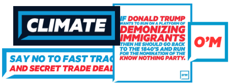 Martin O'Malley's humble word balloon has proven endlessly versatile in practice, as the candidate's Instagram and Twitter feeds demonstrate: its thick borders and bold typography are suitable for any message the candidate wants to send, creating a strong impression that sticks with the viewer. Though he's been playing to small crowds thus far, I wouldn't count O'Malley out just yet, as the sight of a sea of these signs in a crowd just might be enough to win it for him. Grade: A

Rand Paul gets credit for one of the boldest logos of the current crop, which comes off as inspirational and also a little bit terrifying—just what a libertarian wants! Rand Paul is no Paul Rand, but the geometric simplicity of this logo is arresting, and the fact that it's probably readable from the surface of the Moon doesn't hurt. In one of those cute touches that make graphic design geeks soil themselves, the negative space between the A and the N form the base of the torch, but even if you don't pick up on that you can still tell it's a torch. All in all, a very strong mark. When he loses, I suggest he retire some of his campaign debt by selling this logo to the RAND Corporation. Grade: B+

I like this one. Carly Fiorina was a terrible CEO of Hewlett-Packard, but being a former tech CEO is all she has, and this nicely contemporary logo reinforces the modernity theme. The star in place of the crossbar of the A is a decent alternative to the more obvious tactic of replacing the entire A with a star, which would look loutish among the slender letterforms in use here. Like Hillary, Rand, Bernie, and Jeb, Carly takes advantage of an uncommon first name to lead with it, distinguishing herself in the voter's mind while simultaneously reminding us all how much fun we had singing along to "Call Me Maybe" back in 2012. Grade: B

If, like me, you had forgotten that George Pataki is running for president, this logo is happy to remind you. The flag device is a little weird—shouldn’t the top bar be filled out with red, instead of leaving that whitespace there? Or is it supposed to subtly suggest an outline of New York state, in a mirror? Regardless, the typeface, colors, and layout are decent, and the overall effect is not unpleasant. Grade: B-

The soaring eagle in Rick Santorum’s 2016 logo evokes memories of 2012, when the far-right homophobe was an unexpected bright spot in a field of mediocre primary-season logos. That earlier eagle was depicted soaring through a circle of stars and the letters F-R-E-E-D-O-M, in place of the O in Santorum (go check it out, it's a lot better than I'm making it sound); here, the eagle has completed his journey through the O and is gaining altitude in preparation for free flight. It's a nice callback to something few people other than me are likely to remember. If I'm being completely honest with myself, this is not the best eagle graphic I've ever seen, and looks a little like a man in a bird suit. Still, my lingering affection for that 2012 logo inclines me to be gentle here. Grade: B-

The dead-eyed sociopath enters the race with a perfectly serviceable logo in which the E in “Walker” becomes a cute little flag. It’s not a strong enough element to stand on its own in isolation like Obama’s O or Hillary’s H, but in context it looks great. The red of the flag’s stripes reappears in the 16 at the end, creating a nice balanced feel. Grade: B-

In years past I might have called this a good logo, but Barack Obama raised the stakes for everyone, and Bernie Sanders is firmly in the middle of the 2016 pack, if that. The typographic treatment is nice, but the stripes look even more like a squirt of Aquafresh toothpaste than Michele Bachmann’s did four years ago, and that’s not a neighborhood you want to be in. Grade: C+

I have mixed feelings about Rick Perry’s 2016 logo. The less said about the hideous P thing the better, but making it into a roundel is an inspired choice. I’m a sucker for logos that look like life rings. Makes everything look like a baseball team. Grade: C+

Not a big fan of the all-lowercase treatment for Marco Rubio’s name. You’re running for president, not manager of an AM/PM Mini Market. Still, it's different from what everyone else is doing, which is helpful in a primary field that's larger than the starting offensive lineup of the Miami Dolphins. The little USA in place of the dot over the i strikes me as alternately cute and stupid, depending on my mood when I look at it. Grade: C+

I don’t know who lives at 16 Graham Street, but apparently he’s running for president. Like Hillary/Rand/Carly/etc., Lindsey Graham has an uncommon first name; unfortunately for him, it's a girl's name, so he has to do the best he can with the comparatively boring "Graham." Surely he could have done better than this. With its goofy little dormer at the top, this logo seems more appropriate for Greenville, South Carolina’s #1 real estate agent than for a presidential candidate. Points for the whimsy factor, but not much else—although I’m giving Graham a half-grade bump for making a .zip file of graphics ready for social media posting available on his website, a no-brainer idea that most of the other candidates nevertheless don’t do. Grade: C

Like Mitt Romney, whose awkward R-thingy left me scratching my head four years ago, Bobby Jindal has taken exactly the wrong message from Barack Obama’s legendary “O” mark. Everyone has an initial, it doesn’t make you special, but it takes more than just noticing that your name begins with a letter to turn that letter into a symbol that will capture the imagination and stand the test of time. Hillary Clinton’s H symbol hits the mark. This weird candy-cane-gone-wrong shape misses it by a wide margin. Grade: C

Apparently there are so many candidates this year that all the creative graphic ideas have been used up, leaving several of the latecomers with “logos” consisting only of words.  Of these, Ben Carson's words are the best, employing an interplay of colors I find appealing. Carson is also using an alternate version of this logo that features stars and stripes, as shown here. It looks much dumber than the words-only version, proving that sometimes words are all you need. Grade: C-

Donald Trump has been using variations on this typographic treatment as his personal brand for more than 25 years. This logo is apparently inspired by the livery on his personal jet, which itself is an evolution of the livery used by the old Trump Shuttle, in operation from 1989 to 1992. As a campaign logo it's a bit pedestrian, but at least it has some history behind it, so I'm inclined to be gentle. The wide sans-serif letterforms have kind of a 1960s feel to them, which I appreciate. Grade: C-

Meanwhile, Ted Cruz has just stone cold ripped off the 25-year-old Soy Ink logo. I guess we’re probably supposed to see it as a flame, but it reminds me more of a droplet of oil, because Texas. Ted Cruz: the candidate of climate change. Grade: C-

Johnny-come-lately John Kasich gives us a logo that's about as unnecessary as the Kasich campaign itself. The typeface is about as generic a sans-serif as exists today, and while the K-flag is not terrible, it doesn't do anything other than just sit there. If I set out to design the world's most average campaign logo, I think it would look a lot like this. Grade: C-

Oh, not this again. Those of you who are old enough to remember the 1996 primary season will have immediately noticed the similarity to Lamar!, which is so overwhelming it’s hard to think of anything else. It’s even red, for chrissake! Is Jeb Bush trying to channel the magic of the man who came in 3rd in Iowa and New Hampshire 20 years ago and dropped out before Super Tuesday? (Actually, as Andrew Kaczynski of BuzzFeed noted, Jeb’s use of this campaign logo in various incarnations actually predates the Lamar Alexander campaign by two years, so I don’t even know what to think here.)
Some wags have made merry with the fact that Jeb Bush’s tarnished last name doesn’t appear anywhere near his campaign logo, but that doesn’t really jibe with the fact that he’s been using this logo for 20 years. Besides, it’s natural for a candidate to want to distinguish himself from previous officeholders with the same name; you’ll notice Hillary Clinton’s last name doesn’t appear on her own campaign materials either. (Then again, Bill Clinton didn’t leave office with a 29 percent approval rating.) Moreover, it’s actually pretty common for candidates who have distinctive first names to lead with them, as happened with RUDY in 2008 and NEWT in 2012. So no points off for the first-name thing, but lots of points off for emulating the graphic stylings of a campaign that is remembered for little other than that ridiculous exclamation point. Grade: D+

So yeah, this is a thing. Like the Chafee campaign itself, this logo probably makes sense in Lincoln Chafee’s mind, but it’s hard for the rest of us to see why it exists in the form it has taken. If it we're me, I'd have gone the Hillary/Rand/Carly route and run as "Lincoln 2016." That's got to be worth a few votes. Grade: D+

Is this… is this it? Look, I tried to be kind to Ben Carson, but c’mon, you can’t just set your name in Futura Bold and call it a logo. I do like the “Telling It Like It Is” slogan, in that the Chris Christie campaign is probably the closest we’re ever going to come to having Howard Cosell run for president. But you can’t just type your damn name in a common font and call it a logo unless you’re someone like Sony (and Clarendon isn’t that common of a font anyway). I know Sony, I’ve bought electronics from Sony, and you, Chris Christie, are no Sony. Grade: D

Did you know Jim Webb is running for president? If this logo is any indication, Jim Webb barely knows himself, or at least barely cares. The choice of Franklin Gothic Heavy for the typeface evokes a certain 1988 primary season feel that I sort of like, but at the end of the day I’m hard pressed to give this desultory mark much more consideration than its designers did. Grade: D

Like his 2008 effort, Mike Huckabee's logo has a small-potatoes quality to it, with its low-rent, unbalanced swoosh and confused-looking stars. What really pushes it down into the dregs, though, is the silly “From Hope to Higher Ground” slogan. Huckabee has really gone all in on this motto—you can buy gear featuring it in a variety of styles on his campaign website—which is really strange, because what in the living fuck could it possibly mean!? Why are we going from hope to higher ground? Is higher ground what we were hoping for? What’s wrong with the ground we’re currently on? Are we expecting a flood? Are we going to stop hoping when we get to higher ground? Or are we hoping for something completely different that you’re not even telling us about? Etc. As it turns out, From Hope to Higher Ground: 12 Steps to Restoring America’s Greatness is the title of a book Huckabee published in 2007 (hilariously, “steps” is misspelled “stops” on the cover of the first edition). You couldn’t pay me to read it, but apparently “hope” is a reference to Hope, Arkansas, birthplace of both Huckabee and President Bill Clinton, and “higher ground” may have something to do with the Hurricane Katrina recovery efforts, which Huckabee supposedly touches on to some extent in the book. So right there that’s three things you have to know about Mike Huckabee in order to make sense of this slogan, which suggests he’s confining his campaign efforts to people who were already going to vote for him anyway. Brilliant. Grade: D-
So there you have it, and I hope this has been a fun break from the bruising primary wars. If you disagree with any of these assessments, please let me know in the comments.

