I got a message from the Southern Poverty Law Center that allows for one to view past and scheduled Confederate flag rallies.
Seeing this reminded me of the 2008 "Presidential vote shift" map which showed the change in Democratic share from the 2004 to 2008 on a county by county basis. You have to click on "vote shift" on the left of the screen to see this.
So I wondered what the map would look like. See below the fold...
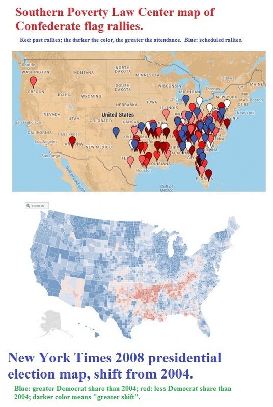
Legend: in the flag rally map, red means "past rally" with the darker colors indicating a larger rally. Blue means "scheduled".
In the election map: "blue" means that President Obama got a greater percentage of the vote in the 2008 election than Secretary Kerry got in 2004; "red" means that Senator McCain got a greater percentage in 2008 than President Bush got in 2004; as usual, the darker the color, the greater the shift.
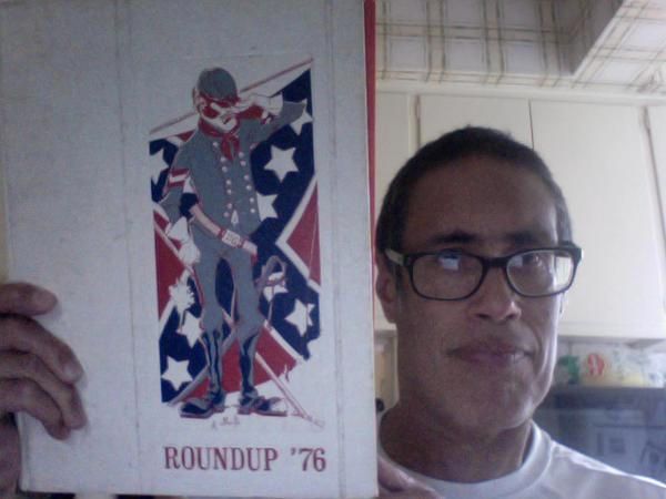
Disclaimer: this "flag" issue resonates with me, in part, because of where I went to high school (at least my last 2.5 years). We were the Travis High Rebels and ...yes, I had a pair of those flags on my bed room wall, crossed...with the team photo of my previous high school football team in between. It was really a "school spirit" thing for me at the time.
Now that I've lived a longer period of time and lived in different parts of our country, well,...let's just say that some of my social media conversation has been tense and heated when talking to both my fellow liberals and with my old classmates.
And no, that flag has no business being flown over a government building nor in a "place of honor" in a government area. I can see it being in a museum or historical park.
