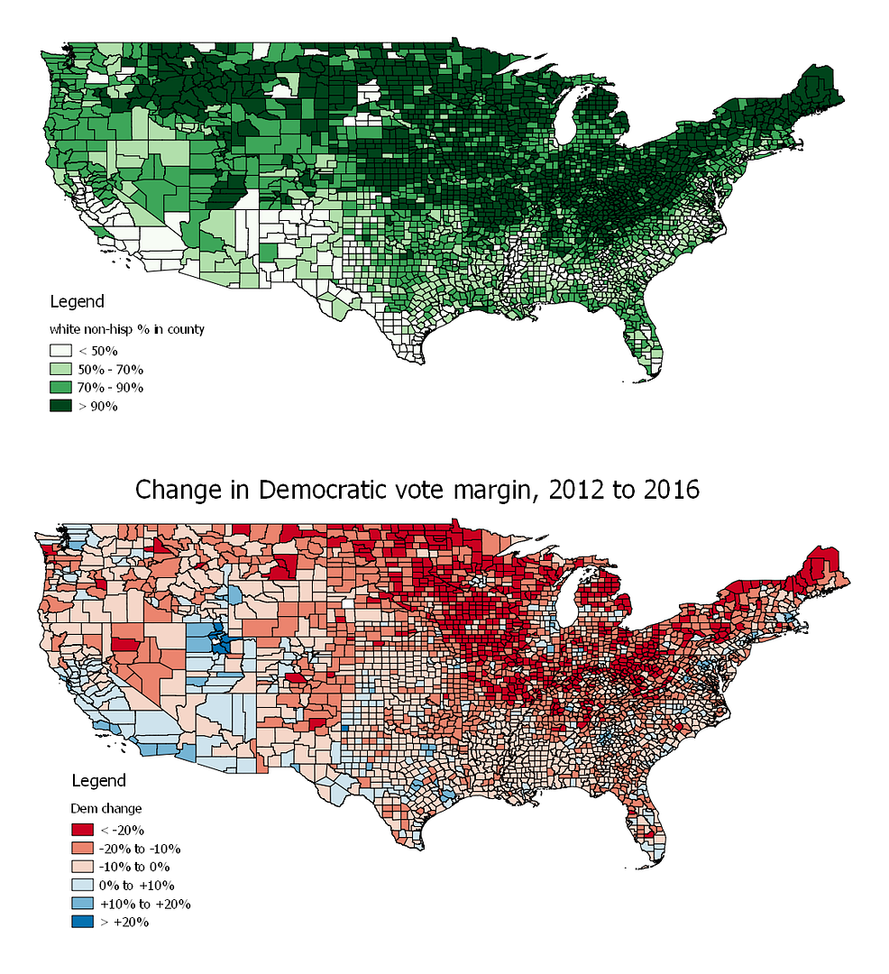
Obama won the popular vote in 2012 by 3.9%. When the 2016 votes are all counted, Clinton will probably clock in with about a 2% popular vote lead. So it wasn’t a huge shift nationwide, basically a 1% shift from one side to the other. To show regional shifts that were in play, rather than the usual red/blue map showing absolute Republican/Democratic support, the map above shows the Democratic popular vote margin change from 2012 to 2016, with deep red indicating the greatest receprion for Trump’s bigoted campaign themes.
It definitely highlights the trouble areas for Democrats in the midwest and upper midwest. But rather than a map of, say, rust belt angst over macroeconomic issues, it is basically just a map of where the white people are. The map in green below shows the concentration of white non-hispanic population per census figures, next to the above map again for comparison:
White voters in general, taken at the county level, saw a lot to like in President-elect Pussygrabber’s neo-nazi themes of deportations of brown people, stop-and-frisking of blacks and Muslim registration databases:
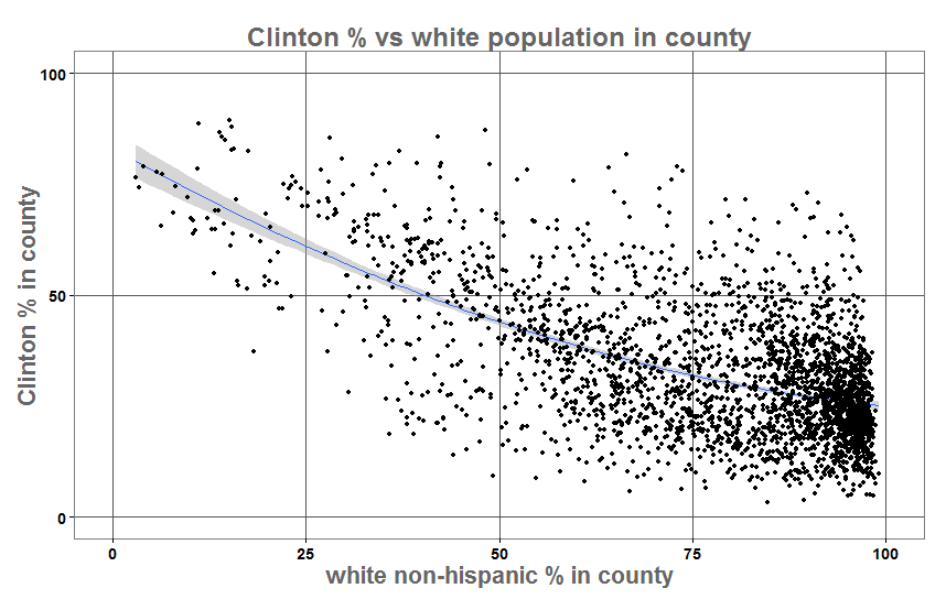
So the vast majority of counties with more than 75% non-hispanic white population went for Trump, 93% of them in fact.
The above picture looks pretty bleak for Democrats among whites but of course it treats all counties equal, each only getting one dot, whether Los Angeles County with 9.8 million people or Loving County, Texas with 92 souls. White voters in populous urban areas were much more favorable to Clinton, with education and diversity offsetting ignorance and bigotry. Even some traditional rich white Republican suburbs, such as Upper Arlington, OH couldn’t stomach Trump and went for Clinton by large margins.
Overall, the populous urban counties more than make up for the slack in RFD votes, given Clinton’s lead in the popular vote. In essence, it was the sparsely populated, lily-white counties that formed the core of Trump support. This is not a picture of the forlorn white rust belter in decaying industrial towns, but rather the angry, insular, white rural voter motivated by Trump’s scapegoating message directed at the “other.”
| COUNTY POPULATION GREATER THAN: |
NUMBER OF COUNTIES |
CLINTON MARGIN |
| 30,000 |
1421 |
3.3% |
| 50,000 |
971 |
5.8% |
| 75,000 |
720 |
8.1% |
| 100,000 |
576 |
10% |
| 250,000 |
259 |
18% |
| 500,000 |
127 |
24% |
| 1,000,000 |
39 |
30% |
Among the 1,689 counties with population less than 30,000, about half of the total, Trump won by a 38% margin. About 7% of the total US population lives in those counties.
In Pennsylvania, counties with population less than 50,000 make up 6% of the state’s population. Trump won handily in those counties by more than 155,000 votes (73% to 24%). Clinton won among the PA counties with more than 50,000 population, 49% to 47%.
Nationwide, the effect of black population on the vote is evident, concentrated perversely in the counties having the highest occurrence of Confederate flag decals.
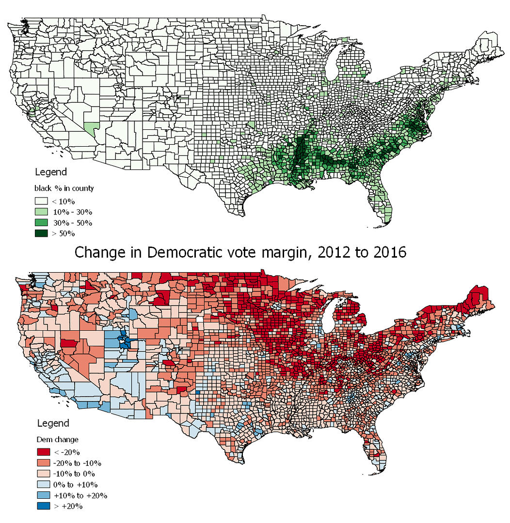
Outside the cosmopolitan centers like Atlanta, Miami and Houston there was a moderate shift toward Trump in the South. So if there was a big white backlash there it was perhaps offset to a large degree by black turnout. It’s also true that these are heavily Republican counties in any case, so there was less for Democrats to lose, so to speak.
The concentration of black population against the heavily Republican white population there highlights the disingenuousness of Bernie Sanders’ characterizations of Clinton’s primary wins there as the “Deep South.” More to the point, it was the black Democratic base, whether in the deep south or in the populous urban areas elsewhere.
Nationwide, as black population in county reaches 85%, Clinton support tops 80%.
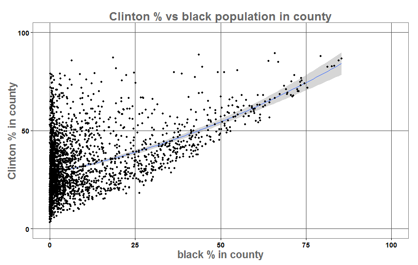
At a precinct level where black population can approach 100%, Clinton support routinely topped 90%.
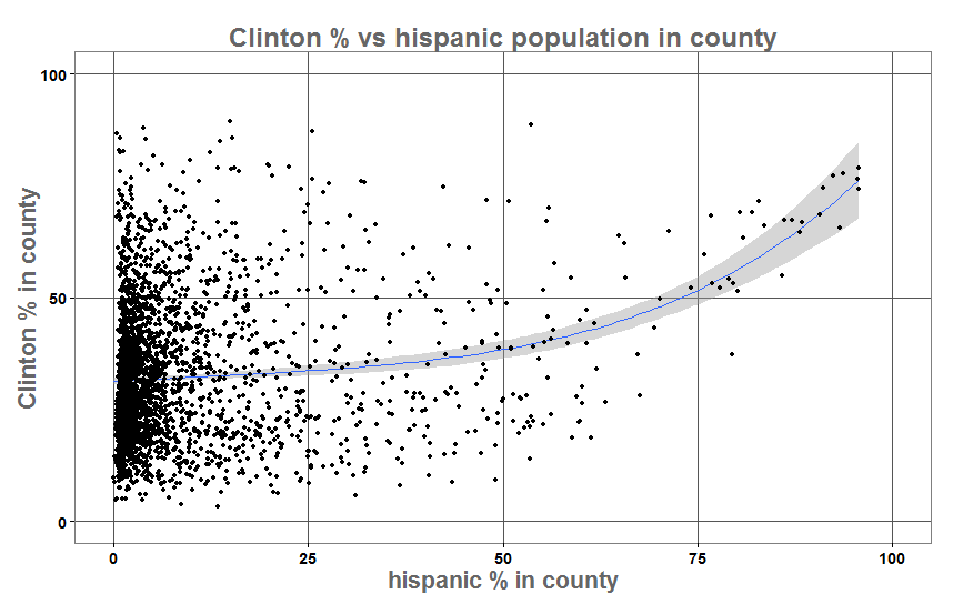
The concentration of Latino voters also shows a noticeable effect:
...as does Native American:
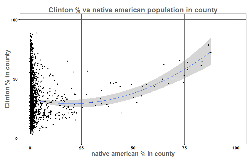
Latino and native american population centers are often in western states where the white population is heavily Republican, so it takes a lot of minority population there to turn the counties blue overall.
 Sieg heil, y’uns
EDIT: if anyone would like CSV files of the county election data for 2012 and 2016 as well as census demographics by county, there’s a zip file here:
US counties 2012-2016
The totals are from shortly after the election & so aren’t completely up to date for 2016.


