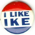
 I've been a campaign junkie as far back as I can remember. I think it might be because of the campaign logos. Logos are the mainstays of modern political campaigns: always present but rarely mentioned, they grace bumper stickers, yard signs, placards, buttons, hats, T-shirts, coffee mugs, and just about anything you can plaster a logo on, all in an attempt to make you remember a candidate's name and feel good about it. Instead of fast food or clothes, campaign logos sell people and ideas. They follow unwritten but rigidly-defined rules—you got your red, you got your white, you got your blue, and you better put a flag in there somewhere—yet within those rules lie infinite possibilities, that can buoy a candidate up or weigh her down. Like the little girl of yore, when they're good they're very, very good, but when they're bad, they're horrid.
Let's have a look at the current crop of contenders and see what works and what doesn't. Pay close attention, prospective candidates and political consultants of the future: what you're about to learn just might put you in the White House some day.
THE BEST

John Edwards scores a home run with a bold, commanding logo that asserts itself without being overpowering. The typeface appears to be an extra-heavy weight from Adrian Frutiger's Avenir family, a striking sans-serif in the tradition of faces like Akzidenz Grotesk and Futura that like to leap off the page and grab you by the balls to make you pay attention. (Ask Barbara Kruger about just how effective a good bold sans-serif can be.) Edwards obeys the rigid red-white-blue rule of American presidential campaign logos, with just one element—the tail of the shooting star—in an insouciant light green. Perhaps the most powerful attribute of Edwards' logo is its versatility: conveying its message almost entirely through colors, shapes, and letterforms rather than through its intrinsic layout or the relationship of different elements to one another, it can be taken apart and reassembled in any number of ways without losing its power. Throughout Edwards' site and around the news media you'll see it appear on two lines or just one, or stacked vertically on hanging banners; the star appears in different places; the entire thing can be replaced with other text and still get the message across. Some campaign logos seem to be designed without regard to the multitude of formats they'll ultimately appear in, but Edwards' logo looks good on anything. Grade: A

Rudy Giuliani has the most audacious logo this cycle: the word RUDY in white in a strong typeface on a blue background with a red border. That's all. Campaigning with just a first name is a gutsy and potentially risky move: you'd better be as familiar to the voters as you think you are, or you'll come in for ridicule (just ask Lamar!). Giuliani takes this a step further: he doesn't feel he needs to include an office, or a year, or any other clue as to what this RUDY thing is all about. (He'll sell you a version with his URL on it, grudgingly, but you can tell his heart isn't in it.) You know who I am and what I'm all about, he seems to be saying, so why should I, a busy man, take the time to explain myself to you? In any other candidate this would be perceived as unforgivably arrogant, but with Giuliani arrogance seems to be part of the appeal. I don't claim to understand it, but I give the man credit for realizing he could pull something like this off. Grade: A
THE GOOD
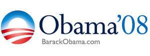
Barack Obama has the most aesthetically pleasing logo by far this cycle, an urbane, elegant mark that draws the eye and doesn't let go. Two classic Eric Gill typefaces (Perpetua for the body, Gill Sans for the URL) integrate beautifully with each other and with the Obama campaign's muted reinterpretation of the traditional reds and blues of American political campaign. As befits a Senator who's a bit of a celebrity, Obama now has his own personal logo (eat your heart out, Tiger Woods!), a stylized letter O with an American flag motif that suggests the sun rising over farmland; a bit reminiscent of the Bank of America logo, perhaps, but not inappropriate for a Senator from the great agricultural state of Illinois.
 I was prepared to call this the best logo of 2008 on artistic merit alone, but a couple of factors limit its effectiveness. In its navy-on-white configuration, as shown above, slender letterforms like these tend to get washed out in bright sunlight, which will inevitably lead to television footage of enthusiastic crowds waving scores of what appear to be blinding white placards with vague, indeciperable red and blue circles on them. The white-on-blue variant doesn't have this problem, but as we can see from the image to the right, the red "'08" gets lost in the dark background, giving the logo an unbalanced appearance and recalling the unfortunate Bush-Quayle 1992 logo. Grade: B+
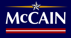
John McCain goes for the "statesman" look with his campaign's choice of Hermann Zapf's timeless Optima, a face that can make just about anyone look good. Like RUDY, McCain figures he doesn't need to waste space on words like "president" or "2008"; if you know who he is, you don't need 'em, and if you don't know who he is, then fuck you. Though not as minimalist as RUDY, McCain's logo includes a couple of very nicely understated reminders of his military background: the faux "general's star" at the top (so what if he was actually in the Navy?) and a red-and-white stripe at the bottom that suggests a military campaign ribbon. Grade: B+
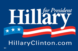
Like RUDY, Hillary leads with her first name, though she's kind enough to at least give us some indication as to what the whole thing's all about. The campaign's use of Caslon, a traditional face but hardly a dull one, is a strong choice. The "streamer" at the bottom is a nice interpretation of the flag, and helps to soften Clinton's perceived hard edges (compare to McCain's ramrod-straight ribbon, designed to project strength and discipline). Grade: B

Slobbering nativist Rep. Tom Tancredo makes a surprise showing near the top of the pack with this unexpectedly contemporary entry, which is similar enough to Edwards' logo to make me wonder which one of them came up with the idea first. Like Edwards, Tancredo makes a strong impression with Avenir Black, though in a more muted palette. I give Tancredo a slightly lower grade than Edwards because of the distracting "eyeglasses" effect, which strikes me as being either endearing or offputting depending on my mood. Grade: B
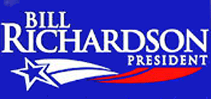
Bill Richardson has to contend with a ten-letter last name here, so I credit him with a high degree of difficulty. He does the best he can with it, setting it in Trajan Bold, which fans of The West Wing know is the best way to pick up a little gravitas without really trying too hard. (We'll be seeing more of our friend Trajan Bold later.) The shooting star motif is bold without being overpowering. Grade: B-
(Incidentally, the reason this graphic looks like crap is because it's a blowup from a photograph. Gov. Richardson's campaign site is a case study in how to avoid accommodating people who want to support you: he's one of only two candidates to have no "swag store" where you can order posters, bumper stickers, hats, pins, coffee mugs, etc. It also doesn't offer any graphics that supporters can put on their home pages and MySpace profiles, which is about the cheapest way a campaign can get its logo in front of the eyes of the electorate without actually getting paid for it. If you want to show the world you support Bill Richardson, you're pretty much on your own.)
THE BAD

We're getting into the ones that, while not really "bad" from an aesthetic point of view, do nothing to distinguish themselves from the crowd, and that is bad. Mike Gravel's logo is about the best of these. The unexceptional typeface and neocorporate bunting are straight out of 1988, which is not good for a candidate who needs to prove he's not a relic of the past. Gravel gets a half-grade bonus for making his logo available on his Web site in Encapsulated PostScript (EPS) format, which made it easy for me to size it to any size I wanted. Grade: C+
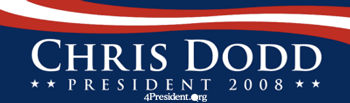
Chris Dodd is another candidate who's going for some of that West Wing magic, but without Bill Richardson's flair. The "streamer" at the top invites unfavorable comparisons to Hillary Clinton's. Again: not a bad logo exactly, but not one that sticks with you after you look at it either. Grade: C

Are you as bored as I am yet? Biden is another candidate who seems to wish it were 1988 again and he were Michael Dukakis (though it seems Biden passed up an opportunity to save a little money by recycling his own logo from that year). Grade: C
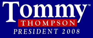
Well, I just don't know what to think about this. Tommy Thompson is hamstrung by maybe not being the only Thompson who runs for the Republican nomination this time, so he's basically forced to lead with his first name. Hillary and RUDY lead with their first names too, but neither of them have names that remind you of that one kid on your YMCA league T-ball team in second grade who never said anything to anyone except for that one time when he had an attack of diarrhea at the plate and then cried. That said, it's a striking mark, lent a bit of flair by the offset capital T, though Thompson gets points taken off for not being able to decide whether the top of the T should be flush with the x-height of the other letters, or not. Grade:C
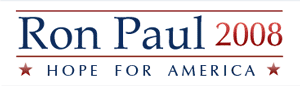
This is the kind of logo a campaign comes up with when it just. Doesn't. Care. I wouldn't have thought it would be possible to juxtapose Palatino and Optima, two lovely Hermann Zapf typefaces, in an inelegant way, but Ron Paul manages to do it. The gradient on the "2008"—and only on the "2008"—is just bizarre. Grade: C-
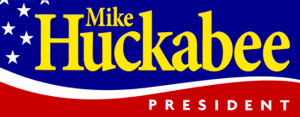
Mike Huckabee wins the award for Logo Most Befitting a Little Rock City Council Candidate, with the 2008 campaign season's only use of yellow in a logo. The color scheme, the frivolous typeface, and the layout all scream "small potatoes." Grade: C-

We're really starting to get into the dregs here. Brownback's logo features an unpleasantly squashed Palatino along with some kind of murky star-based motif at the left that couldn't possibly reproduce well on a T-shirt or a coffee mug. Perhaps sensing what a laugher they had on their hands, the campaign has been spotted using an alternate logo that's slightly more inspired, apart from the depressingly literal-minded flag that recalls the execrable Kerry-Edwards logo from 2004. Grade: D+

Oh, Dennis, no. No. The typeface and layout are inoffensive enough, if a bit pedestrian, but the peace symbol... ugh. Even the hippie kids today aren't into that sixties crap. Contemporize, man! Anachronistic qualities aside, you don't need to be a triangulator to know that symbolism that plays well in the primaries isn't necessarily going to fly in the general election. Tom Tancredo's logo doesn't include a Mexican behind bars, does it? Grade: D+
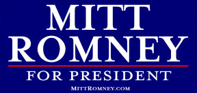
This logo actually manages to make me angry, somehow. A candidate with an odd first name (or, in Romney's case, an odd middle name) has two choices: he can deemphasize it, using only his last name to identify himself in his logo, or he can overemphasize it, figuring it's memorable if nothing else. (I'm lookin' in your direction, Lamar!.) Romney, oddly, goes with neither option, resulting in a logo that seems almost to be intentionally unimaginative, as if he was afraid going with something nicer would make people think he wuz queer, or something. Grade: D
(According to the invaluable MyFonts.com, incidentally, Romney's typeface is something called "Mrs Eaves." Really.)
THE UGLY

Duncan Hunter brings us the Return of the Ugly-ass Gradient, but my eye is immediately drawn to the backwards apostrophe. I don't care if your logo was designed by Paul Rand himself—if you can't even get your apostrophe to face the right way, go directly to jail without passing Go. Grade: F

Oh, where to begin with this one? Jim Gilmore is the only Republican going for the West Wing vote with a Trajan-based logo—yeah, good luck with that. He outdoes even Duncan Hunter with an upside-down apostrophe. The giant letter G on the left looks like it wandered in from another logo. The four stars at lower right evoke memories of Wesley Clark's logo from four years ago—except, of course, that Gen. Clark earned those four stars; Gilmore, not so much. As if the whole thing wasn't busy enough already, he adds a slogan at the bottom, locking him into a Battle of the Single-Word Sentences with Sam Brownback ("Principled. Conservative. Republican." If this keeps up we're eventually going to have to answer to President Nuprin. ("Little. Yellow. Different.") Grade: F

