 Campaign logos form the backdrop—literally—of any modern election. Last year, I took a look at the crop of logos in use by the then-current field of candidates, from the good to the bad and beyond. Soon, possibly as soon as a few weeks from now, the candidates will choose their running mates and unveil new logos for the fall campaign, which may be similar to the ones they're currently using or very different. Let's take a look back through history at the logos used in previous general election campaigns and see what worked and what didn't.
I begin with the 1984 presidential election, for no reason other than it's the first one I really remember clearly. Kicking us off:
Reagan-Bush 1984

This logo is so beautiful it almost puts tears in my eyes. The font, the use of color, even the horizontal lines all work together to create an elegant mark that's as fresh today as it was 24 years ago and will still look good 100 years from now. It's a simple, unadorned logo that follows the First Law of Presidential Campaign Logos (serif for incumbents, sans-serif for challengers) with style: ITC Garamond Bold Condensed, a lush, lovely font, connotes strength, wisdom, and experience, and really pops on a plain white field with no silly stars or flag designs to get in its way. The full-sized caps at the beginning, middle, and end with small caps in between create a look that's so perfectly balanced that one is tempted to wonder whether Reagan selected Bush as his running mate because he had a last name of the correct length. I say this to you with conviction: future graphic artists may someday design another campaign logo this good, but no one will ever design a better one. Grade: A+
Mondale-Ferraro 1984

The Mondale campaign, by contrast, figured you can't go wrong with Helvetica, the ultimate workhorse font that's outlived all the artistic movements that sought to bury it and will continue to do so. Helvetica is the elevator music of typefaces: intentionally unobtrusive, it manages to be everywhere without drawing attention to itself. Unfortunately, "unobtrusive" isn't really what you want in a campaign logo. Grade: C
Bush-Quayle 1988
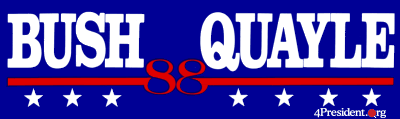
Alone among the post-1980 logos, I have no memory of this one whatsoever, probably because it's so boring. Actually, boring would be a slight improvement: the uneven distribution of stars at the bottom makes it look wobbly, and the "88" design, while pleasant enough, disappears into the background. Grade: C-
Dukakis-Bentsen 1988

Now remembered mainly for its ineptitude, the Dukakis campaign came up with a pretty good logo that looks even better when stacked, as on a yard sign. The flag background is visually arresting without being distracting, and is offset nicely by the font, an appealing slab-serif face with which I'm not familiar. All in all, a logo you could feel good about. Grade: B
Clinton-Gore 1992
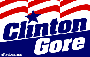
Aww HELL yeah. This logo kicks more ass than every other logo on this page combined. Technically, it violates the First Law with its use of a serif typeface for a challenger, but that typeface is Colin Brignall's ball-stomping Aachen Bold, which barely qualifies as a serif anyway. (You try telling Aachen Bold it's a serif. Go ahead. I dare you.) Two competing angles, in the oblique of the type and the slant of the baseline, harmonize to create an impression of forward progress, while the red stripes stream confidently in the logo's wake like the flag in the Daily Kos logo. The star above the lowercase i punctuates the whole thing with the clarity of a bullet hole.
This is a logo that perfectly epitomizes strength, confidence, and optimism. If I'd been more like this logo when I was in high school, I'd have totally scored with all the girls. Grade: A+
Bush-Quayle 1992
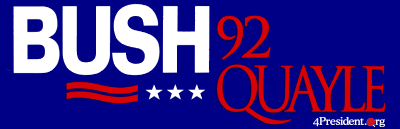
This one is hilarious. By 1992, Dan Quayle had been a national laughingstock for four years, and people were mildly surprised when Bush elected to keep him on as his running mate. When the Bush-Quayle '92 campaign logo was introduced, the first thing everyone noticed about it was that "BUSH" was set in a bold white sans-serif that leaped out of the dark blue background, while "QUAYLE" was set in a spindly dark red serif that was wholly invisible on the average bumper sticker from more than about 20 feet away. Have a few issues there, guys? Grade: D
Perot 1992
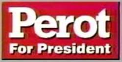
Like Ron Paul's campaign this year, Ross Perot's insurgent 1992 campaign was never really in control of its own message due to its huge and insanely passionate following among people who were, to put it politely, slightly unhinged. As a result, the campaign was represented among the grassroots by a bewildering array of independently produced buttons, signs, stickers, and other memorabilia, most of it pretty crummy, which apparently precluded the campaign from having to develop much of a visual identity of its own. Towards the end of the fall campaign Perot had mostly settled on the mark shown above, which is taken from a screenshot of one of his campaign commercials. It's inoffensive, if a bit plain. The main font is the time-honored Rockwell, a remarkably versatile family of faces that are equally at home in body text or on a poster. Note the complete absence of any mention of Perot's running mate, Adm. James "Who am I? Why am I here?" Stockdale, who was only ever supposed to be a placeholder anyway. Grade: C
Clinton-Gore 1996

While no match for their 1992 logo, the mark designed by the Clinton-Gore campaign for 1996 is a strong conventional entry. The campaign went back to the Garamond well that had worked so well for Reagan 12 years earlier, though Clinton used Adobe Garamond, a similar but distinctly different face than ITC Garamond. It's hard to go wrong with a 9 and a 6, and the placement and use of the year here doesn't disappoint. The red and blue creates an agreeably vivid contrast for what is overall a very nice logo for an incumbent. Grade: B+
Dole-Kemp 1996

Among the many problems that beset the Dole-Kemp campaign in 1996 was its utter lack of visual identity discipline, which led to a proliferation of semi-official logos that didn't have much to do with each other and none of which dominated the campaign's message.
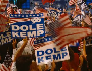 The strange, unbalanced thing above seems to slightly predominate the memorabilia that's been preserved on the Web, although I personally have more vivid memories of the slightly better logo shown on the right. (This is the logo, incidentally, that was spoofed by the infamous "Role Hemp" shirts, which I'm told is some sort of drug use reference that's supposedly considered totally fucking hilarious by people who are into that crap.) And the campaign's Web site sported a third logo that was totally different than either of the other two. It's hard to put a grade to a disorganized effort like this, except to say that the whole thing sucks. Grade: C-
Bush-Cheney 2000

Gee, who could have imagined that a man like George W. Bush would run under a banner as ugly and uncouth as this one? The best thing you can say about it is that it's visually arresting, but it's ruined by a loutish font and unimaginative flag... thingy. The effect is that of being bullied into voting for the candidate. Grade: D+
Gore-Lieberman 2000
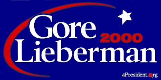
To this day I have fond memories of Al Gore's shooting-star logo, a modification of the one he used in the primaries. A name like "Lieberman" is hard to accommodate in a logo, but the gentle, elegant typeface (Karl Erik Forsberg's Berling) keeps it from becoming overbearing. The shooting star motif would later reemerge in greatly modified form in John Edwards' 2008 campaign logo. Grade: B+
Bush-Cheney 2004

It wouldn't have been too hard to improve on the Bush-Cheney campaign's dismal 2000 mark, but they didn't even try: it's the same goddamn logo. If they didn't care enough to come up with something new, I certainly don't care enough to say anything else about it. Grade: D
Kerry-Edwards 2004
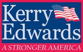
This is the worst campaign logo I have ever seen. This logo is not just awful, it's recursively awful, fractally awful: there is no part of it that is not hideous, either in context or in isolation. If this logo is not the reason Kerry lost--and, given how close the contest came in a few places, it's hardly an inconceivable notion--it is surely a product of the same organizational disarray that did cost him the election. Some knowledgeable campaign insider needs to document the decision-making process that led to this logo and distribute it to Democratic organizers across America as a warning.
Let's start with the font. Incredibly, the logo is set in Georgia, a typeface that you get for free with your computer. Using Georgia to typeset your campaign logo is the modern-day equivalent of typing it with an IBM Selectric and blowing it up real big with a photocopier. It's a technique that's more appropriate for punk rock zines than for presidential campaigns. Georgia is not a bad font per se, but it's all wrong for a logo that's going to be plastered on bumper stickers and yard signs: the letterforms are spindly and ineffectual, conveying weakness.
The rest of the logo is no better. The insipid, excessively literal American flag rendering looks like something from an old CorelDRAW clip art collection circa 1993. The colors are a mess: compared to the navy blue used in the Bush logo--as well as in nearly every other campaign logo in history--Kerry used a lighter blue that appeared washed-out by comparison. It seems, in fact, that the only people who didn't instantly recognize what a trainwreck this logo was worked for the campaign itself. The New York Times devoted op-ed space to a piece excoriating the thing, complete with annotated graphics. And to this day, the number 1 search result for the phrase "kerry-edwards logo" on Google is a petition begging the campaign to change it.
 The sad irony is that it didn't have to be this way: Kerry's primary logo was one of the best of that year's crop. The font is a bold, somewhat condensed weight of American Type Founders' groovy Americana, a terrific face that saw a lot of use during the Bicentennial celebrations in 1976. Combined with the Paul Rand-ish neocorporate flag design, the logo has a cool retro sensibility that recalls a time when Massachusetts was known more for the Battle of Bunker Hill than for latte-sipping, Volvo-driving whatevers. What hurts most of all is that a "Kerry-Edwards" version of this logo appeared in the first few TV commercials that aired after Kerry selected his running mate before disappearing from the face of the earth entirely. Which means that the campaign actually went to the trouble of creating a general-election version of their great primary logo, and then discarded it in favor of the abortion shown above. We should've known then how it would all turn out in the end.
In short, this is by far the most colossal logo fuckup a major presidential campaign has ever committed in the modern era. If I could give it a grade lower than F, I would. Grade: F
Happily, this year promises not to be a repeat of 2004. Both candidates have strong, effective logos, and the Obama campaign in particular has been exercising graphic message discipline to an almost terrifying degree. When the candidates choose their running mates and unveil their new fall marks, I'll be back to assess them for you.

