This year's Nobel Prize for Stupidity in Statistical Graphing goes to the Washington Post. The poll itself, "Does U.S. President Barack Obama deserve to have won the 2009 Nobel Peace Prize?", may be a bit slanted in the wording, but check out the bar graphs of the results...
These two graphs were captured a few minutes apart. In the first, the 'No' vote was ahead slightly. In the second, 'Yes' had taken over a bit of a lead. In both cases, it's pretty close to 50/50.
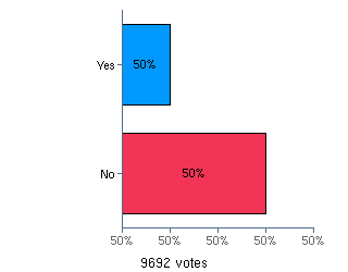
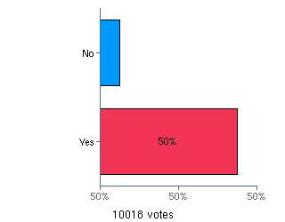
As a student of quality charts and graphs, this is about the most horrible thing I've seen all month. The range going from '50%' to '50%', seemingly showing an enormous disparity for one side or the other, when the actuality is a near tie. The missing decimals so that we don't know what the range actually is and the switch between no as red and yes as red between the graphs are just adding insult to injury.
A very very minor point on top of a large story, but there's no excuse for this sort of sloppiness.
-dms
