I have uploaded a new version of Dave's Redistricting App (2.2.9), which changes the colors that are displayed for showing population demographics and election data. I think the information is much more evident than before and it includes all demographic groups. Here's a quick taste of what it looks like.
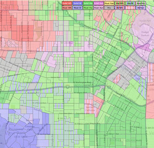
This shows full population demographics of the area between West Hollywood, Dodger Stadium and USC. More details below the fold.
Dave's Redistricting is a project of ProgressiveCongress.org. Please consider supporting the project with a tax-deductible contribution. Thank you.
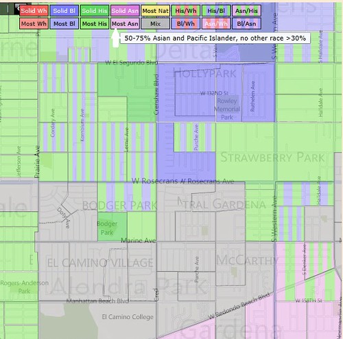
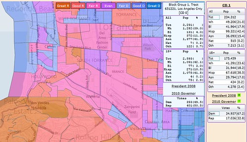
I've tried to make the colors much more visible and make interesting demographic information jump out at you. Each of the four demographic groups White, Black, Hispanic and Asian/Pacific Islander have a major color. A darker shade of that color means a group is over 75% of the population in that vote district or block group. A lighter shade means the group is 50-75%. Except that if 2 demographic groups are significantly represented (over 30%) and combined are over 75%, then the vote district is striped with the 2 colors representing those 2 groups. Additionally, Native Americans have a single color shown if they are over 50% and the color gray is used if the vote district has a mix of 3 or more groups. You can hover over the color key to get the detail for that key.
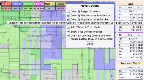
Be sure to check out Tools/More Options, where you can toggle between using the full population demographics or the 18+ demographics, and toggle between using the presidential election data and using average election data.
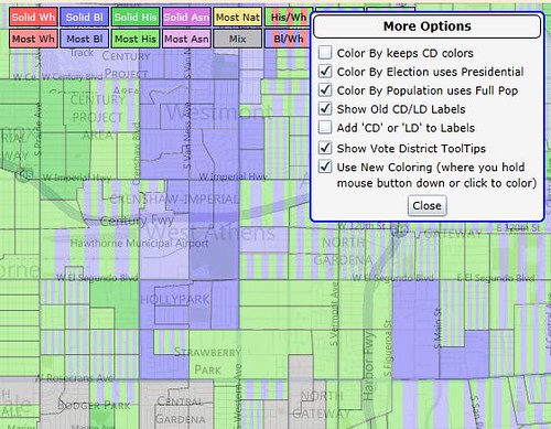
Other options allow you to keep the CD colors of CDs/LDs you've already colored, while showing population or election colors on the unassigned vote districts, allow you to show or hide Old CD/LD labels, allow you to add or subtract the prefix "CD" or "LD" on those labels, and allow you to show or hide the vote district tool tips.
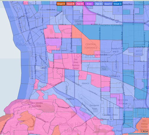
The colors for election data have changed, too. Vote districts are now colored with one of 7 colors, ranging from Great R (Dark Red) to Even (Purple) to Great D (Dark Blue). This shows the area around Redondo Beach and Torrance, California.
Lastly, you can now hide the election sections of the district data panel on the right side of your screen. When you hide a section for 1 district, it hides it for all and hides the same section on the vote district tool tips.
By the way, this version also fixes the problem where the saved VTD CSV header names were incorrect, and changes the default to show CD labels without the text "CD" .
One more thing about the striped coloring for 2 demographic groups: the thickness will vary based only on the width of the vote district. Stripe thickness carries no other meaning. There are technical difficulties with making it always uniform for each zoom level. This seems like the best option that does not take a boatload of time to get right.
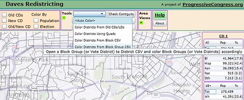
And remember, especially when the new California drafts come out, you can Auto Color by loading from a block, block group or vote district CSV.
Thanks for using the app. I hope this helps a lot, especially for some of the big states with significant diverse populations, like California, Texas and Florida. Please let me know what you think about the new colors. Next big thing: I hope to enable you to load custom data. Enjoy!
