Data have proven a potent tool in the hands of dissidents and reform activists elsewhere. Using numbers, OWS can help society overcome some misconceptions and gain a greater public support.
I would like to offer two examples, one of which shows the power of data as a tool to ascertain the truth while the other goes beyond that and demonstrates how data can also help spur an activist network or movement.
Alexander Bolonkin is a Russian-American scientist. He came to the US in 1987, after spending fifteen years in the Gulag for his dissident activities and subsequently being forced out of the country by the Soviet authorities. This dissident's memoirs mention an experience that shows the potency of basic statistics.
When Bolonkin first read underground literature critical of the regime, his reaction was that of a scientist. He wanted to find a way to verify claims made in the banned books. Not a trivial task in a totalitarian society where the state has a complete control over how information is collected and distributed. Since the information channels are highly centralized, there is also little room for informal exchange of knowledge. But Bolonkin found an elegant solution. He went to the library to study back issues of official newspapers. What he found there confirmed what he was discovering in censored publications.
Back then, there would be a big party congress twice a decade. A list of statistics supposed to illustrate resounding achievements of the five-year economic plan would be publicised and goals for the next quinquennial period would be outlined. Both sets of numbers would be published in newspapers. Comparing these figures across time, Bolonkin discovered that the government had been lying to the people and failing on its promises to deliver higher standards of living.
Another example comes from present day Russia, where Alexey Navalny, a lawyer, uses data from contracts and company reports to expose the breadth and depth of official corruption. He started out as a lone blogger. But the numbers proved more persuasive than words and soon he became popular and his effort turned into a veritable movement, supported by donations from the public. His organization has become a thorn in the side of corrupt officials. Navalny's is probably the first data-driven activist effort to date. (The NYT had a story on the activist earlier this year.)
OWS, of course, is operating in a different time and in a different environment. But using data, the movement can help address two challenges the society is facing and in the process - gain more public support.
One challenge was summarised by Chrystia Freeland:
"Americans actually live in Russia, although they think they live in Sweden. And they would like to live on a kibbutz. This isn’t the set-up for some sort of politically incorrect Catskills stand-up joke circa 1960. It is the takeaway from a remarkable study by Michael Norton and Dan Ariely on how Americans think about income inequality."
And a different problem was explained by Paul Krugman:
"Inequality is back in the news, largely thanks to Occupy Wall Street, but with an assist from the Congressional Budget Office. And you know what that means: It’s time to roll out the obfuscators! Anyone who has tracked this issue over time knows what I mean. Whenever growing income disparities threaten to come into focus, a reliable set of defenders tries to bring back the blur."
OWS could help with both. The images of protesters and their signs are in the news regularly. The majority of those signs, while probably reflective of the prevailing emotions, don't change minds or win hearts and minds because they tend to be abstract. Vagueness also leaves them open to misunderstanding and misinterpretation.

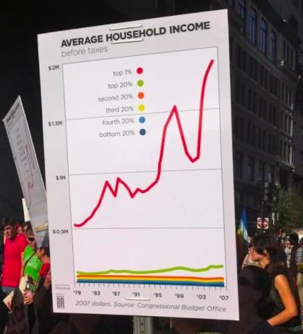
We live in an increasingly data-rich world. Data is replacing assumptions and holding theories up to more robust scrutiny than has ever been possible. Besides, data is being used to tell stories. Journalists are employing this method to display news and teachers are using infographics in the classroom. The idea here is that complex data patterns can be visualized and made obvious even to a fleeting glance. Visualized data is truly worth thousand words. Take this chart, for example (h/t Joan McCarter):
If this chart is made into a sign and provided with a succinct caption, it will explain very well one of the big problems the economy is facing.
Using the same tools that are popular with teachers and journalists, OWS can create cogent signs that will communicate effectively from TV screens and newspapers pages. In the process, OWS will have helped push back the blur that Paul Krugman wrote about and dispel some of the misconceptions that Chrystia Freeland called attention to. Data-driven signs will resonate even with sceptics.
(picture on the top of the page h/t Matt Yglesias)
