One million dollars in TV ads reaches a greater proportion of Nevadans than Floridians. But I often read about the total spending on TV ads in a given swing state, and in that metric, Florida, Ohio and Virginia are the leaders.
What happens when we look at TV spending in a slightly more nuanced way? What if we instead consider the amount of spending per voter (i.e. estimated voters in 2008) and the amount of spending per electoral college vote (ECV)?
(I've aggregated spending by candidates, political parties and supportive super-PACs and c4s.)
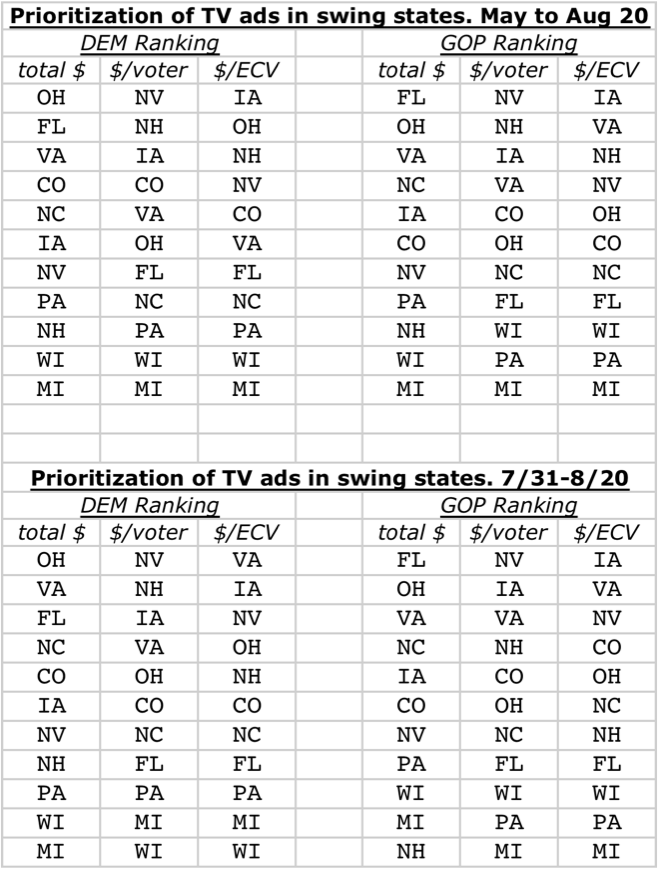
Each way of analyzing it, produces a different picture for how team blue and how team red have prioritized their TV spending (states receiving the most spending are listed at the top):
There are definitely limitations to this analytical approach. Airtime is cheaper for campaigns than for PACs, but this analysis treats all dollars as equal. (Of the total TV spending in swing states since May, Obama's campaign accounts for 72% of team blue's spending, while Romney's campaign and the RNC account for 51% of team red.) Also, the analysis does not include national level TV ads, and more importantly, it does not include money going to the ground game, campaign offices, staff, etc.
Anyways, here what's being spent on TV ads per voter: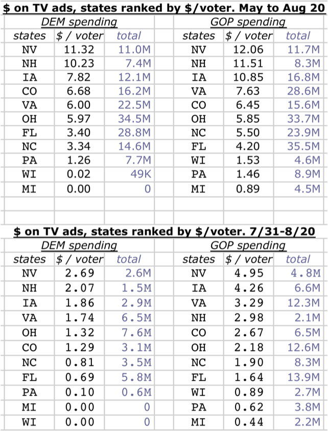
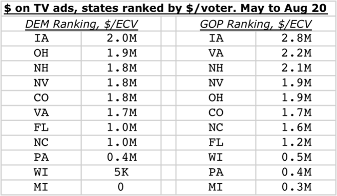
I think this is a useful metric for comparing to Nate Silver's return on investment index (see: 538), which is "the relative likelihood that an individual voter would determine the Electoral College winner."
And here's the spending on TV ads per ECV:
(Edit to above table: Democrats have spent 49K on WI, not 5K)
In the coming two and a half months, Republicans may open up more of a spending advantage.
But when it comes to the ground game, we are second to none:
