This is a continuing part of an ongoing series using polling data, past exit poll data, census data, and other data sources to analyze the 2016 Democratic Primary. This is a last pre-Iowa update. I plan to update this analysis again after we have the Iowa Caucus exit polls and the results, taking them into account.
Previous posts are:
In the previous two posts, we systematically collected and analyzed demographic crosstab data from national polls since November on the demographic categories of region, party identification, race, gender, age, ideology, education, income, and neighborhood type. Then we took averages across polls to get a better idea of the demographic characteristics of Sanders and Clinton’s supporters. In so doing, we found that the dominant media narrative is not supported by the consensus of the polling data.
The most important differences from the media narrative is that Sanders’ support among white voters is not specifically concentrated among higher income, higher education white voters. Instead, Sanders is showing in the polling data that he can also appeal to working class whites, which gives him a relative strength in comparison to Obama in 2008. Secondly, while Clinton leads among African Americans, her lead is smaller than Obama's lead was in 2008; Sanders could win nationally while losing African Americans by as much as 2 to 1. Thirdly, Sanders already shows as much appeal to Hispanics as did Obama in 2008; if Sanders draws even in national polls, he will likely do so in part by doing better among Hispanics than Obama ever managed to do in 2008.
All of these factors add up to paths to victory for Sanders and Clinton that are different from the paths that would have been followed by Obama and Clinton in 2008. This time around, the coalitions are not the same. Simplistic analogies to 2008, such as Sanders = Obama 2008 - African Americans, and its corollary (Clinton 2016 = Clinton 2008 + African Americans) are missing the point and are “fighting the last campaign.”
Since these first two posts, a few in the media have begun to catch on. Many others may be surprised when exit polls start to come out (beginning with Iowa on Monday), if they show Sanders drawing strong support from working class white voters and not just from higher education, higher income white voters. Another thing that few have yet caught on to is that there is also evidence that Sanders is doing better with Hispanics than many have assumed — but we’ll have to wait until Nevada to start to get an idea of just how true (or not) that is.
We also extrapolated this demographic data onto 2008 Democratic primary exit polls and applied a “least resistance swing” to make a projection as to what results we should expect state level polls would find currently, and also which states both Sanders and Clinton would tend to need to “win” in order to win the most delegates in the Democratic nomination.
Since the last post in this series, several new national polls which included usable crosstabs have come out from Mcglaughlin, FOX, CNN, and IBD/TIPP. I also found crosstabs from one more McClatchy/Marist poll with crosstabs from November that I couldn't find before, and so I have updated the analysis with these five new polls.
In the current diary we will expand our previous analysis by using census data and some other data to come up with vote projections down to the Congressional District level. Since many delegates are assigned on the Congressional District level, if you really want to know how the delegates will shake out in a state, you really need to have some sort of projection not just of the statewide vote, but also of how results will differ between Congressional Districts.
More on the Sanders and Clinton coalitions: State Level polls
Before we get to that, a recent article by Matt Karp employed a similar sort of methodology (on a smaller scale) as I applied on the state level in Iowa and New Hampshire to what I did on the national level. Karp compiled crosstabs on vote by income from New Hampshire polls since October. Note that he is not showing results from voters with incomes between $50k and $100k. However, you can compare how Sanders and Clinton are doing overall to how they are doing with voters with incomes under $50k to infer that Sanders is actually doing a bit better with lower income voters than with higher income voters in New Hampshire:

While I have not compiled state poll crosstabs systematically, I have looked at most poll crosstabs as they have come available, and at least anecdotally it seems to me that you see the same thing in Iowa data — Sanders doing as well, if not better, among lower income voters than among higher income voters. The same seems (anecdotally) to generally be the case with regards to education as well as to income. If this indeed proves to be the case, then it will be evidence that Clinton may be losing part of the coalition that supported her in the 2008 primaries to Sanders. That will be something to watch for when the Iowa exit polls come out.
National Poll Support by Demographics
First, we'll update our previous analysis and look at how support by demographics has changed given the additional national polling data (not much). Then we'll get into the state and congressional district vote projections, and into the delegate math.
The five new polls shows a bit less polarization by age than had previous polls. So the "age gap” declines a bit as compared to our previous projection.
The five new polls, on the other hand, showed a bit larger of a "gender gap” than previously.
Polarization by ideology declines slightly, as compared to previously.
Sanders’ relative strength in urban and rural areas. As with the previous update, vote by urban/rural is based on less data than any other demographic category, and is the most uncertain. Sanders' relative strength in rural areas is based mostly on polls from Morning Consult. There is also a slight methodological change in how I am treating urban/rural/suburban areas, which I will explain below when we get to Congressional district level vote and delegate projections. But this doesn't make much of a difference.
Vote by income remains quite evenly split (but polarization increases very slightly with the five new polls). There is not much evidence that either Sanders or Clinton get very much stronger or weaker support from either higher income or lower income voters. Again, this contradicts the media narrative, though maybe the media narrative is starting to shift a bit.
Vote by education remains quite evenly split (but polarization increases very slightly with the five new polls). Again, this contradicts the media narrative.

Vote by Party continues to show Clinton with relative strength among self-identified Democrats and to show Sanders with relative strength among self-identified Independents. However, there is a shift worth noting in the five national polls I added. Previously, in a hypothetical 45-45 national race, Clinton would have led among Democrats by about 53.9-46.1 Sanders would have led among independents by 62.2-37.8 and Clinton would have led among Democrats by about 53.9-46. Adding the new polls increases polarization by party by a significant amount — to the point where Sanders only needs 45.5% support among Democrats, but needs fully 64.2% support among independents in order to draw even nationally. It should be noted that self-identified Independents includes many voters who are registered Democrats. There is a difference between Party ID and Party Registration, and self-identified independents vote even in closed Democratic primaries.

There are minor shifts in the new polls I added. There is a difference in how Sanders fares among “non-whites” generally and how he fares among African Americans specifically. Sanders fares a bit better among non-whites generally than in the polls used in the previous projection, but a bit worse among African Americans specifically (in comparison to Sanders’ overall support). Since essentially no data is available on how Asian Americans, Native Americans, and people with more than one race are likely to vote, I am treating having them vote the same as “non-whites” generally.
The major story in vote by region remains the relative concentration of Clinton’s support in the South. There are also some other regional variations — Clinton may be faring a bit better in the Northeast than in the West and in the Midwest.
State-Level Vote Projections
Next I will paste in state level projections. More detailed projections on the Congressional District level are below, but these are easier to look at to get a quicker overview first.
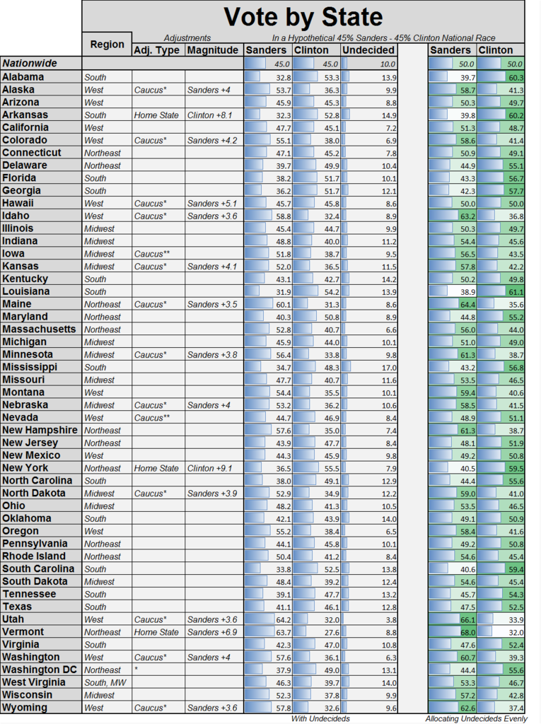
Here are updated state-level vote projections, with current national polling averages:
And here is what the race is projected to look like by the model if Sanders gains in the polls and the race narrows to a tie nationally:
Methodology of Congressional District-Level Vote Projections
In order to extrapolate statewide projections down to the Congressional District level, I collected data (mostly from the census) on demographics across Congressional Districts, and I assumed that turnout within each demographic category would be constant across each demographic within each state, in order to obtain the overall statewide electorate matched to 2008 Democratic primary exit polls. I also used the data collected by Fladem (check it out!) on how many delegates each Congressional District assigns as a starting point. I assumed that each demographic category has an independent effect and that each demographic group is homogeneous (except for age and race, where I took into account an interaction effect).
- For party identification, unfortunately I could find no useable data with which to systematically project which congressional districts have higher proportions of self-identified Democrats vs Independents. So I just assumed that the distribution of self-identified Democrats and Independents was the same as statewide within all Congressional districts. Please leave a comment if you have an idea of something I could use!
- For race, gender, education, and income, I collected census data from the 2014 American Community Survey.
- For age, I collected census data as with race, gender, education, and income. However, there is also an interaction effect between age and race that I took into account (using census data by age and race). The problem is that most minority-majority Congressional districts tend to be younger than average, for the reason that non-whites tend to be younger on average than do whites. If you treat age and race entirely independently, this means that the model would predict that in majority-minority districts, Clinton would be helped by the presence of the minorities, but Sanders would be helped by the fact that they tend to be young (canceling out a substantial part of the race effect). The model takes into account this interaction by separately comparing, within each racial group, how much younger or older the population is. Rather than applying an age effect on voting that does not correct for differences in age in a congressional district which can be explained by age, an age effect that corrects for the effect of race on age is applied. Of course, there are other such interaction effects which I have not taken into account, but I took this into account because the effects of race and age are both strong predictors of Clinton/Sanders preference, and because in many districts if you do not take it into account they improperly cancel each other out.
-
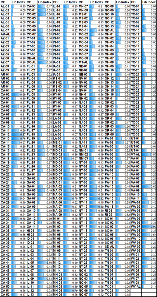
For ideology, the census obviously does not collect data on how many people are liberal, moderate, or conservative in different Congressional Districts. But this is important to try to take into account somehow since ideology has a significant effect on candidate preference, and since it clearly differs across Congressional Districts. So I constructed an index which hopefully will do a reasonably good job of capturing this factor, or at least as good of a job as can be managed. I started with Congressional District data from the American Ideology Project, which has ideology data on the CD level based on the Annenberg National Election Study and the Cooperative Congressional Election Study from 2000 to 2011, which classifies ideology in Congressional Districts on a scale from most liberal to most conservative. Unfortunately, the index by itself does not suit our purposes perfectly — it is correlated strongly with race. For example, one of the most strongly liberal districts in the index is New York's 13th Congressional District (Harlem area, represented by Charlie Rangel). While many people there may hold liberal political opinions and may self-identify as liberal, they are not the liberals who are most likely to support Bernie Sanders, since many are African American or Hispanic. So I modified this, by forming three components:
- 1) The original index.
- 2) Multiplying the index by the percentage of the voting age population that has a college degree.
- 3) Multiplying the index by the percentage of the voting age population that is white.
- Each of these three components is then scaled and averaged to produce the final index. Within each state, I then distributed the "liberal” and the “moderate” voters from statewide 2008 Democratic primary exit polls in Congressional Districts according to how relatively "liberal” each district is in this index, as compared to the statewide average. Below is what the "liberalism index” looks like this for all states and CDs. Since there is no harder data to go on, the best that can be said for this is that it “looks about right,” which I think it does. If it is significantly off, that is one additional source of error in these projections. It is the within-state variation that makes a difference in determining where the self-identified "liberal” voters and where the more moderate to conservative Democratic primary voters are concentrated within each state:
Ad-Hoc Liberalism index by state:
Ad-Hoc Liberalism index by Congressional District:
-
For neighborhood type (urban/suburban/rural), unfortunately the census bureau does not actually collect good data on whether an area is urban, suburban, or rural. Instead, the census classifies areas as either "urban” or rural, but the definition of "urban” that is used can include a small town of 5000 people in the middle of western Nebraska. So, I followed the suggestion used Trulia, from this Fivethirtyeight article. Trulia has data on whether an area is urban/suburban/rural, but this is not freely available, as far as I can tell. So I used census data to classify all zip codes by household density per square mile. Then I matched zip codes to Congressional Districts in order to determine the share of households in each Congressional District that lives in urban, suburban, and rural areas. After debating with myself, I ended up deciding to use this data on the statewide level as well as on the Congressional District level, because I have more confidence in its accuracy, so there is a methodological change in how I am treating neighborhood type generally. This may have been more effort than it was actually worth, since there is actually relatively little polarization by urban/suburban/rural neighborhoods to be found in national polling data. But if significant polarization by urban/suburban/rural does emerge as the primary goes on, the model will be able to capture it and hopefully to predict its effects on the Congressional District level.
Delegate Peculiarities:
There are a few peculiarities in how some states allocate their delegates. For the cases when states assign delegates based on something other than state-wide or CD-level results, I applied the statewide results uniformly.
- I am not attempting to project the results in Puerto Rico and in other American territories which have delegate allocations (Democrats Abroad, American Samoa, Guam, Northern Marianas, and the Virgin Islands). However, these delegates could make a difference if they go strongly one way or the other. In 2008, Obama generally fared well in the territories, while Clinton won in Puerto Rico.
-
Texas and New Jersey do not give out districts by Congressional District, but rather by state legislative districts. I do not have the data to project onto those state legislative districts at the moment.
- A few other states allocate delegates below the state level, but not on the Congressional District level.
-
Delaware splits some of its delegates by county (and between the city of Wilmington and the rest of New Castle County). Each of these has 2 delegates (essentially ensuring 1-1 delegate splits in all conceivable circumstances) except for the party of New Castle County excluding Delaware, which has 8 delegates. The intent of this was probably to give representation to all parts of the state. The effect will be the opposite — if the campaigns are smart, the only place in Delaware either Clinton or Sanders will ever set foot is in the part of New Castle County excluding Delaware, because that is the only place delegates can be swung.
-
Montana splits some of its delegates between the eastern half of the state and the western half of the state. I would expect Sanders to probably do a bit better in the western half of the state and Clinton to do a bit better in the eastern half of the state.
-
Oregon splits its 2nd Congressional District into two pieces, on the county level. Each piece gets 3 delegates.
-
Washington DC splits some of its delegates between MD1 (7 delegates; wards 1,2,6,8) and MD2 (6 delegates; wards 3,4,5,7). Both of these include some of the more heavily African American and more heavily White wards in DC, so the results in each of these will probably not depart too far from the results in DC overall.The ones shown below that were won by Muriel Bowser in 2014 are generally the more heavily White words, while the wards won by Vincent Gray are more heavily African American.
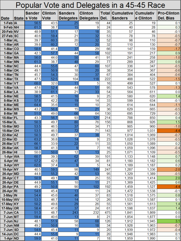
CD-level vote and delegate estimates with current national polls (37% Sanders, 51% Clinton)
Next, let's finally take a look at a CD-level vote and delegate projection, assuming current national polls with Clinton at about 51% and Sanders at around 37%.
In the first column, state or congressional district are shown. The next 3 columns (Sanders, Clinton, and Undecided) are a best guess as to what a good Congressional-District level poll might find, based on the demographic characteristics of Clinton’s and Sanders' support in national polls and the demographic characteristics of each state/congressional district, and 2008 Democratic primary exit polls. The next two columns show the same projected results, splitting undecideds evenly between Sanders and Clinton. Next are delegate splits that would be implied by those results.
For example, if Clinton won Arizona statewide by about 56.9-43.1, she would win 14 of the delegates that are apportioned statewide, while Sanders would win 11. If the result AZ-01 were 57.0%-43.0% in favor of Clinton (as projected if the Arizona Primary election were held today), we would end up with an even 3-3 delegate split, even though Clinton would win the popular vote in the district by a fair margin. In the next two columns, the swing that would be needed for each candidate to pick up an additional delegate. When a swing of less than 5% is needed to pick up a delegate, it is highlighted in green. For example, Sanders would need to expand his vote share by 15.3% (from 43.0% to 58.34%) in order to win an extra delegate and have a 4-2 split in his favor in AZ-01. On the other hand, Clinton would expand her vote from 57.0% to 58.34% (thereby also knocking Sanders below the critical delegate cutoff point of 41.67%) in order to win another delegate and a 4-2 split in her favor.
You can see that the candidates are not the most likely to campaign extensively in AZ-01, based on its demographics. Though it is close to the edge in which if the election were held now it could split its delegates either 4-2 for Clinton or evenly (3-3), under that scenario Clinton will have already won the national race. Meanwhile, if the race does become competitive nationally, it will probably require too much local over-performance for either candidate to get an extra delegate. We should mention, however, that there is a wildcard in this particular case — the Native American vote, which is modeled as being the same as “non-whites” in general here but which might in reality be substantially better for either Sanders or for Clinton.
On the other hand, you can see that the campaigns may be more likely to push hard in AZ-03 and AZ-05. If the race pulls close to even nationally (which is really the scenario of interest, and would require about a 7 point national gain for Sanders), those are the sorts of districts in which a slight shift in the results might be more likely to tip a delegate one way or the other, at least if these CD-level projections are in the right general ballpark.
We can see that if national polls were to remain the same as they are now, we should expect a strong victory for Clinton (something like 2247 delegates to 1702 delegates). However, Sanders would earn a large number of delegates — certainly enough to have some influence on the party platform and the like. The system tends to give a good delegate haul to any candidate that can exceed minimum thresholds - and both Clinton and Sanders pass those thresholds across the country.
The model predicts using only demographics and national polls (not state polls) that Clinton should narrowly win Iowa. Specifically, she should get around 50.6%, 50.1%, 52.0%, 50.2% in IA-01, IA-02, IA-03, and IA-04 respectively. From that, you can see that the model often does not predict very wide variation in the results between Congressional districts in the same state. Race, more than any single other factor, tends to explain most of the differences in projections for different congressional districts in the same state. However, other factors play a role as well. The model doesn't predict large differences in how white voters are likely to vote across geography because the national poll averages find only small differences based on income, education, and voter preferences. Meanwhile, gender and age (after taking into account race) tend to be distributed relatively evenly geographically — with some exceptions. So either there will in fact be less geographic deviation in how white voters vote, or else that deviation must be explained by other factors not taken into account in the model. State specific effects play an important role (mostly in matching the demographic composition of the projected electorate to 2008 Democratic Primary exit polls), but also because ideology has to be assumed to be constant across all CDs within each state, due to lack of data.
I included Congressional District level projections for Texas and New Jersey, but assigned all delegates in accordance with the statewide vote. But the Congressional District projections give you a rough idea of what the projections might look like for the New Jersey legislative districts and Texas State Senate districts.
This is a best guess as to what a national primary would look like, if held today:
CD-level vote and delegate estimates in hypothetical national dead heat (45% Sanders, 45% Clinton)
Next we look at how we would expect the results to look on the Congressional District level if Sanders pulls even to Clinton in national polls (perhaps following a strong showing in Iowa and momentum from a big win in New Hampshire). Sanders almost certainly (barring unforeseen events) needs to gain momentum out of Iowa and New Hampshire in order to have a good shot at winning the Democratic nomination — otherwise Clinton's national lead will be difficult for her to lose.
The first thing to note is that although this scenario examines a hypothetical national dead heat, Clinton nonetheless wins a small but significant delegate win over Sanders. So at least given the current national poll numbers and my various assumptions, the way delegates are allocated is currently projected to tip the scales slightly towards Clinton. However, this can change easily with small shifts in the structure’s of Sanders' and Clinton's support, and obviously this is well within what one might call (in non-technical terms) this projection's “margin of error.”
In total, the bias of the delegate allocation system swings 15.5 delegates to Clinton relative to what they “should be” based on the popular vote, which gives her a 31 delegate lead. Most of the swing comes from the Northeast (rather than, as one might suppose, the South).
| Region |
Pro-Clinton Delegate Bias |
| Midwest |
+ 0 Delegates to Clinton |
| Northeast |
+ 8.7 Delegates to Clinton |
| West |
+ 2.4 Delegates to Clinton |
| South |
+ 4.3 Delegates to Clinton |
In particular, Pennsylvania is responsible for a +4.4 delegate swing to Clinton — if you scroll down on the chart to Pennsylvania, you will notice that Sanders narrowly misses out on delegates in a large number of CDs. Ohio, though not in the Northeast, is also responsible for a large pro-Clinton swing of +4.4 delegates (which is offset by swings to Sanders in some other states in the Midwest). This is because of how Ohio allocates its delegates. The most heavily Democratic — and African American congressional districts in Ohio are given much more delegates than are other districts (substantially more compared to other states). Sanders ends up with even splits in all the other districts, but loses OH-11 by 10 to 7 delegates (maybe in reality Nina Turner would help him there). As a result, even while winning the popular vote in Ohio 53.5-46.5 (assuming a national dead heat), Sanders would only win a single delegate's advantage out of Ohio.
There are many other biases like this — working sometimes in favor of Clinton and other times in favor of Sanders, though more to Clinton on balance at this point. A slight shift in other aspects of the race could reduce this pro-Clinton bias, or even turn it the other way around.
The definition of a "popular vote tie” that I am using is a tie in the delegate-weighted popular vote. That means that if you take the projected shares across all states and multiply by the number of delegates in each state, you come out with a tie. This delegate-weighted popular vote tie includes the adjustments that I made — the home state advantages in Vermont, New York, and Arkansas, and the caucus boosts for Sanders.
Returning to our previous example of Arizona, we can see that the projected result in AZ-01 means that both Clinton and Sanders would need large additional swings (+8.5% for Sanders and plus 8.1% for Clinton) to win an additional delegate. For that reason, if the race in Arizona were close, as projected here, the candidates would be wise not to focus their effort on AZ-01. However, some other districts, including AZ-03 and AZ-05 (colored green) are close to the tipping point where one candidate or the other could pick up a delegate with a slight shift in the vote.
As they plan for Super Tuesday and beyond, the campaigns are almost certainly both looking at the race in this sort of way — trying to figure out where are the places that they should focus their resources in order to pick off an extra delegate here, save an extra delegate from going the other way there. They are doing this with better data than we have here, but it is the same basic idea.

Projected delegate allocations over time (in an even national race)
Next we will total all of that up and put it in an easier to digest format, to see how the delegates are allocated over time, across which states.
In the rightmost column, this also shows the amount that the delegate allocations are biased away from what one would expect based on the popular vote (of an assumed hypothetical 45-45 race). A pro-Clinton bias is colored in light orange, while a pro-Sanders bias is colored in light green. For example, in Colorado Clinton gets 1.7 delegates more than she would if all Colorado delegates were split by the popular vote.
Projected delegate allocations over time (in non-even national races)
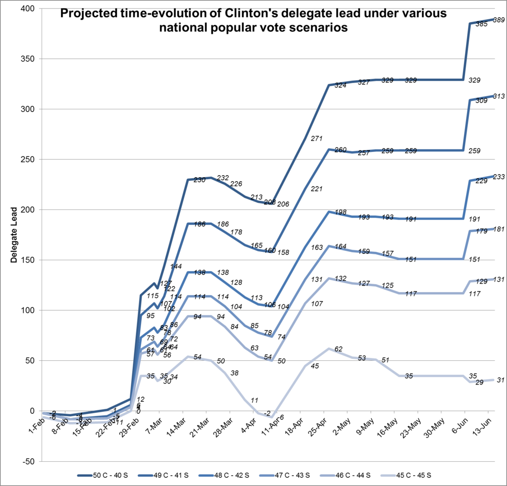
Finally, how would the delegate leads be different if Clinton maintained varying leads in national polls across time? At what point could Clinton hope to "put Sanders away” by taking such a large delegate lead that Sanders just can’t make it up?
Below are the paths that Clinton’s delegate lead would be projected to follow if she maintained a constant national lead of varying amounts. For example, the darkest blue line (and the highest line) is "50 C — 40 S,” which in other words is a 50-40 Clinton lead in the national polls maintained through all primaries. By comparing the lines, you can see the degree to which her lead declines if the national polling narrows.
A good thing for her is that if she is just slightly ahead (46-44), she ends up with a projected 131 delegate lead. An equivalent lead for Sanders (46-44) only gives him a 43 delegate lead. This may or may not stick as the race continues and polling changes, but for the moment it does suggest that the way delegates are allocated may help to give Clinton a slight extra boost.
It should be noted that the large jump for Clinton in mid-April is from when New York votes. It is assumed in all of these scenarios that Clinton will get a large "home state advantage” boost in New York, as well as Arkansas. This is one of the things that helps her to get a large lead if she is ahead in the national polls. If that is not the case, then her delegate totals may go up by much less at that point. Without the assumed home state advantage, New York would be fairly competitive based on demographics.
In any case, the Scenario for Clinton to win is simple — to keep Sanders from gaining in the national polls and to hold her national lead. If she can’t do that, even if Sanders only gains the lead after Super Tuesday (as long as it is not too long after), Sanders could still win the nomination.
Projected Time-evolution of Clinton delegate lead under various national popular vote scenarios:
On the other hand, what about scenarios in which Sanders gets a large surge in the national polls following Iowa and New Hampshire and overtakes Clinton? How quickly could Sanders start to amass a large delegate lead from which Clinton could not recover?
The states that vote on Super Tuesday include many of the states that are the most demographically favorable to Clinton (much of the South). On the one hand, the fact that many of the Super Tuesday states are so demographically favorable to Clinton is clearly a good thing for her. On the other hand, it could be her only shot to really knock out Sanders.
Sanders is unlikely to actually win more delegates on Super Tuesday than Clinton regardless of who ultimately wins the nomination — he would need to be ahead by about 47-43 in national polls to draw roughly even on Super Tuesday in terms of delegates. But the thing is, Sanders doesn't need to win the most delegates on Super Tuesday. Because after Super Tuesday is over, the states that start voting become much more demographically favorable to Sanders. So all Sanders really needs to do is to gain enough momentum from the early states to draw even in national polls, or at least close to even by Super Tuesday. If he does that, then he would be in position to hold Clinton's delegate win on Super Tuesday under a hundred or so delegates (preferably closer to 50 or so than to a hundred).
Then, in mid-march through early April, a string of states that are mostly more pro-Bernie than the national average start to vote in succession. By winning these, depending on his margins of victory, Sanders could easily wipe away any delegate advantage that Clinton might accrue from Super Tuesday. This is only really broken up by New York voting on April 19 — but that will only give Clinton a big boost if indeed she gets a large home state advantage. Then, through the rest of the primary calendar, there is a string of states that are mostly more demographically favorable for Sanders than the national average (broken up by smaller numbers of states that are both pro-Clinton than the national average). Under all scenarios, Sanders would need a national lead of some size by this latter half of the primary calendar (roughly late April through June). With that, if he were to get that far, he could build up a lead. If Sanders were to prevail, the result would most likely be finalized on June 7 — when California (along with Montana, New Jersey, New Mexico, and South Dakota) votes.
Projected Time-evolution of Sanders delegate lead under various national popular vote scenarios:
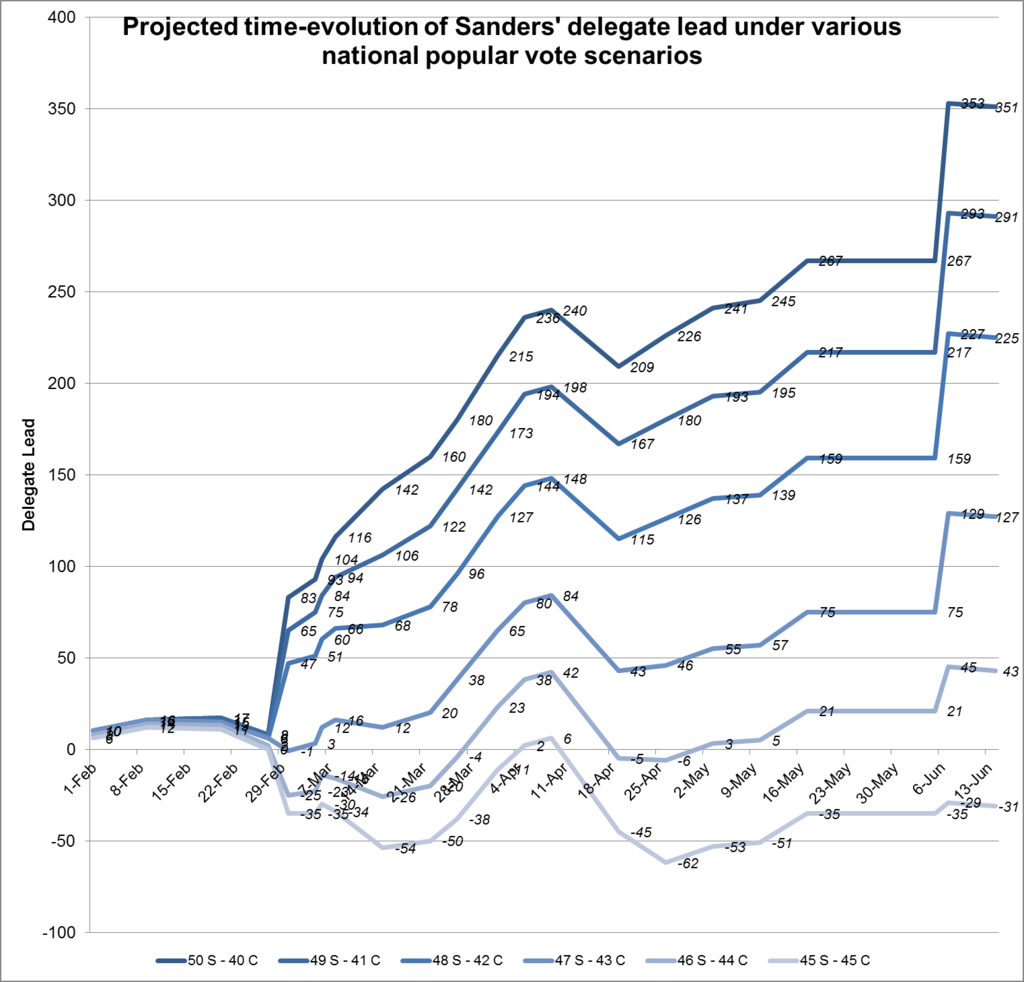
If Sanders manages to keep it close in Iowa, or even to win (so that Clinton will not wrap up the national primary quickly, in which case there would be little point continuing), and if Sanders fares well in New Hampshire, then we will subsequently examine the possible paths of the primary in greater detail, and game out various scenarios, depending on what happens. I also plan to adjust and improve the model using the Iowa results and exit polls, if time allows and if it is worthwhile doing so (again, assuming that Sanders holds his own in Iowa and New Hampshire). At some point I’ll probably start explicitly taking state polls into account, if we get to that point.


