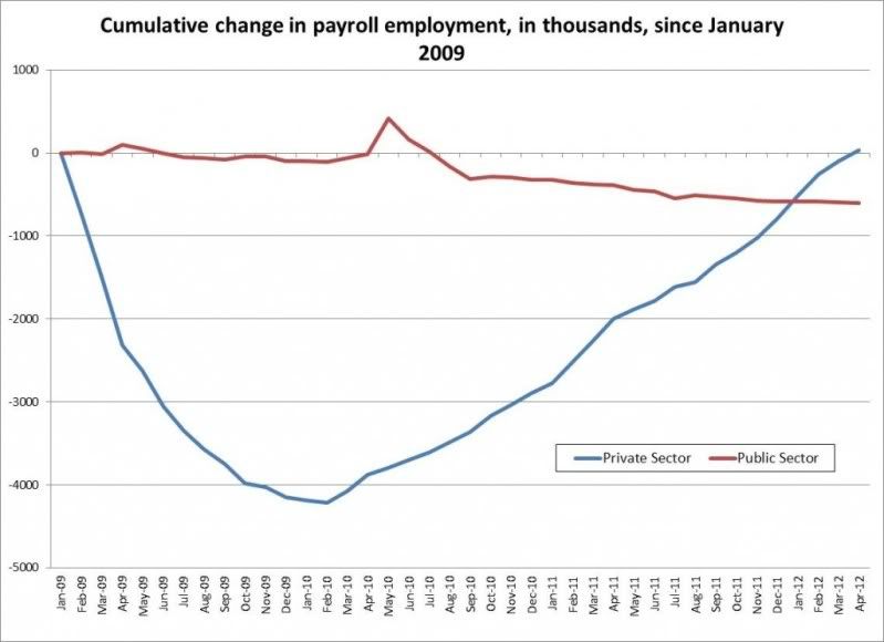
Michael Linden, the Director of Tax and Budget Policy at the Center for American Progress Action Fund is doing his best to put a positive spin on the awful April jobs report with this graph.
It's election season, and rather than be honest with the American people on what the prospects are in this horrible economy and election, Michael Linden is touting the same parlor game spin master Ezra Klein tried in 2010. This involved moving the private employment statistical benchmarks(100) to a more favorable data point starting after the depths of the great recession in Ezra's chart.
In Linden's chart, though the recession was not bottomed out yet, moving the (100) benchmark to Inauguration day(95) in that second chart study still makes the private sector recovery in Michael Lind's graph look a lot better than it is without seeing the full downturn of the great recession. I'm thankful to John Schmitt and others for exposing this campaign 2012 statistical parlor game for what it was back then in 2010.
A TALE OF TWO GRAPHS
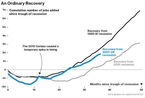
This first graph shows the change in total private-sector employment from the trough of the last three recessions (assuming that the Great Recession ended in the summer of 2009). By this measure, the last year or so doesn’t look so bad.
[............]
But there are two problems here. The first is that the Great Recession was a lot longer than the other two.
[............]
The second problem is closely related: the chart above sets the post-recession private employment level equal to 100 and compares the recovery only to the absolute depths of the recession.
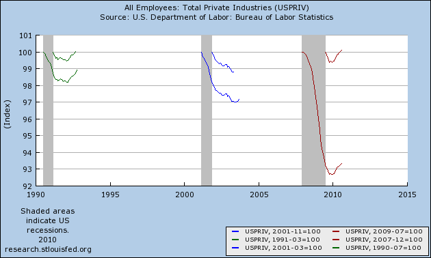
The top three lines are exactly the same as the ones in the first chart. The bottom three lines, however: (1) start tracking private employment from the beginning (not the end) of the recession and (2) use the employment level immediately before –not after– each recession as the benchmark (employment at the benchmark is set equal to 100).
That second graph ruins the delusion that there is something to be happy about when it comes to the real metrics in both cases. It matters a great deal whether you start measuring private employment at the start of the great recession(December 2007) rather than
what is called the end(June of 2009). It also matters whether you start touting Inauguration Day(January 2009) as the relevant benchmark a few months before the official end(the two red lines putting the short one [100] at benchmark [95]) rather than the beginning of the recession to get the full picture.
That is a pretty dishonest way to spin things to cover up for an administration which could have and should have done more for the economy. Despite any political constraints, the overall smug lack of effort is what is the most striking and damaging. The great Neo Chartalist Economist James K. Galbraith warned this administration and Congress that there would be no return to normal under these circumstances. They didn't listen and laughed. They also lost the House in 2010.
Michael Linden does mention the drop in public sector jobs in the graph in his piece. However, he puts it all on Republicans(who do bear responsibility but not all of it) as if the White House and Congressional Democrats had nothing to do with it. Unfortunately, as David Dayen notes, when Democrats talk as if government work is inferior, they enable a shrinking critical government work force and their spending power that goes along with it.
The Remarkable Public Sector Depression
It irks me to hear Democratic officials hail “private sector jobs numbers” or the “rebound in the private sector,” as if there are somehow two economies out there, and the amount of jobs up or down in the one where governments happen to sign the paychecks somehow has no bearing on the other. When cops and firefighters and teachers and nurses lose their jobs, they lose purchasing power. They lose the ability to hire private contractors or visit private businesses for the purchase of goods and services. Public employees don’t use a different currency or a different set of businesses. You cannot divorce them from the private sector.
And writing the public sector out of the equation like this really obscures the incredible nature of the depression in public sector jobs over the past few years.
[...........]
[..........]
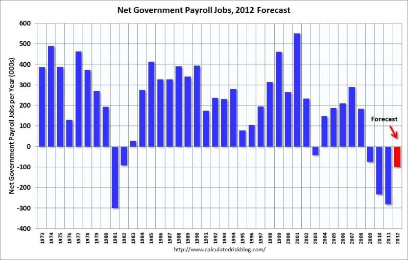
Well, if you look at trend growth in the public sector, which is entirely natural because the population keeps growing, and the public sector must grow with it to provide the same level of public services, then you see 2011 as a year where the public sector dipped close to a half a million jobs below trend. And the same for 2010. So federal cutbacks, and the ripple effects they had across the public sector, could easily have accounted for that loss of jobs.
As you can see, work in the public sector is just as important as the private sector. The dollars paid to public workers spent in the economy are the same as those paid to private workers. Although there's blame to go around,
Obama's federal pay freezes while asking federal employees to increase their contribution to their own retirement plans for dumbass deficit reduction(which is actually detrimental) did not help matters at all.
This ignorant philosophy bears a significant responsibility for all of this. It's all there in that clip; the smug preaching about federal austerity for the mythical deficit crisis in addition to the total ignorance of the federal budget he is in charge of. Probably the most insulting part of that statement to anyone without an intelligence deficit is the idiotic comparison of the federal budget to a family's household budget.
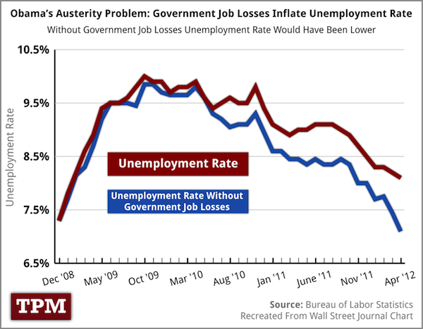
All of this utter crap contributed to the decline of public sector jobs along with not enough aid to the states in the original lackluster stimulus. The official U3 unemployment rate would be around 7% if private sector jobs weren't the only fixation by this administration and Congress.
And furthermore, economist Dean Baker and the CEPR are on the case again correcting more spin about how "great" this net jobless recovery is. This time the spin comes from a graph touted by Bloomberg Businessweek Economics Editor, Peter Coy. Now keep in mind, this is Dean's controversial title, not mine, but I agree with the substance within to qualify it. You will see why.
Stop the Obamapologists Before They Kill the Data
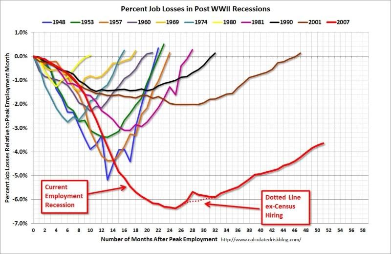
When you evaluate the strength of a recovery, you also have to consider the depth of the downturn that preceded it.
[.......................]
In the 2007-2009 recession we lost 7.5 million jobs.
Several Obama supporters have picked up Coy's graph and tried to make a political statement with it. They have. They don't believe that Obama can make a serious economic case to support his re-election.
To further show how out of touch Peter Coy and others touting this so called "recovery" are, I'll post this updated graph from
Calculated Risk everyone should pay attention to. It shows how deep we still are as far as job losses are concerned compared to other post WWII recessions and recoveries. Bottom line, Dean Baker is right.
Here is where we really see the problems of all of our overall metrics and how the real economy is not measured. This is a long but important piece that I link to constantly, but it's for a good reason; not counting 9 million dropping out of the labor force allows politicians and the media to proclaim official unemployment rates dropping without some of the population ever finding work; Daniel Amerman crunches the data on what is called the (CWP)Constant Workforce Participation Rate.
There are other estimates that are close to Daniel Amerman's. Robert Oak, of the Economic Populist does good work, and analyzed the April Jobs report using the labor participation rate. His finds are equally scary; even given population growth, the labor participation rate is back to what it was during 1981.
The Meager April 2012 115,000 Jobs Report Shows Lowest Labor Participation Rate Since 1981
The labor participation rate, dropped -0.2 percentage points to 63.6% and hasn't been this low since December 1981! If we go back to December 2007, the labor participation rate was 66%. The highest civilian labor participation rate was in January 2000, at 67.3%. What this means is there are over 5.83 million people not be accounted for in the official unemployment rate, in other words counted as employed or unemployed, many who probably need a job and can't find one. That's in addition to the official 12.5 million unemployed.
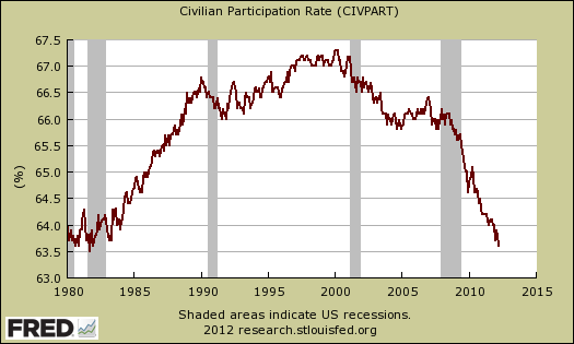
The employment to population ratio is now 58.4%, at record lows and dropping a 10th of a percentage point from last month. You have to go back to the severe recession of 1983, October to find such low ratios, but in the 1983 case, the low ratios were short lived. Now we have a persistently low employment to civilian noninstitutional population ratio! The low employment to population ratio clearly includes people dropping out of the labor count. we can see this by the cliff dive employment to population ratio during 2008-2010.
As you can also see, you would have to go to the severe recession of 1983 to find such a low employment to population ratio; one which was short lived unlike now. Now with every padded labor statistic that comes out, officially, the employment to population ratio nevertheless remains persistent. Last month it even dropped by a tenth of a percentage point.
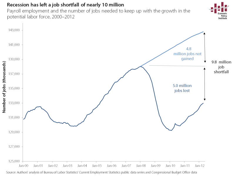
As a MMT/Neo Chartalist in my thinking, I have some disagreements with economists at the EPI and did not like how they participated in Peter Peterson's Fiscal Summit, but they generally do good work on analyzing BLS data. Economist Heidi Sherholz did a great job indexing the job gains during this recovery to how many are needed just for population growth. This recovery is still officially 9.8 million jobs short of what is needed.
Weaker jobs report is a reminder that we’re still on a rocky road
To get back to full employment in three years we would need to be adding around 350,000 jobs per month. It will take more jobs than that to get to what MMTers consider full employment, which is real full employment, not just at 4-5% unemployment. No one in this electoral race is being serious about this problem.
Both candidates talk about debt being the dire problem of the day. That's their way of saying to you, "We don't really care." It's true; at this rate 2019 is the earliest there might be official full employment assuming there is not another financial crash orchestrated by the President's "savvy" and "responsible" banker friends like Jamie Dimon.
Is this what responsibility looks like to the President? Isn't Jamie Dimon as irresponsible as those "irresponsible" home owners that are not qualified for mortgage modifications? That's the missing 2 billion dollar question.
Back on point; we need politicians to speak in realistic terms about how our fiscal and monetary system works at the very least. Human lives actually do depend on it. The truth is that people don't have to be sacrificial lambs for government debt, and there will never be any government debt collector that shows up at their door.
And yet still, Americans keep being fed these lies in this campaign about the number one issue on their mind(jobs) when some of them can barely eat. This is not smart tactically on the Democrats' part to play the "I'm the compassionate deficit terrorist unlike the Republican" game. This is also a failure of framing as Professor in the Departments of Psychology and Psychiatry, Drew Westen has outlined.
It's not surprising that some polling on who would best handle the economy shows voters prefer Romney's deficit axe instead of Obama's scalpel; none of which has anything to do with job creation in this fake crapanomic 2012 debate. Why? It's simple; when Democrats fail to offer a bold rebuttal that is entirely opposite to the deficit lies and austerity Romney is selling, voters prefer the axe like they prefer the real Republican.
As long as Democrats keep referring to spending and debt as dirty words, it will become more unlikely that real demand side solutions to our massive unemployment problem will be ever be pursued at all. Many people can't survive until 2019. It's cruel and dishonest for any of us to demand that we all just pretend that this is what they are resigned to because of the lack of a credible macroeconomic debate in this campaign.
The focus of this election should be about issues that qualitatively affect people and their families, but it's not. Not really. For instance, if I describe someone who can't survive with the low wage work he or she can find(if they can find any at all), and then criticize the president for never making an effort to raise the minimum wage as he said he would, it raises an intense visceral emotional reaction.
And yet, not the one you might think; not one in concern for the wage slave, but for the politician living in the best public housing money can buy. Meanwhile, the working poor dealing with the foreclosure crisis are getting kicked out of their homes. They need that intense emotional support, not a politician. A number of people get this, but too many do not.
Many people forget that regardless of the outcome of this election, President Barack Obama and Mitt Romney are going to be just fine. The American people won't be though. Not unless the right diagnosis of our problems and correct solutions are at least part of the discussion. I'm sure some of you will scream about how that one step up out of the 100ft of deep shit justifies demeaning the unemployed as if they exist within a void for election season 2012.
There's a reason I call it demeaning; defending politicians who don't want to spend anytime talking about the fiscal spending that will restore dignity to the 99% fits the definition. Many will say it has to be that way. I don't buy it. I won't forget about their plight because it's not right. I'll keep telling the truth about our fiscal and modern monetary system in order to qualitatively help them because we must fight.
I don't care if bought politicians won't. I don't do so to be part of a group that pretends to care about people through support of a politician or to make political campaign friends, either. So go ahead; write whatever hysterical insult laden unsubstantiated response diary you want.
I still won't STFU and fall in line.
10:50 AM PT: Ok, some people seem confused on why the John Schmitt piece relates to how flawed Michael Linden's piece is regarding our private sector jobs recovery, but it's simple if you visualize it in this graph.
Setting the benchmark on Inauguration day puts the benchmark(95) at (100) as Ezra Klein's graph did after the depths of the great recession(shaded area) in the first graph in the John Schmitt piece originally(why I used that term depths) which still paints a rosey picture of this recovery.
This is shown in this graph with the red shorter line after the shaded area. You just have to picture a short red line(100) at benchmark (95) to get why measuring the recovery at that point of data(January 2009 via Inauguration day) is flawed. That is why his study clearly debunks how happy we are supposed to be about Michael Lind's graph.
